graphic-art, print, etching, typography
#
graphic-art
#
conceptual-art
# print
#
etching
#
typography
#
abstraction
#
surrealism
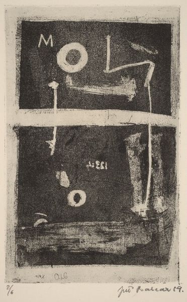
Dimensions: plate: 24.9 x 16 cm (9 13/16 x 6 5/16 in.) sheet: 40.5 x 26.9 cm (15 15/16 x 10 9/16 in.)
Copyright: National Gallery of Art: CC0 1.0
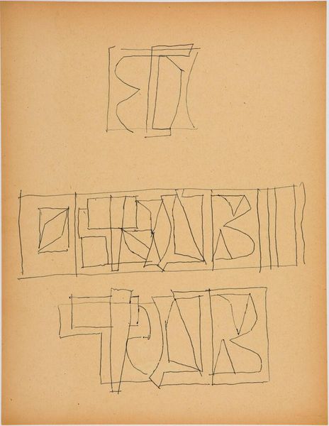
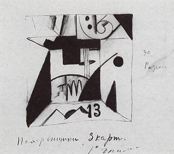
Curator: Jiří Balcar created this print, titled "He Sprang Up and Fell Down," in 1965. It's an etching combining graphic art, typography, and elements of Surrealism. Editor: My immediate reaction is one of controlled chaos. The superimposition of different graphic elements gives the piece a very frantic feeling. But there's also an undeniable sense of order in the composition— the distribution of the typographical elements across the plate, the carefully-scratched cancellations. Curator: Indeed, that feeling of tension is potent. The title itself suggests an act of rebellion, perhaps against imposed authority or rigid systems. In Eastern Europe during this time, the visual arts became a site for this kind of coded socio-political discourse. Editor: Precisely! The crossed-out words at the top certainly feel like visual censorship. Then you have the stencil-like letters that form the phrase "vyskočil a upadl!", the titular, 'He Sprang Up and Fell Down!", in bold typeface. The exclamation point reinforces the sense of finality and possibly failure. Curator: And consider the medium: etching. It lends itself beautifully to capturing texture, allowing for delicate details as well as bolder strokes. The act of scratching into the metal plate can be seen as another act of resistance, or perhaps frustration, echoing the piece's theme. It embodies a physicality that contrasts nicely with the intellectualism. Editor: It’s fascinating how Balcar balances clarity and ambiguity. The typography, though distorted, still attempts to convey information. The stark contrast of black ink against the paper highlights the formal qualities of the lettering while subtly destabilizing legibility. The scratches and imperfections become textural, almost sculptural, elements. Curator: I agree. What Balcar achieved here is a visual representation of the precariousness of upward mobility. The dashed words and strong exclamation point evoke societal setbacks and perhaps shattered dreams. He used recognizable forms – text, layout - and transformed it into something unsettling and powerful. Editor: Well, "He Sprang Up and Fell Down" reveals that art in even very restrained aesthetic choices can resonate far beyond its immediate appearance and evoke larger themes. Curator: Absolutely. It reminds us of how the interplay of text and image, combined with historical context, enriches art, and communicates beyond verbal language.
Comments
No comments
Be the first to comment and join the conversation on the ultimate creative platform.
More like this