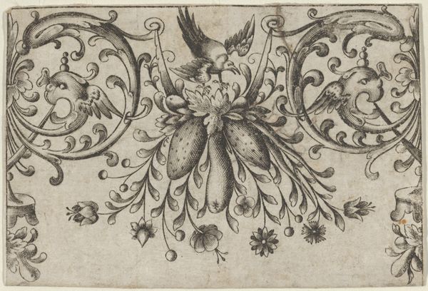
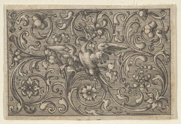
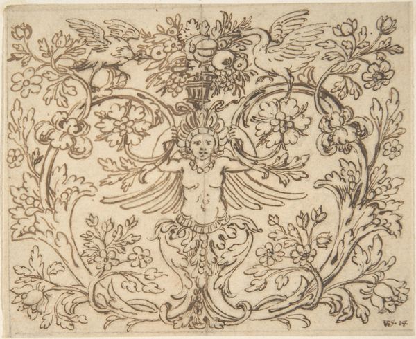
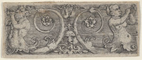
Design for Silverwork with Garlands, Birds, and Grotesque Motifs 1568 - 1633
0:00
0:00
drawing, ornament, print
#
drawing
#
ornament
#
toned paper
#
light pencil work
#
pen drawing
# print
#
pen sketch
#
bird
#
pen-ink sketch
#
men
#
pen work
#
sketchbook drawing
#
tattoo art
#
pencil art
#
doodle art
Dimensions: Sheet: 2 15/16 × 4 5/16 in. (7.4 × 10.9 cm)
Copyright: Public Domain
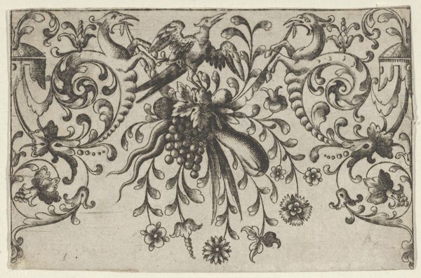
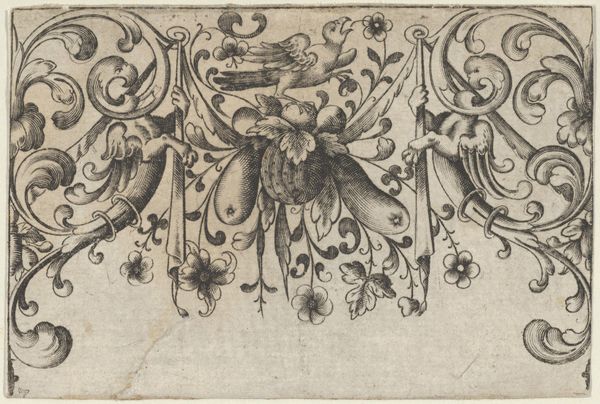
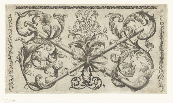
Curator: This drawing, rendered in pen and ink on toned paper, is entitled "Design for Silverwork with Garlands, Birds, and Grotesque Motifs." It's attributed to Hieronymus Bang and dates to between 1568 and 1633. Editor: My initial reaction is that it feels quite balanced. The symmetry, despite the organic forms, is very striking. And there's a definite interplay between delicacy and these… what did you call them? Grotesque motifs? Curator: Indeed. These drawings served a crucial function. They were effectively pattern books circulated amongst artisans. This particular one might have been destined to inspire silverwork. Notice the heavy reliance on curvilinear forms—the garlands, the scrolling acanthus leaves. Editor: The weight of the lines is fascinating. There’s such a fine network of them, creating almost a tapestry-like density in places. It reminds me that during this period printmaking facilitated not just art dissemination but the rapid spread of design ideas across Europe, which then had a significant influence on cultural trends. Curator: Precisely. This drawing offers insights into the period’s design sensibilities, the patrons' expectations, and the socio-economic networks through which art was exchanged. Think about the labor required to translate this drawing into physical form! It wasn’t simply about aesthetics; these patterns dictated entire industries. Editor: You can also detect the rise of Mannerism here in the late 16th-century, a departure from Renaissance ideals. It’s a move towards artifice and embellishment, evident in those slightly unsettling winged figures at the edges. And the central bird, what might its presence signify, conceptually? Curator: Bird imagery often represented freedom, perhaps, or divine connection in that era. Placed centrally, amidst symbols of luxury, it almost seems like a commentary on the aspirations, or perhaps the excesses, of the patrons commissioning such work. Editor: Looking closely at the pen work, I realize how intentional each mark must have been. To conceive and execute this level of detail with such confidence...It brings to mind the labor-intensive art that was produced during this era. Curator: It's remarkable, isn’t it? We get a glimpse of the creative energy and design knowledge fueling artistic output back then, by observing the intricate relationships among material forms and the cultural ideas being produced here. Editor: Absolutely, a rich synthesis of aesthetic aspiration and material possibilities!
Comments
No comments
Be the first to comment and join the conversation on the ultimate creative platform.
More like this