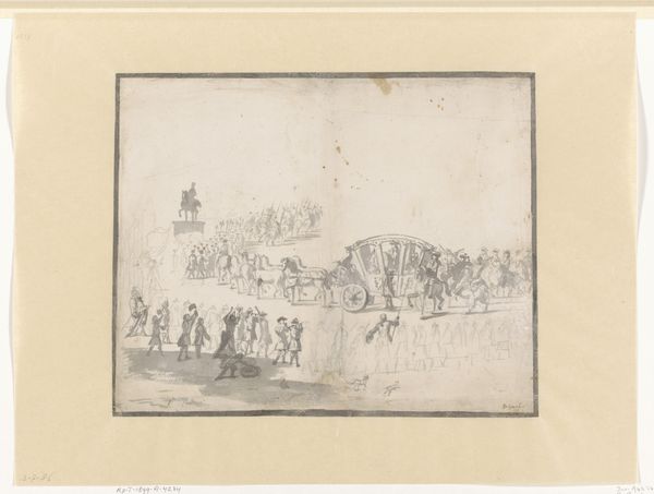
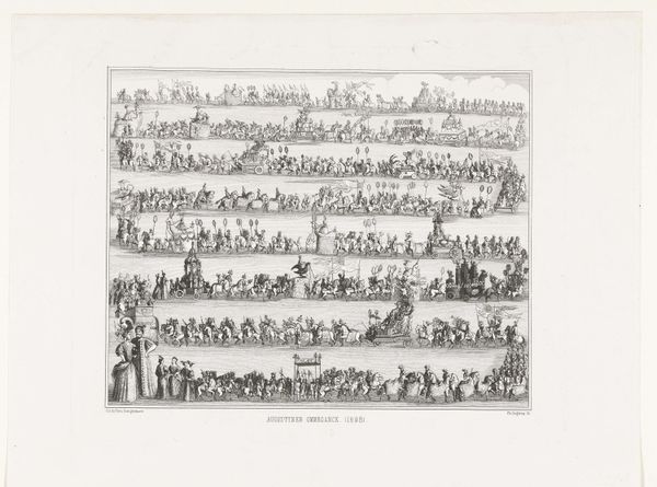
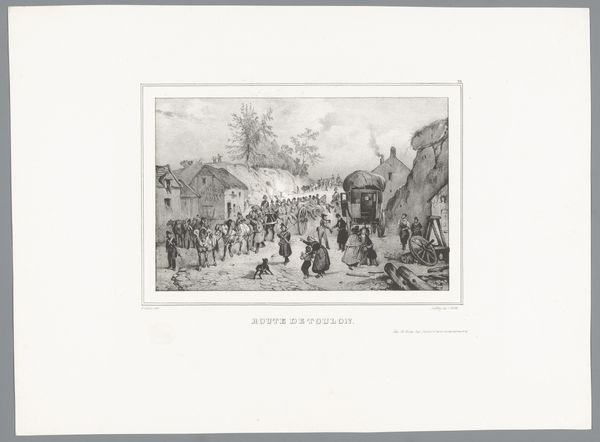
Volksuitgaaf. Maskerade gehouden door de leden van het Leydsche Studenten-Corps, den 11den Junij 1860. De intrede van den Hertog van Anjou binnen Antwerpen, den 19den Februarij 1582. 1860
0:00
0:00
gerardusjohannesbos
Rijksmuseum
lithograph, print, engraving
#
light pencil work
#
quirky sketch
#
narrative-art
#
lithograph
# print
#
pencil sketch
#
sketch book
#
figuration
#
personal sketchbook
#
sketchwork
#
ink drawing experimentation
#
pen-ink sketch
#
line
#
sketchbook drawing
#
cityscape
#
genre-painting
#
history-painting
#
academic-art
#
sketchbook art
#
engraving
#
realism
Dimensions: height 393 mm, width 500 mm
Copyright: Rijks Museum: Open Domain
Editor: Here we have a lithograph titled "Volksuitgaaf. Maskerade gehouden door de leden van het Leydsche Studenten-Corps, den 11den Junij 1860. De intrede van den Hertog van Anjou binnen Antwerpen, den 19den Februarij 1582," created in 1860. It looks like a historical procession, a parade of some kind. The composition feels very ordered and regimented, quite detailed given the medium. What do you see in the formal construction of this piece? Curator: The composition employs a rigorous horizontal stratification. Observe how the artist structures the visual space through distinct registers, each populated with figures and motifs meticulously arranged. This layering creates a sense of depth and order, but it also invites a semiotic reading. Consider the line, its precision in delineating form and texture, building tone. What meanings might arise from that choice? Editor: I notice the stark contrast between the dense lines of the figures and the relative emptiness of the background. Is this a reflection on negative space? Curator: Precisely. The tension between figure and ground is vital. Notice how the line quality changes in different areas. The density in the foreground contrasts the sparser, almost skeletal treatment of the background architecture. This variance is important, and demands exploration. Can we see the line become form here? What theory emerges from that shift? Editor: It creates a sense of scale, maybe? Almost flattening the background and giving the foreground greater prominence? So we see not a political meaning, but rather one that plays more with space, texture, the flatness of the paper, and the form itself? Curator: An insightful assessment. Consider too how the print medium affects our perception. The lithographic process inherently emphasizes the two-dimensionality of the artwork, reinforcing the flatness that you astutely observed. Editor: That’s fascinating! I initially focused on the narrative aspect, but analyzing the composition this way really brings out how the artistic choices shape the viewing experience. Curator: Indeed. The interplay of line, space, and printing technique shapes meaning, often far beyond initial narrative assumptions.
Comments
No comments
Be the first to comment and join the conversation on the ultimate creative platform.
More like this