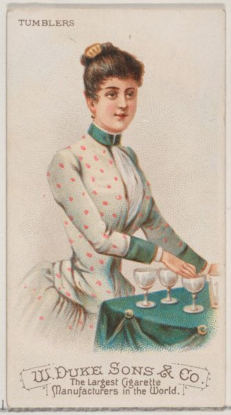
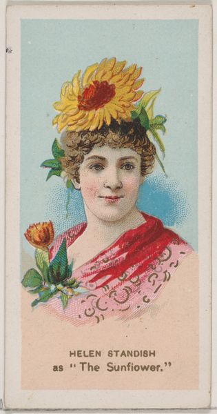
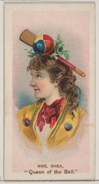
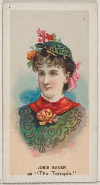
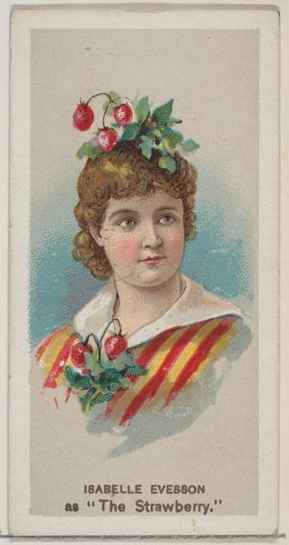
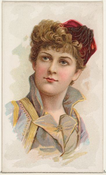
Minnie Palmer as "The Apothecary's Maid," from the series Fancy Dress Ball Costumes (N73) for Duke brand cigarettes 1889
0:00
0:00
drawing, coloured-pencil, print
#
portrait
#
drawing
#
coloured-pencil
#
water colours
#
fancy-picture
# print
#
impressionism
#
oil painting
#
coloured pencil
#
academic-art
Dimensions: Sheet: 2 3/4 x 1 1/2 in. (7 x 3.8 cm)
Copyright: Public Domain
Curator: Welcome. We're looking at "Minnie Palmer as 'The Apothecary's Maid'," a colored pencil drawing from 1889. It was created by W. Duke, Sons & Co. as part of a series of fancy dress ball costume cards for Duke brand cigarettes. Editor: My first thought is how strangely endearing this portrait is! There's an undeniable charm in its somewhat awkward, playful construction. It almost feels like a precursor to some pop art of the future. Curator: Absolutely. As a cigarette card, its purpose was both promotional and collectible, reflecting a Victorian fascination with elaborate costumes. Think about the production—hundreds of these small cards, distributed with tobacco products, acting as miniature advertisements and collectibles. It blurred the lines between commerce, entertainment, and art. Editor: And speaking of the Apothecary theme—that’s quite a loaded choice. Apothecaries, traditionally, held a position of considerable authority in matters of life and death. It would seem, in the language of symbols, that there might be an implicit endorsement of this tobacco brand, which is audacious if we really look at it. Curator: I agree. The choice of Minnie Palmer, a recognizable stage actress, elevated the image. These cards circulated widely, embedding idealized images into popular culture. Her costume suggests not only craft but also labor and even medicine in an age deeply concerned with public health and hygiene, albeit one often challenged by industrial manufacturing and distribution practices like that of mass produced tobacco products. Editor: I also notice how the color palette reinforces this sense of manufactured optimism. The bold reds and soft blues feel intentionally designed to be eye-catching but not alarming, given the card’s intention to market. And the slightly stiff pose of Minnie suggests less agency for the individual. Curator: Very interesting. Seeing it this way does make one contemplate the effect of material circulation of this artwork with its consumer good origin, embedding commercial ideas within people's aesthetic tastes. Editor: Yes. These commercial objects are a time capsule, filled with meanings that shift when we unearth them in the present. Thank you. Curator: Indeed. These throwaway collectibles now challenge how we value what is art, advertising, and culture.
Comments
No comments
Be the first to comment and join the conversation on the ultimate creative platform.
More like this