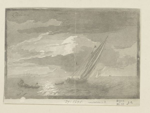
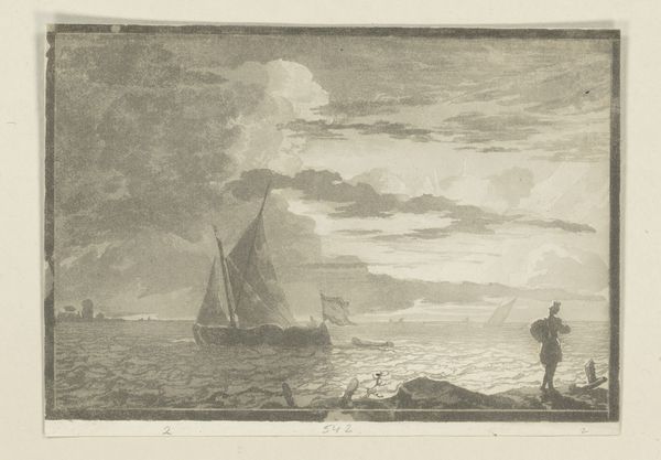
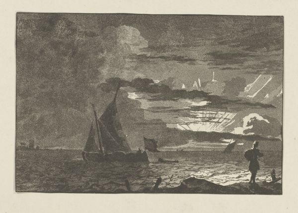
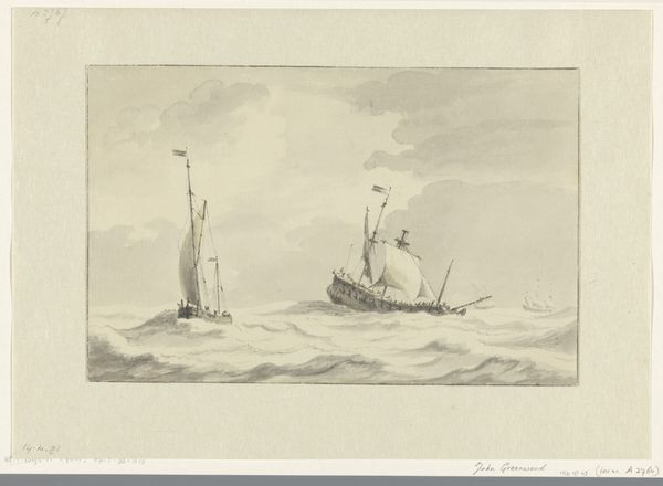
drawing, print, graphite
#
drawing
# print
#
landscape
#
graphite
Dimensions: height 138 mm, width 208 mm
Copyright: Rijks Museum: Open Domain
Editor: Here we have "Seascape with Full Moon" by Cornelis Brouwer, made in 1781, using graphite in a drawing or print medium. The silvery quality gives the whole scene a melancholic feel, and my eye is really drawn to the way the moonlight shimmers on the water. What aspects of its formal elements stand out to you? Curator: The arrangement of tonal values commands our initial attention. Note the strategic placement of dark masses juxtaposed with light. This tension is further emphasized through the stark diagonal thrust of the primary sailboat against the horizontal expanse of the sea. Editor: So you’re saying the strong contrast and sharp angles create the visual interest? Curator: Precisely. The dynamism inherent in the formal structure overrides any anecdotal narrative one might be tempted to construct around the subject matter. Ask yourself, where does your eye travel, and why? Editor: I see what you mean! I jump from the moon’s reflection on the water to the ship’s sail, creating a zig-zag through the whole composition. I didn’t notice that at first. It really does energize the viewing experience. Curator: Indeed. And what of the texture suggested through the gradations of graphite? Does the materiality contribute to your interpretation? Editor: Yes, the subtle gradations enhance the atmosphere; you can almost feel the cool, damp air of the sea. Focusing on how it's made helps understand how Brouwer created that specific feeling, irrespective of subject matter. Curator: An excellent observation. It is in this rigorous examination of form and material that we approach a deeper understanding of the artwork’s essence. Editor: Thanks for walking me through this! Looking at the basic elements really let me understand this artwork much more deeply than just thinking about the scene it represents.
Comments
No comments
Be the first to comment and join the conversation on the ultimate creative platform.
More like this