Copyright: Modern Artists: Artvee
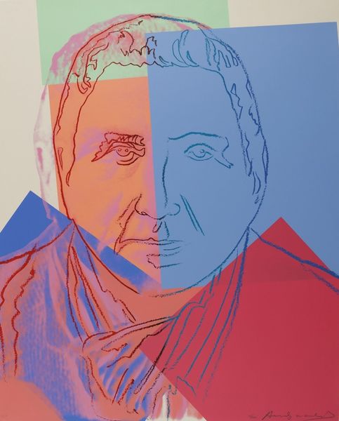
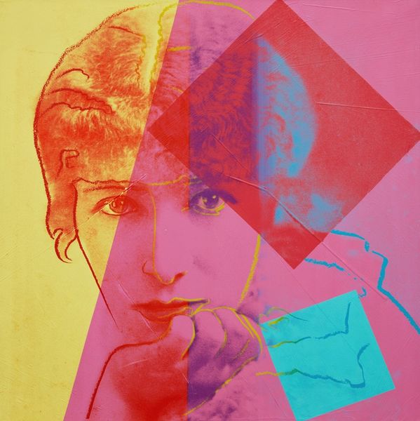
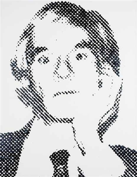
Editor: This is Andy Warhol’s 1980 portrait of Golda Meir, rendered with acrylic paint, a departure from his more famous silkscreens. The hard, contrasting blocks of color against the softened features seem jarring, almost as if two aspects of her personality are battling one another. What symbols or images strike you most in this portrait? Curator: Notice how Warhol’s bold color choices immediately bring the viewer in, reflecting how a powerful political image commands attention. But also consider the overlaid sketched lines—red and yellow here—they are significant. Aren’t they reminiscent of the “outlines” we use to simplify figures and objects? What do such graphic simplifications suggest to you about celebrity? Editor: Perhaps the simplification boils her down to an image, easier for the public to grasp. Almost like branding. So, is the bright, contrasting color palette just a vehicle for her popular image? Curator: Think beyond that too! Recall the bold color fields in Suprematism, as explored by Malevich in the early 20th century. This art does not aim at the recognizable. The flat expanses and shapes seek some essential meaning through visual shorthand, and, perhaps, some deep emotional or psychological impact of pure, concentrated color, form and symbol. What continuity do you see here with the older movement? Editor: I see how the image has this weight. It gives an aura that transcends mere commercial branding, it’s monumental, like folk art depicting an icon. Thank you for that reading! Curator: And thank you for sharing your perspective – noticing that collision of hard versus soft – an appropriate way to look at this particular cultural icon!
Comments
No comments
Be the first to comment and join the conversation on the ultimate creative platform.
More like this