De wijk Oud-Antwerpen in de wereldtentoonstelling van 1894 / in beeld gebracht door Frans van Kuyck; beschreven door Max Rooses 1894
0:00
0:00
graphic-art, print, textile, paper, typography
#
graphic-art
# print
#
textile
#
paper
#
11_renaissance
#
typography
#
history-painting
Dimensions: height 468 mm, width 325 mm, thickness 10 mm
Copyright: Rijks Museum: Open Domain
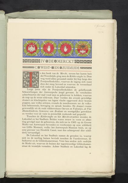
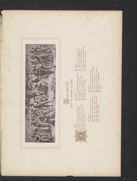
Curator: This print, entitled "De wijk Oud-Antwerpen in de wereldtentoonstelling van 1894 / in beeld gebracht door Frans van Kuyck; beschreven door Max Rooses," originates from 1894. The mixed media is an interesting compilation of graphic art, prints, textiles and typography all presented on paper. Editor: It’s intriguing how static yet vibrant it feels. The coloring, those heraldic symbols and the bare figures – there's such a careful layering of visual information on this page, giving texture and weight through design and production processes, but what could it mean in a larger sense? Curator: Indeed. Consider the social context of world exhibitions in the late 19th century, showcases for nations projecting an image of their past glories and industrial prowess. Frans van Kuyck captured a historical scene of Antwerp within that framework. The print then presents Old Antwerp not merely as history, but as a commodity for display, and, thus, consumption at the event. Editor: Yes, and focusing on materials, this piece acts as documentation. From the typography, we're not just seeing a representation but also getting historical accounts through Rooses' writing and the textile quality in production suggesting a handcraft element coexisting with new modes of mass productions in printing. Curator: And beyond the visible, the choice to represent Antwerp’s golden age in the 16th century brings up interesting discussions around identity and cultural pride. It reflects anxieties and desires of a Belgium still fairly young after its independence, searching for ways to establish a distinct, dignified history through events like the world's fair. It raises broader questions about who controls the narrative. Editor: Definitely. The graphic style has echoes of renaissance illuminations mixed with modern printing techniques – a layering that highlights tensions inherent in memorializing ‘old’ Antwerp at the cusp of radical social, material, and technological changes. Even that framing could become part of an artistic dialogue. Curator: Right, even down to the chosen motifs, the weaponry and the heraldry signal very pointed narratives on Belgian militarism and nationalism during this period. They may serve to remind one who held social and economic power then, versus the working classes that labored largely behind the curtain constructing these spectacular affairs. Editor: Looking at it through the means of production is so enlightening. The work's physicality—paper, print, applied colors—reveals its intended function as a printed book that was meant to give context and depth, but could also exist purely as an individual artwork as a document, even while packaged into the spectacle of that time’s trade fairs. Curator: It truly brings forth fascinating aspects about Belgian history, its performance, and, importantly, it invites questions on the politics ingrained within cultural expressions in a very exciting way. Editor: Precisely. It leaves me thinking of art’s position as a piece that functions in conjunction with consumerism through printed documentation, like many material productions exhibited across that era.
Comments
No comments
Be the first to comment and join the conversation on the ultimate creative platform.
More like this