acrylic-paint
#
abstract-expressionism
#
abstract painting
#
pop art
#
colour-field-painting
#
acrylic-paint
#
form
#
geometric pattern
#
acrylic on canvas
#
geometric
#
line
#
modernism
#
hard-edge-painting
Copyright: John Ferren,Fair Use
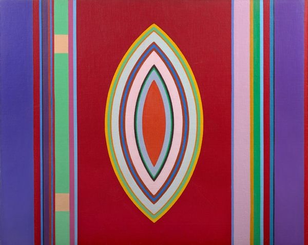
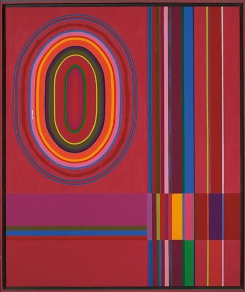
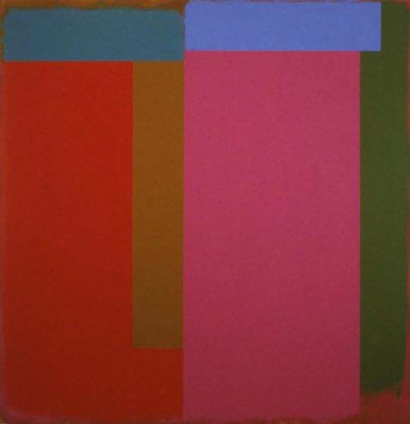
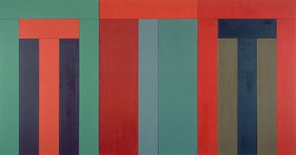
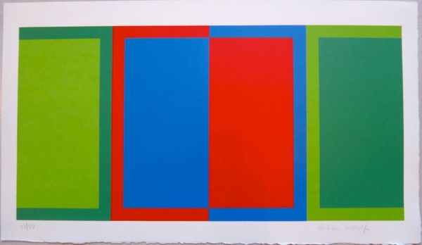
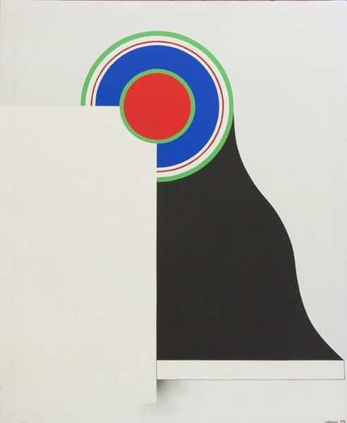
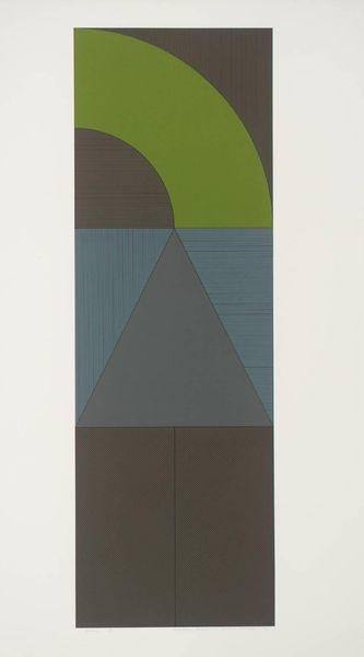
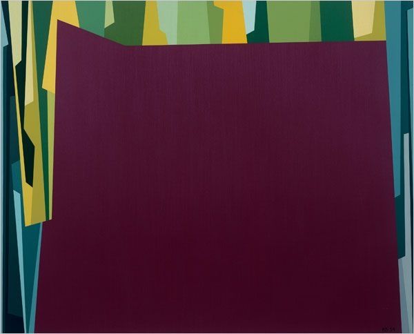
John Ferren made this painting, Quiet, with oil paint, and it's got this way of seeing that feels both planned and spontaneous. The color palette is really considered, but the hand of the artist is visible in the application, which gives it life. I'm really drawn to how Ferren balances the matte surfaces with the brighter bands of color and the central oval shape. The texture isn't trying to hide itself; it's part of the story. And this big lozenge shape in the middle with its colors split in two, feels like a kind of symbolic language that's both simple and complex. Quiet reminds me a little of Agnes Martin, though Ferren is working with a different kind of geometry. Both artists use simple forms to hint at something bigger, something maybe just beyond our grasp. What do you think?
Comments
No comments
Be the first to comment and join the conversation on the ultimate creative platform.
