drawing, ink, pen
#
drawing
#
comic strip sketch
#
quirky illustration
#
street-art
#
narrative-art
#
caricature
#
cartoon sketch
#
personal sketchbook
#
ink
#
ink drawing experimentation
#
pen-ink sketch
#
pen work
#
sketchbook drawing
#
pen
#
storyboard and sketchbook work
#
sketchbook art
Dimensions: height 250 mm, width 230 mm
Copyright: Rijks Museum: Open Domain
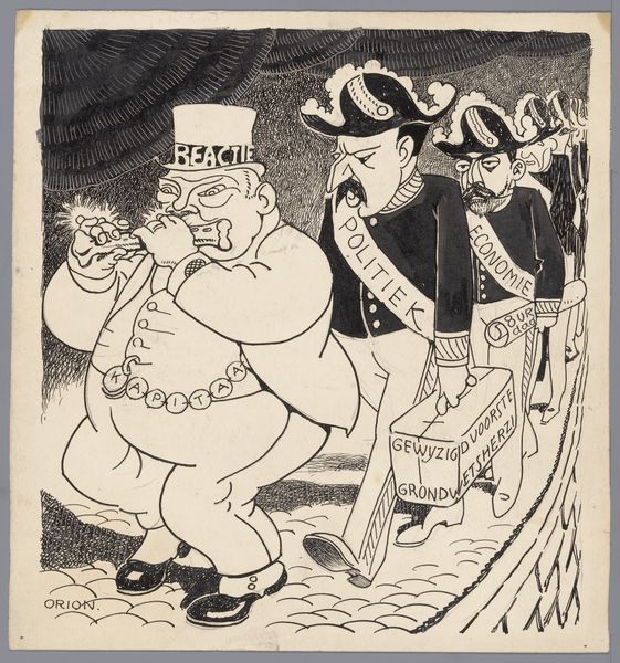
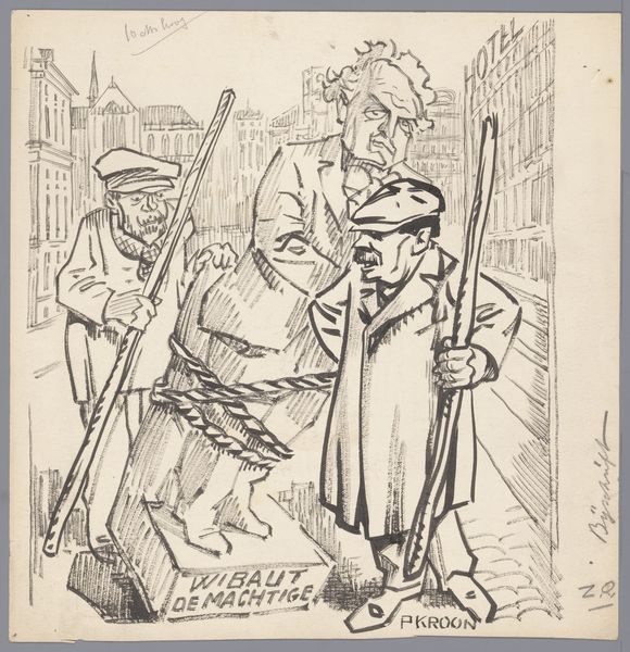
Curator: This intriguing ink and pen drawing is entitled "Praalwagen van de Nationale Bond tegen Revolutie" and it dates from somewhere between 1915 and 1935. What strikes you most about this satirical piece? Editor: Well, visually, it's this stark contrast in scale that jumps out. You have these meticulously drawn, almost elegant figures pulling what is essentially a grotesque, looming representation of… well, what exactly is it? A political body? Curator: Precisely. The central figure embodies the "Nationale Bond tegen Revolutie" – the National League Against Revolution. The drawing operates on many levels, critiquing both the organization itself and its supporters. Note the three men pulling the float are labeled Snuders, Bogaerts and Beumer and they appear as if to be refined upper class men. The group as a whole used street parades and public spectacle as tactics to convey a particular ideology that often demonized left-wing organizations, labor unions and socialist ideals of the time. Editor: The use of ink here, particularly the way it delineates shape and exaggerates form, feels particularly loaded. Look at the figure, and the implied weight bearing down upon the so-called working men pulling it - is that perhaps a play on economic disparity between the so-called elites being toted by the working class? What kind of dialogue do the materials have with the theme? Curator: It is fascinating, isn’t it? By using caricatures, the artwork targets the bourgeoisie, creating a strong anti-establishment feel. Consider how traditional power structures, often presented with solemnity, are instead portrayed as ludicrous and unwieldy. There's a sharp commentary on societal roles and the burden of tradition, isn't there? Editor: It really does make you wonder about the artist's own relationship to that power structure. I'm compelled by the sheer labor invested in creating the scene using minimal materials, the stark pen-strokes perhaps suggesting the heavy cost on social change. The weight being hauled by the working-class members and how much burden they will willingly bear. Curator: Yes, by blending materials with a subversive message, it reveals complex dynamics. Looking closely reminds me to check the very means of production we consider to be conventional! Editor: Absolutely, it underscores that art doesn't need grandeur to have weight.
Comments
No comments
Be the first to comment and join the conversation on the ultimate creative platform.
More like this