paper, photography, albumen-print
still-life
paper
photography
albumen-print
Dimensions: height 198 mm, width 539 mm, width 279 mm, thickness 103 mm
Copyright: Rijks Museum: Open Domain
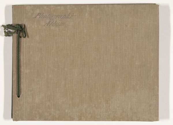
Editor: Here we have a photograph album from 1922 titled 'Fotoalbum leprozenkolonie Danaradja en familieopnames', so family photos alongside pictures of a leper colony. The album cover has a sepia tone, tied with a string and simple gold script. It has an immediate feeling of sadness because of the implied narrative inside. How should we interpret this as a standalone object, purely on its visual qualities? Curator: The interplay of textures commands immediate attention. The rough, fibrous paper of the album cover contrasts starkly with the anticipated slickness of albumen prints contained within. Do you notice the effect of the barely visible inscription in gold? The word 'photographs', placed on an otherwise uniform surface. Editor: Yes, it is quite understated, like it is embossed rather than printed, hinting at care and permanence despite its modest nature. Curator: Precisely. Consider also the structural integrity. The binding, a simple cord, speaks volumes about access and closure. It hints at a carefully curated sequence of images, though readily available for viewing. It makes me think of framing; where the interior is curated as an individual experience through aesthetic positioning. Editor: So you see the exterior as deliberately composed and revealing certain clues to a sensitive archive. Curator: The minimal palette and textured surface invite a tactile engagement, directing us to the artistry invested in the entire object, including and beyond what's presented in the individual images held within. It prepares us to enter the archive, thinking not only of photographic details, but the object that presents the narrative itself. It really does force one to question the ontology of memory. What do you think of the lettering? Editor: It's such a good point! It made me reflect on the function of the book as a container of many untold stories, I almost didn’t look beyond the cover! The font seems so soft and personal.
Comments
No comments
Be the first to comment and join the conversation on the ultimate creative platform.