mixed-media, print, woodcut
comic strip sketch
mixed-media
narrative-art
comic strip
folk-art
woodcut
comic
genre-painting
Dimensions: height 424 mm, width 320 mm
Copyright: Rijks Museum: Open Domain
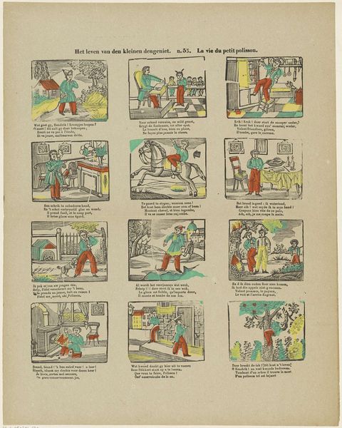
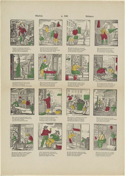
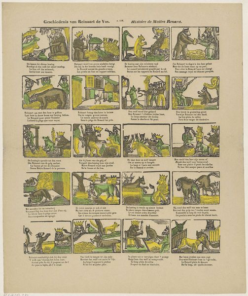
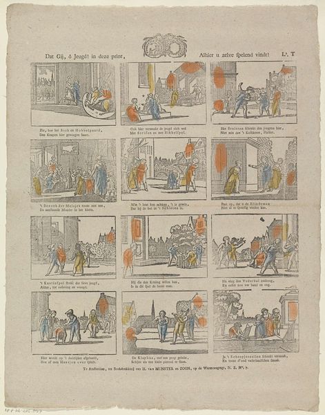
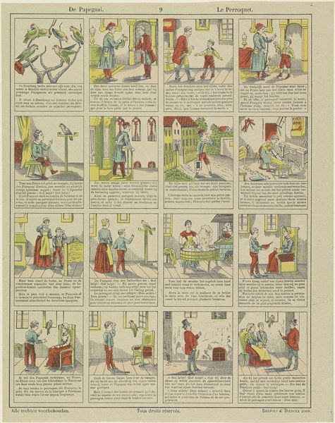
Editor: This mixed-media print, titled "Klein Duimpje" by Franciscus Antonius Beersmans, dating between 1866 and 1902, has a unique comic strip feel, doesn’t it? What do you see in this piece? Curator: The visual organization of the print, arranged into a grid of sequential images, immediately directs our attention to its structural composition. Note the use of line to define forms and delineate space within each panel, and the varying use of color across these frames creates internal rhythm. Do you observe how the limited palette affects the narrative flow? Editor: I do see how the colors direct the viewer's eye. What strikes me is the crude rendering of figures. Curator: Precisely. While a trained artist might employ chiaroscuro to achieve depth, here, Beersmans embraces a flatness, almost a caricature. How does this stylization affect the reading of the narrative? What philosophical assumptions underlie such visual representation, or, as it might be said, "realism"? Editor: It feels less about realism and more about telling a story clearly. Curator: Exactly. The form reinforces the function. And what does this "function" contribute to our philosophical understanding of late 19th-century illustrated folk-art production? Do such philosophical questions add any value to the discussion? Editor: I hadn’t thought about it that way before. Viewing it through the lens of structure helps understand the piece as a whole. Curator: Indeed. By dissecting the formal elements, we come to understand the artist's intent, the work's structure, and its place in a complex symbolic order, both reflecting and constructing our perceptions of reality. I appreciate the clarity it can bring to one’s understanding.
Comments
No comments
Be the first to comment and join the conversation on the ultimate creative platform.