#
pattern-and-decoration
Copyright: Modern Artists: Artvee
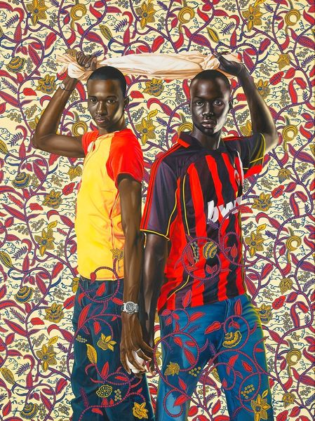
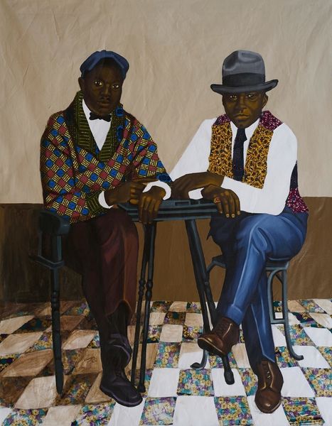
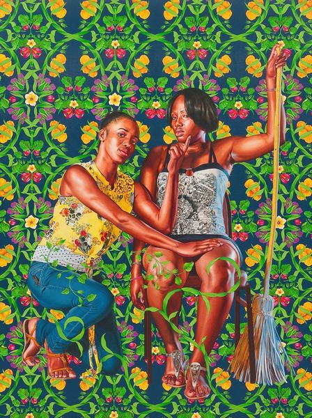
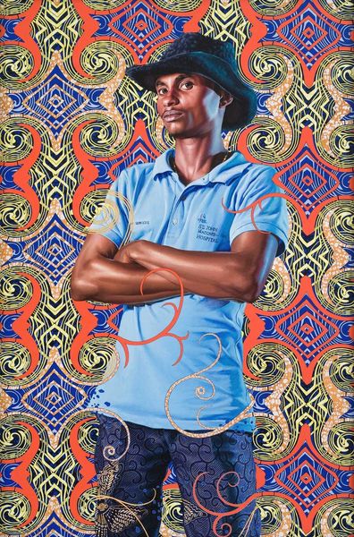
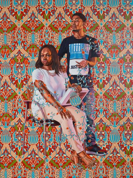
Editor: So, here we have Kehinde Wiley's "Dogon Couple" from 2008, crafted with acrylic paint. What first strikes me is the sheer vibrancy; the background practically leaps off the canvas, creating this intriguing tension with the subjects. The patterns are beautiful, though, very Pop. What’s your take on this? Curator: Vibe, baby, vibe! This piece pulses with a double rhythm. Wiley’s playing a delicious game. Look how the conventional portrait gets ambushed by this tidal wave of pattern. It's almost as if he’s asking, “Can you hold onto your colonial gaze while I throw a party in the background?" Isn't the way those bold, bright patterns threaten to overwhelm the subjects' figures strangely alluring? I mean, traditionally, portraiture seeks to immortalize and elevate, but here, Wiley uses that language to say something totally different, something more...now. Editor: That makes a lot of sense. The subjects themselves, in their everyday clothing, also stand in contrast to traditional portraiture. I was reading it almost as, these guys were chosen by someone else rather than commissioning their portrait in the grand tradition, but using those same visual languages. Curator: Chosen, or perhaps...discovered? Remember that Wiley often street-casts his models, inviting them to select poses from art historical sources. It's a process of collaborative reimagining. And consider the title, "Dogon Couple." The Dogon are an ethnic group in Mali, West Africa, famous for their wooden sculptures. By invoking this connection, is Wiley asking us to consider ideas of representation, origin, and belonging? Are we simply gazing or engaging with this gorgeous surface and powerful presence? What do *we* bring to the table as viewers? Editor: It almost creates a conversation between the classical and the contemporary. Really makes you think. Curator: Precisely. And that, my friend, is when art transcends decoration and becomes truly provocative. It sparks a dialogue not just with itself, but with us. What we *think* and what we *feel*. Editor: So much more to it than I initially realized. It’s easy to just see the colors and move on, but there is such depth here.
Comments
No comments
Be the first to comment and join the conversation on the ultimate creative platform.
More like this