![[inscriptions not by Turner] by Philip James De Loutherbourg](/_next/image?url=https%3A%2F%2Fd2w8kbdekdi1gv.cloudfront.net%2FeyJidWNrZXQiOiAiYXJ0ZXJhLWltYWdlcy1idWNrZXQiLCAia2V5IjogImFydHdvcmtzL2U3M2Y1ODM2LWMwNTMtNGI4Ni1hMTg0LTBjMjQ1NDhlMjI0NC9lNzNmNTgzNi1jMDUzLTRiODYtYTE4NC0wYzI0NTQ4ZTIyNDRfZnVsbC5qcGciLCAiZWRpdHMiOiB7InJlc2l6ZSI6IHsid2lkdGgiOiAxOTIwLCAiaGVpZ2h0IjogMTkyMCwgImZpdCI6ICJpbnNpZGUifX19&w=3840&q=75)
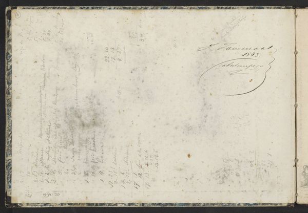
Dimensions: support: 80 x 111 mm
Copyright: CC-BY-NC-ND 4.0 DEED, Photo: Tate
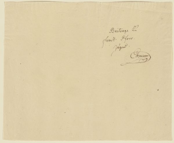
Editor: This tiny piece by Philip James De Loutherbourg, entitled "[inscriptions not by Turner]", is surprisingly quiet. At just 80 x 111 mm, it's like holding a secret. Curator: Indeed. The visual weight is almost entirely in the calligraphy; its elegant flourishes command the composition. Editor: I find myself wondering about the labour involved in crafting these precise inscriptions. Was it a task of meticulous skill or more of a standardized bureaucratic process? Curator: The calligraphic style possesses an undeniable aesthetic quality. Consider the negative space surrounding the marks; it’s as crucial to the artwork’s visual balance as the inscriptions themselves. Editor: Perhaps it’s both. The act of writing, the materiality of ink on paper, holds a certain value regardless of its purpose. Curator: I agree, and the placement of these inscriptions creates a visual tension that is really interesting. Editor: It’s prompted me to consider the role of writing as both art and document, blurring those boundaries. Curator: An astute observation, one that enriches our understanding of the image considerably.
More like this