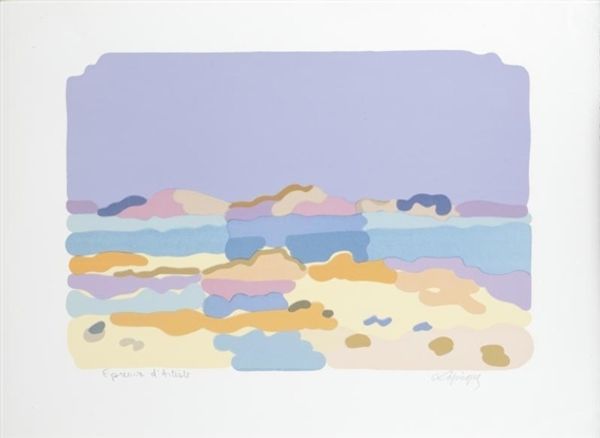
Copyright: Charles Lapicque,Fair Use
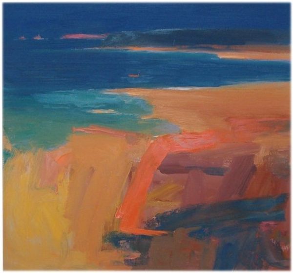
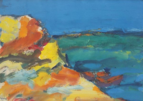
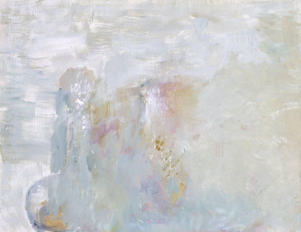
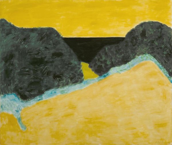
Curator: This "Untitled" oil painting, completed by Charles Lapicque in 1959, immediately gives off an interesting blend of dreaminess and structure. Editor: Yes, the hazy pastel palette certainly contributes to that dreamy feel. It's a landscape, but the land and sky seem almost interchangeable, blurred together in these blocks of colour. The paint appears thickly applied, wouldn’t you agree? Almost troweled onto the canvas. Curator: Absolutely. It’s that very process that defines Lapicque’s approach. Look at how he builds up the landscape with these distinct, almost architectonic strokes of oil paint. It is almost like we're witnessing a constructive act, the formation of an image from its basic materials. Post-Impressionist brushwork at its finest. Editor: The symbolism, even in abstraction, still evokes very powerful feelings of melancholy or solitude, doesn’t it? I'm particularly drawn to the light. Notice how that almost translucent application of white paint seems to create pockets of illumination in the lower half, giving a quiet sacred glow? It also reminds me a bit of a stylized map – where each colour block represents a city, a region. Curator: The map-like quality you perceive is fascinating when we consider Lapicque's engineering background. It wouldn’t surprise me to see parallels between mapping techniques and his art, particularly in organizing spatial relationships through color and form. Think about how the thickness and texture of paint itself adds layers of meaning; it suggests weight, physical presence, perhaps even the density of human experience etched onto the land. Editor: That’s insightful. In some cultures, bodies of water or skies of this specific lilac hue are seen as gateways to spiritual dimensions, thresholds between realities. So, perhaps we are invited to move beyond the literal, the terrestrial… to seek what lies beyond. Curator: The material reality of the paint serves as a counterpoint to this symbolism. It firmly grounds the image, reminding us of the labour involved, of the artist’s physical interaction with his materials. Editor: An apt way to understand Lapicque’s perspective; the meeting place between earthly making and the ethereal beyond. Curator: A dual lens allows for appreciating it with a refreshed understanding of production as well as cultural connections to color, in context.
Comments
No comments
Be the first to comment and join the conversation on the ultimate creative platform.
More like this