drawing, paper, ink, pen
#
portrait
#
drawing
#
neoclacissism
#
ink drawing
#
pen sketch
#
paper
#
ink
#
pen
#
calligraphy
Copyright: Rijks Museum: Open Domain
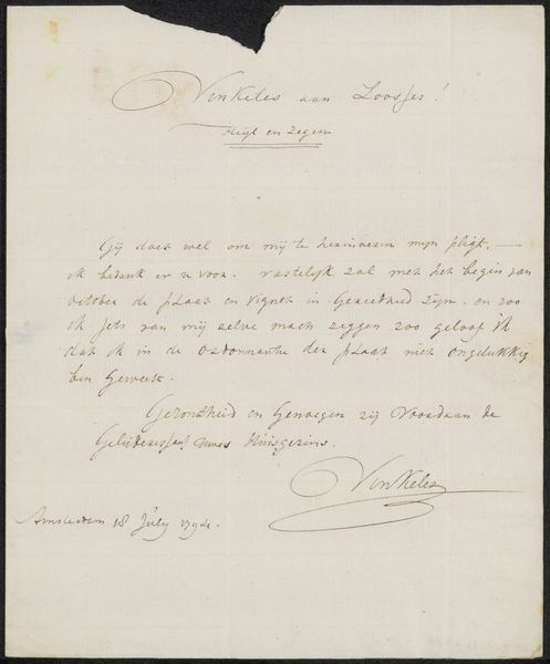
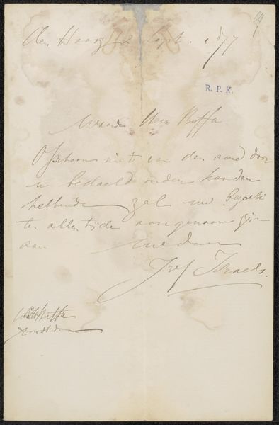
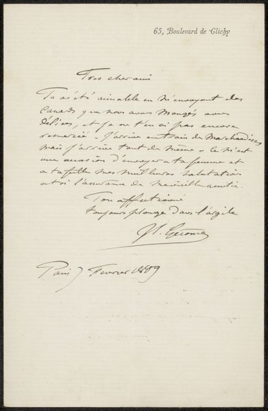
Editor: We're looking at "Brief aan anoniem" by Gerard van Nijmegen, likely from the 1780s. It's an ink and pen drawing on paper. The writing is so stylized. What elements stand out to you from a formal perspective? Curator: The interplay between line and void is immediately striking. Note the delicate, almost ornamental quality of the script itself. Observe how the calligraphic flourishes don't just convey linguistic information, but actively sculpt the overall composition. Editor: So, it’s less about what the letter *says* and more about how it *looks*? Curator: Precisely. Consider the directionality established by the strokes. The curvilinear forms generate a dynamic tension across the rectangular plane of the paper. How does that contribute to its aesthetic impact? Editor: I suppose it creates a visual rhythm, guiding your eye through the work. Like musical notes, each character contributes to the whole composition. What does the placement of the script contribute to the message being sent? Curator: Note the upper register containing oversized loops, and the deliberate placement of the signature at the bottom right, anchored by a sweeping flourish. Does this placement indicate an artistic gesture rather than a solely functional arrangement? Editor: Interesting! So, even a functional piece like a letter becomes a study of form and balance. Thanks. Curator: Indeed. Examining these qualities invites a deeper appreciation beyond the simple transmission of textual content.
Comments
No comments
Be the first to comment and join the conversation on the ultimate creative platform.
More like this