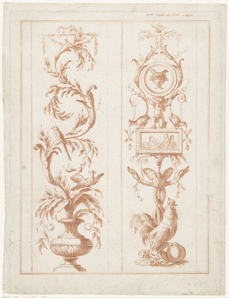
drawing, ink, pen
#
drawing
#
comic strip sketch
#
light pencil work
#
baroque
#
pen sketch
#
cartoon sketch
#
figuration
#
personal sketchbook
#
ink
#
ink drawing experimentation
#
pen-ink sketch
#
sketchbook drawing
#
pen
#
genre-painting
#
storyboard and sketchbook work
#
sketchbook art
#
calligraphy
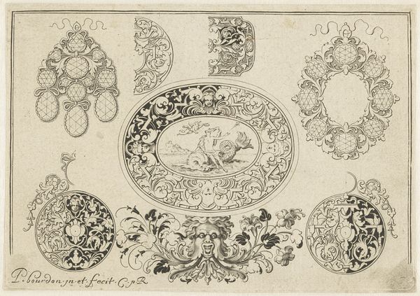
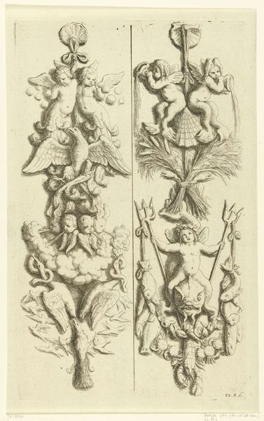
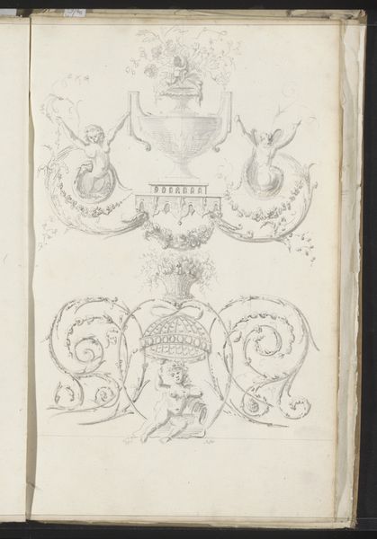
Dimensions: height 411 mm, width 328 mm
Copyright: Rijks Museum: Open Domain
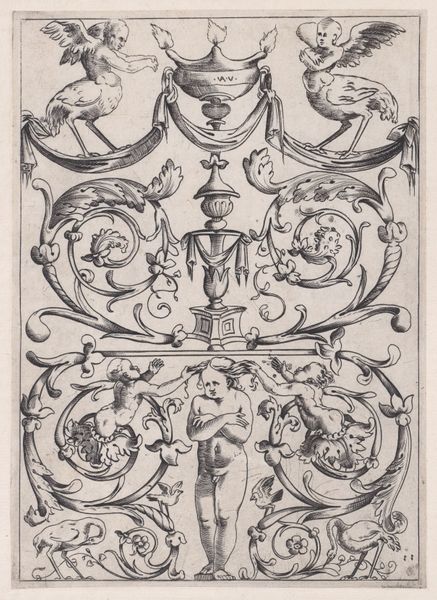
Curator: Welcome to the Rijksmuseum. Today, we’ll be discussing a drawing titled "Kalligrafie met duellerende mannen en putti", which translates to Calligraphy with Duelling Men and Putti. It's by an anonymous artist and dates roughly from 1675 to 1700. What are your initial thoughts? Editor: Whimsical and lighthearted! The figures seem to float on the page, created by a playful hand. The stark contrast of the pen strokes on the paper accentuates its fantastical and sketch-like qualities. Curator: Precisely! The anonymous artist utilizes ink and pen to create a visually engaging composition across four distinct sections. The calligraphic lines are fascinating; they construct figures from fluid swirls. The men engaged in a duel in the bottom panel, for example, possess a sort of cartoonish dynamism. The use of looping lines almost obscures what we would normally understand as human form. Editor: The emphasis on the medium—ink on paper—foregrounds the material process. I’m wondering about the role of the artist: was this perhaps a preparatory sketch or an artist experimenting with the very limits of their tools, embracing what the materials offered? Were the fluid pen strokes a display of technical skill, and the medium's limitations an inspiration? The sketch embodies this exploration of material constraints. Curator: Interesting questions. The placement of the putti above, combined with animals, introduce a sense of allegory or symbolic meaning. This juxtaposition contributes to the artwork’s distinctive structure. Consider, too, the composition as a series of vignettes, each contained within its own frame, suggesting a narrative. The linear quality of the artwork almost flattens space. Editor: Yes, the notion of space here seems secondary to the sheer materiality of the line itself. It almost dissolves form instead of defining it! I am curious how the artist was experimenting with conventions, pushing against, say, the tradition of Baroque painting by instead focusing on a stripped-down artistic approach. It’s also compelling to wonder how the artist’s social status affected their practice. Was this a personal piece, free from the pressures of commission and patronage? Curator: That provides food for thought. Ultimately, "Kalligrafie met duellerende mannen en putti" challenges our expectations. It offers us a unique glimpse into the Baroque period while questioning the function of drawing itself. Editor: Agreed. Its stark simplicity makes it memorable—a striking statement through careful experimentation with pen and ink.
Comments
No comments
Be the first to comment and join the conversation on the ultimate creative platform.
More like this