print, paper, photography, ink
editorial cover design
portrait
script typeface
aged paper
still-life-photography
editorial typography
paper
photography
ink
magazine mockup
stylized text
thick font
publication mockup
classical type
publication design
Dimensions: height 140 mm, width 98 mm
Copyright: Rijks Museum: Open Domain
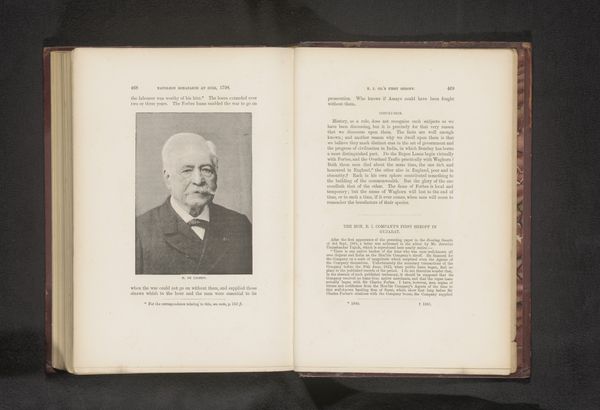
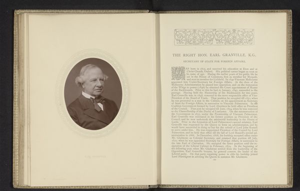
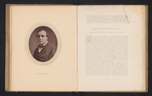
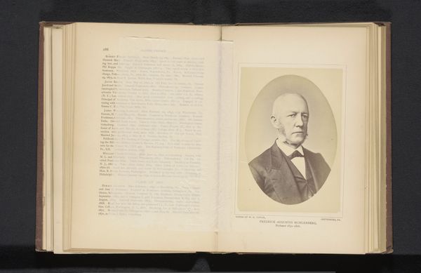
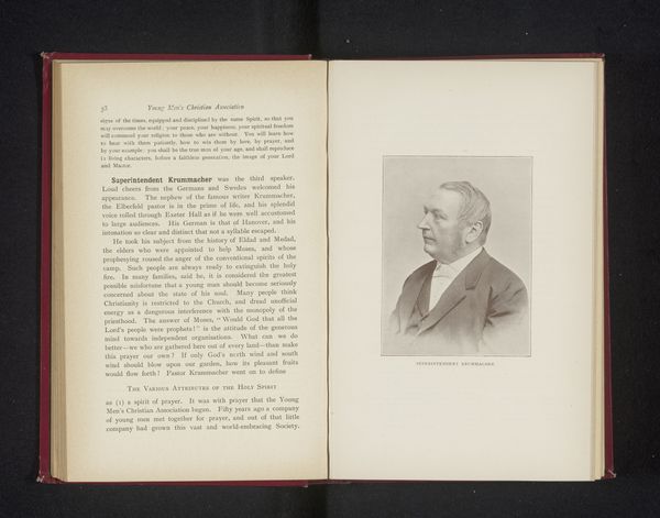
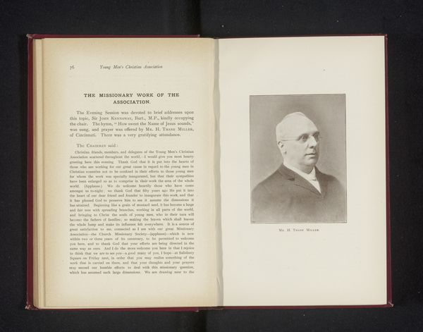
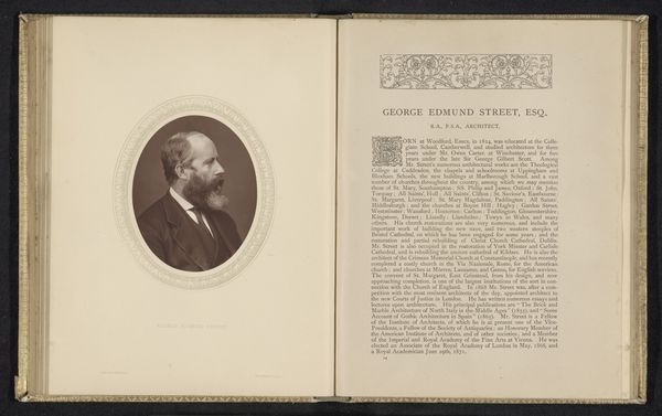
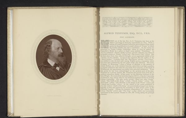
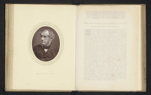
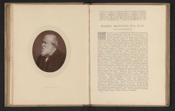
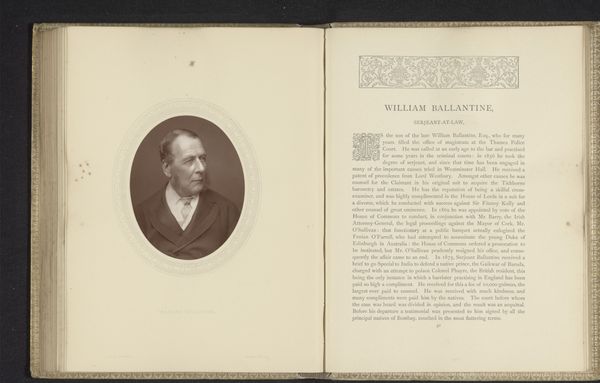
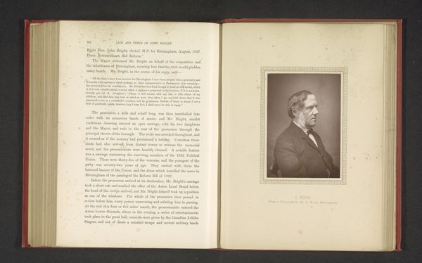
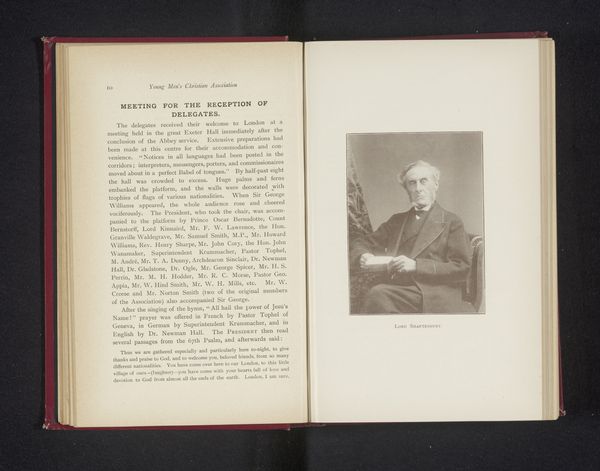
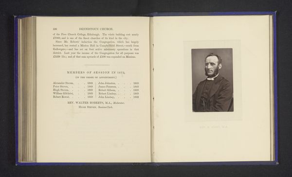
Curator: Look, isn't this striking? The layout of "Dr. Harold Schofield," likely from before 1888 and attributed to Byrne & Co., is just so deliberate. It looks like a memorial publication of some sort, filled with stylized text and photographs, all on this beautifully aged paper. What do you think? Editor: Immediately, the script typeface evokes a sense of solemnity and historical weight. The image of Dr. Schofield looks rather imposing and a bit forlorn amidst all this antiquated typography. Curator: Indeed. Aged paper and ink carry the patina of cultural memory here. Each element points to someone of renown; perhaps someone deeply committed to spreading a moral message in their time, someone worth commemorating through an elaborate magazine cover like this one. The portrait's strong lighting also accentuates this memorial tone. Editor: The text arrangement almost borders on devotional. "A Beloved Physician," it reads. How did he navigate the role of medicine and spirituality in society? His identity as a doctor appears almost inextricable from a spiritual calling. I wonder how gender, race, or class played into his practices and beliefs at the time. Curator: Absolutely. Notice, as well, the script on the other page - "Memorials of H. Harold R. Schofield, M.A., M.D., First Medical Missionary to Shansi, North China." What can we tell from his mission? How did that role situate him in broader imperial narratives? This makes us think of his impact, positive or negative, from a current view. Editor: These layered roles are precisely where critical inquiry becomes important, right? Was he actively resisting the social and medical establishment? The image evokes a sense of authority, yet also invites us to deconstruct the narratives perpetuated through stylized, historical portrayals of 'great men.' The magazine mockup invites us to rethink. Curator: The enduring nature of these symbolic texts— the stylized letters and classical type—speak volumes. A potent blend of visual communication and historical narrative. Editor: Exactly. Hopefully these memorial images prompt contemporary audiences to dig deeper, beyond the surface aesthetics, to unravel the legacies these individuals and practices represent.
Comments
No comments
Be the first to comment and join the conversation on the ultimate creative platform.
