drawing, paper, ink, pen
#
portrait
#
drawing
#
paper
#
ink
#
pen
#
calligraphy
Copyright: Rijks Museum: Open Domain
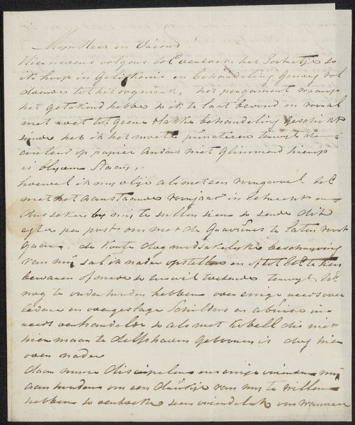
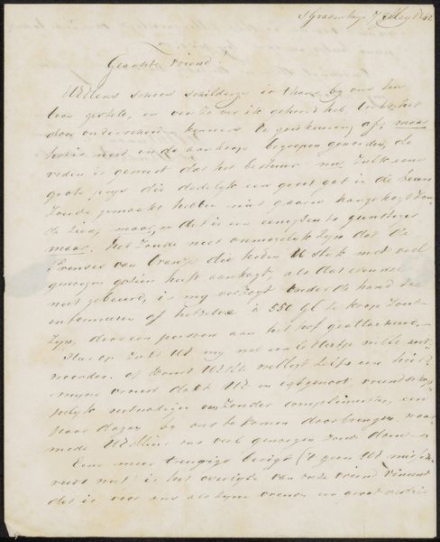
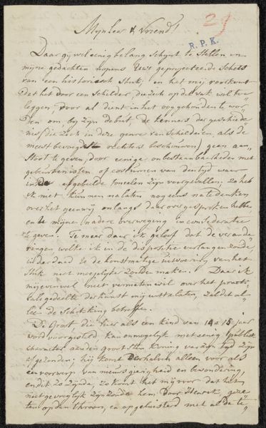
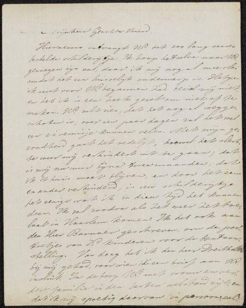
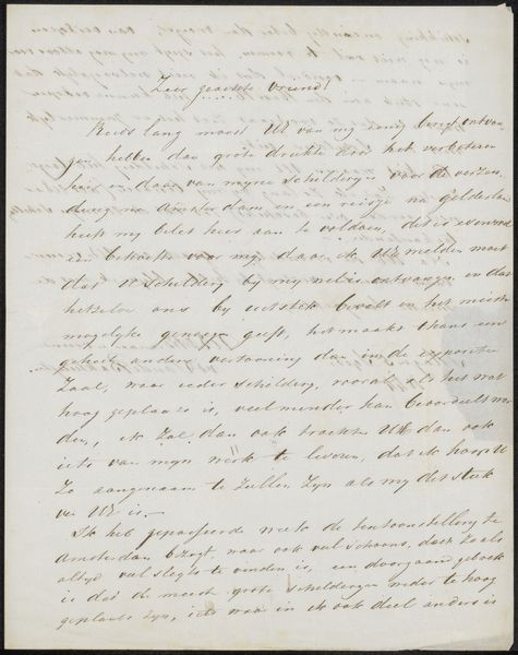
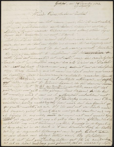
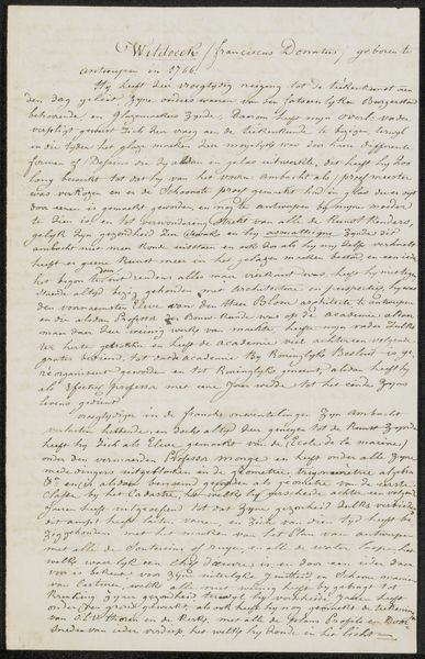
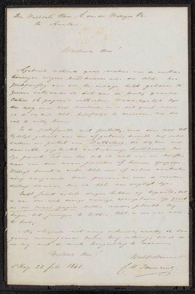
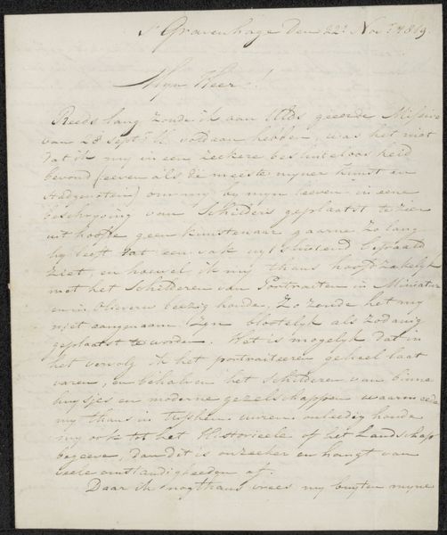
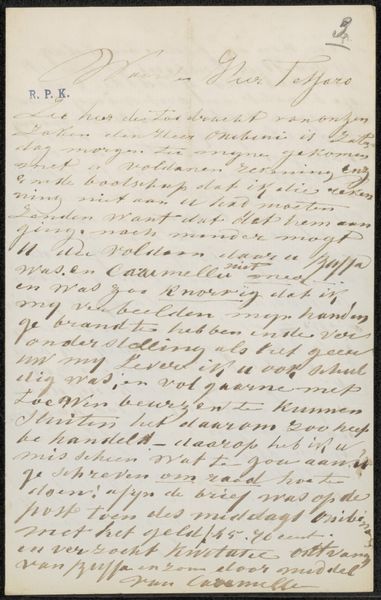
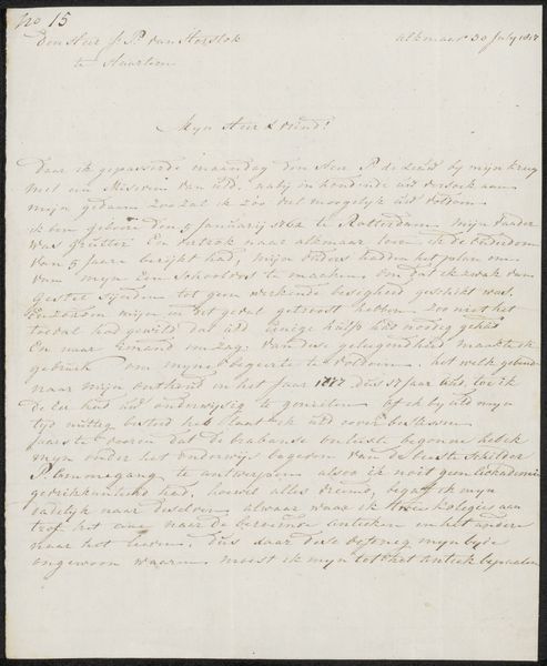
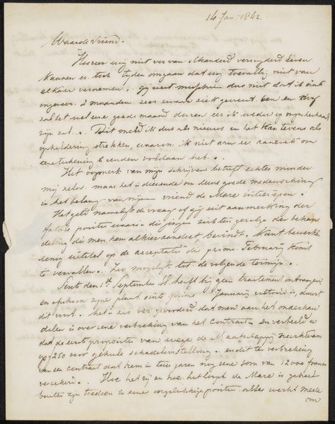
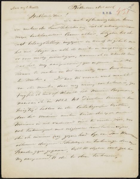
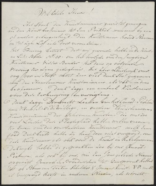
Curator: What an interesting selection! "Brief aan onbekend," or "Letter to an Unknown" by Adriaan Bemme, likely dating between 1763 and 1806. A pen and ink drawing on paper, housed at the Rijksmuseum. Editor: Yes, I found it quite intriguing. The sheer density of the text is mesmerizing, creating an almost abstract visual texture. How would you approach an analysis of a piece like this? Curator: Well, discarding for now what it communicates, let us instead examine the letter's very architecture. Notice the consistent slant of the script, the nearly uniform weight of the lines forming the letters. This deliberate hand creates a unified visual field. The eye is guided across the surface not by narrative but by rhythm and pattern. Editor: I see what you mean. So you’re saying the aesthetic value lies not in the content but in the visual consistency of the writing itself? Curator: Precisely! The act of inscription becomes a form of mark-making, transforming language into an abstract composition. Even the numbering in the upper corner can be interpreted as an element within the design, contributing to the overall visual framework. Editor: That's a totally different way to consider a written document as artwork. I hadn't thought about deconstructing it that way. Curator: What would be particularly interesting to consider would be what this emphasis on calligraphic performance suggests about contemporary aesthetic priorities, its status as document, gesture, or form. Editor: It changes the experience when looking at it from afar and up close. I think it invites an active viewer to come to new perspectives about something we consider fixed. Curator: Exactly. Shifting away from merely reading text into the realm of interpreting graphic presentation allows us fresh perspectives to appreciate this piece's construction as a thing in itself.
Comments
No comments
Be the first to comment and join the conversation on the ultimate creative platform.
