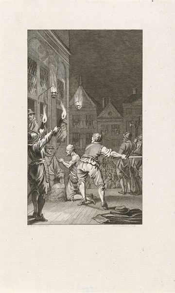
drawing, pen
#
drawing
#
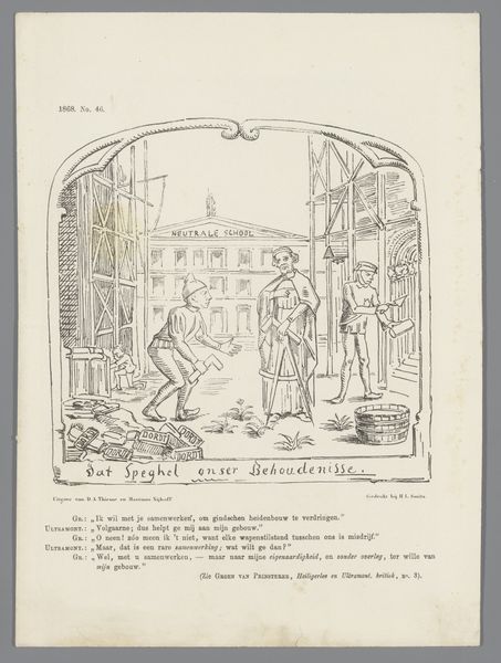
caricature
#
pen
#
cityscape
Dimensions: height 275 mm, width 215 mm
Copyright: Rijks Museum: Open Domain
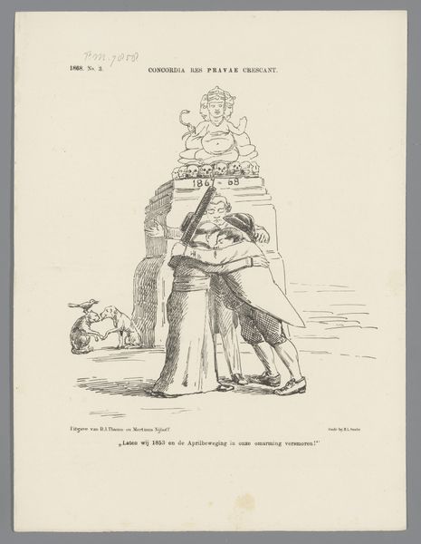
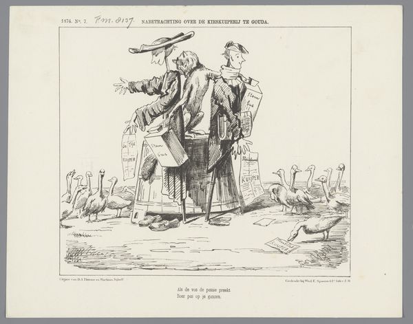
Curator: Let's analyze this pen drawing from 1867, "Spotprent over de persvrijheid in Nederland, 1867" by Johan Michaël Schmidt Crans. What are your initial observations? Editor: Well, at first glance, the figures appear almost comical, a bit exaggerated, standing in front of what seems to be a fairly detailed rendering of a cityscape. What’s striking is the contrast between their informal, caricatured poses and the architectural backdrop. How do you interpret the composition? Curator: Indeed. Focus first on the stark line work. The artist has used the pen to create sharp contrasts and textures, highlighting the contours of the figures against the more elaborate detail of the architecture. Consider the strategic placement of the figures relative to the lines of the buildings, creating a certain tension. Notice also that the lines defining the architecture are less assertive. Do you agree? Editor: I do agree about the varying linework weights; what significance do you see in this deliberate contrast in line quality? Curator: It serves, formally, to draw your attention to the figures themselves and the narrative suggested in their stances and gestures. Their interaction is the primary subject of the composition, relegating the built environment to mere background. Without this line emphasis the primary narrative of the piece is diminished. Editor: I see your point. By prioritizing line strength around the figures, the artist directs our focus to their interaction and story. It really brings a sharper understanding of their relevance. Curator: Exactly. A detailed consideration of line reveals the artwork's thematic core. Editor: Thank you for pointing that out. I see how the formal elements contribute directly to understanding its purpose as a social critique.
Comments
No comments
Be the first to comment and join the conversation on the ultimate creative platform.
More like this