Dimensions: height 160 mm, width 102 mm
Copyright: Rijks Museum: Open Domain
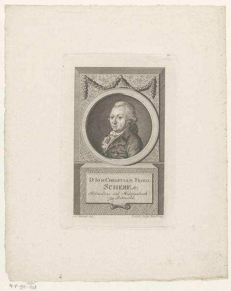
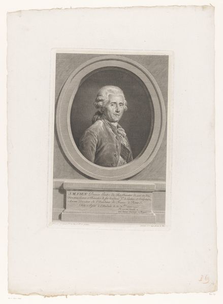
Editor: This is "Portret van Franz Rudolph von Grossing," a print, likely an engraving, from between 1764 and 1804 by Peter Haas. It’s quite formal. What really strikes me is the way he’s framed, almost like a cameo. What do you see in this piece? Curator: The oval frame itself speaks volumes. The oval, you see, represents containment, a controlled world. But within, there’s Franz Rudolph. Notice how the gaze confronts us. It asks a question. The very font, a formal script, also reflects authority, permanence. It imprints identity onto the viewer’s memory. Editor: So it's not just about likeness, but about projecting an image. Is there something symbolic in the text below the portrait? Curator: Absolutely! The text, "Franciscus Rudolphus a Grossing," along with "M. Theresinae quondam Imperatrici," and the birthdate, anchors the sitter in time, connecting him to Maria Theresa. What do these details say about how he wished to be remembered? Editor: That he was somebody important! Linked to the Empress, to history itself! Curator: Precisely! Think of heraldry, the symbols used to convey lineage. This portrait uses typography and framing in a similar way. It's visual branding. And remember, Baroque loved grandeur, but also emotional intensity, think of Bernini's sculptures. How does the sitter project strength and status in the composition? Editor: The way he fills the frame. It's carefully calculated, that's for sure. Curator: Indeed! Each element reinforces a narrative of power and pedigree. What began as a simple portrait suddenly reveals layers of meaning beneath the surface! Editor: It definitely makes you consider how every element in a portrait, down to the font used, conveys information and shapes our perception of the subject. Thank you!
Comments
No comments
Be the first to comment and join the conversation on the ultimate creative platform.
More like this