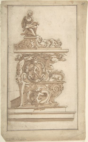
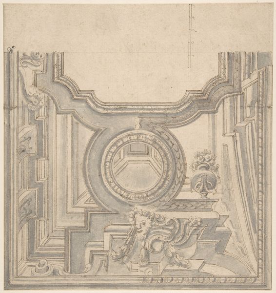
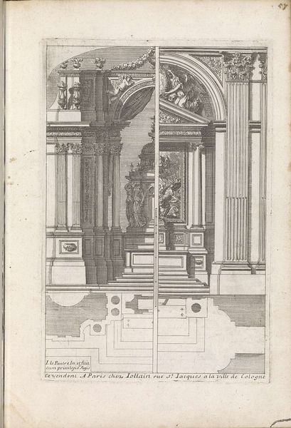
drawing, print, paper, ink, engraving, architecture
#
drawing
# print
#
old engraving style
#
figuration
#
paper
#
11_renaissance
#
ink
#
geometric
#
academic-art
#
engraving
#
architecture
Dimensions: height 276 mm, width 180 mm
Copyright: Rijks Museum: Open Domain
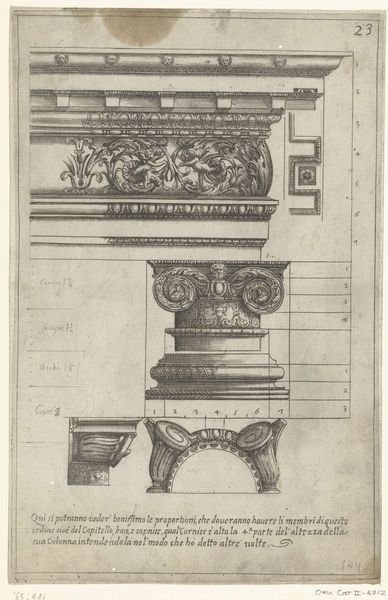
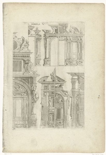
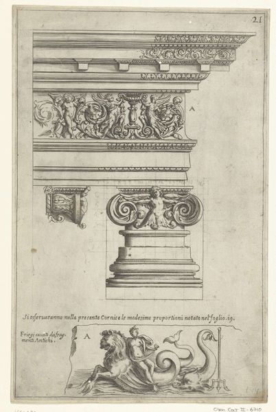
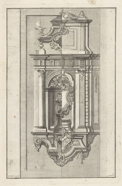
Curator: Right, let’s delve into this fascinating 17th-century print, “Fries en vier hoofdgestellen,” from 1636, etched in ink on paper. It's currently held at the Rijksmuseum and it's attributed to an Anonymous artist. Editor: It feels so precise and technical at first glance, almost clinical. Like an architect's fever dream meticulously rendered. There's an inherent tension between the organic sculptural elements and the rigid architectural layout. Curator: Absolutely, it’s a wonderful blend of art and architectural blueprint. Notice the series of friezes and capitals – the "vier hoofdgestellen," or four headpieces. Each section showcases different decorative elements. Editor: My eyes are immediately drawn to the fantastical creature up top - the hybrid griffin and cherub combo feels almost surreal set against those meticulous geometric lines below. What symbolic weight do those motifs carry, you think? Curator: Griffins often symbolize strength and vigilance, while cherubs represent divine love and innocence. Putting them together…perhaps the intention here is to portray idealized virtues applied to the foundation and structure of a building or maybe an institution. They represent desirable features such as strength and innocence that it should embody. Editor: That connection is fascinating! The cultural memory woven into these architectural details is astounding, how each symbol echoes centuries of beliefs and artistic practices. It shows such complexity despite being black and white! The line work, the details - how each stroke is like a meditation. Curator: Precisely! And the text beneath adds another layer – likely annotations, or instructions relating to construction. The purpose could have been for architectural education, demonstrating different stylistic options to builders and designers of the period. Editor: This wasn't just art for art's sake; it was meant to inform, to educate, and to inspire craftsmanship. These kinds of engravings offered visual vocabulary which shaped the look and feel of its contemporary surroundings. The artwork continues to speak to that interplay between art and its cultural impact. Curator: Indeed, and I suppose it continues to provide interesting information about artistic conventions for many centuries to come, too! Editor: An important demonstration that function and beauty need not be strangers!
Comments
No comments
Be the first to comment and join the conversation on the ultimate creative platform.
More like this