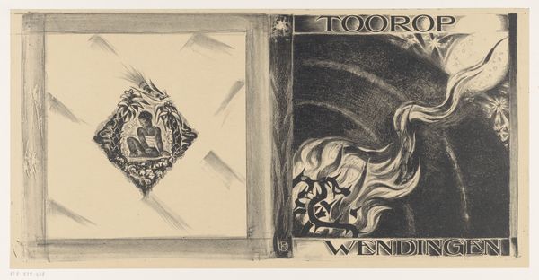
drawing, graphic-art, ink
#
drawing
#
graphic-art
#
ink
#
line
#
symbolism
Dimensions: height 480 mm, width 645 mm
Copyright: Rijks Museum: Open Domain
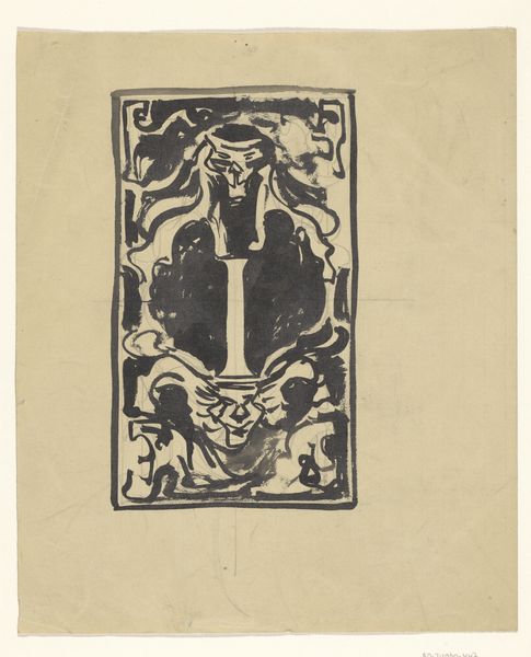
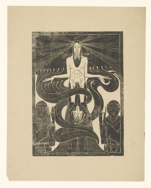
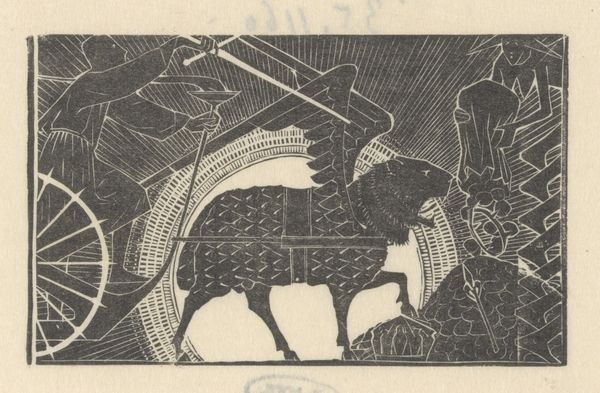
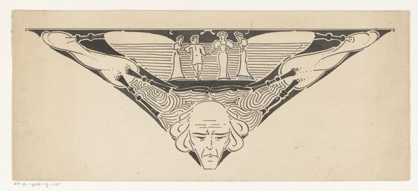
Editor: This is Richard Nicolaüs Roland Holst's cover design for "Wendingen, Maskernummer" from 1920, done with ink. The juxtaposition of the somber mask with teardrop shapes above the theatrical masks strikes me as quite dramatic, and there’s a kind of weight to the image overall. How do you interpret this work? Curator: It's powerful, isn’t it? Considering this was designed shortly after the First World War, these masks take on added layers of meaning. Masks, of course, have historically been used across many cultures, concealing and revealing different aspects of identity. How do you see this playing out here? Editor: I guess, the two masks below could represent the personas that we adopt, especially within performative spaces like theatre, while the darker mask on top seems more…internal, maybe representing hidden emotions or social anxieties? Curator: Precisely. Holst was deeply engaged with social issues, and "Wendingen" itself was a journal known for its progressive perspectives. What do you make of the contrast between the 'high' art represented by the stage and the raw emotion of the upper mask? Editor: It's almost like the elite world of theatre can't contain or truly represent the suffering that existed outside of it. A critique of art's escapism? Curator: Exactly. And consider, too, the symbolic language – the tears, the stars and moon, the abstract patterns. They evoke a sense of searching, of grappling with deeper truths beyond the surface. The drawing isn’t merely decorative, but a potent commentary on society and self. Editor: I hadn't thought of it in such socially conscious terms. This makes me look at it completely differently! Thank you. Curator: Art history is so exciting because it’s constantly in dialogue with the present.
Comments
No comments
Be the first to comment and join the conversation on the ultimate creative platform.
More like this