About this artwork
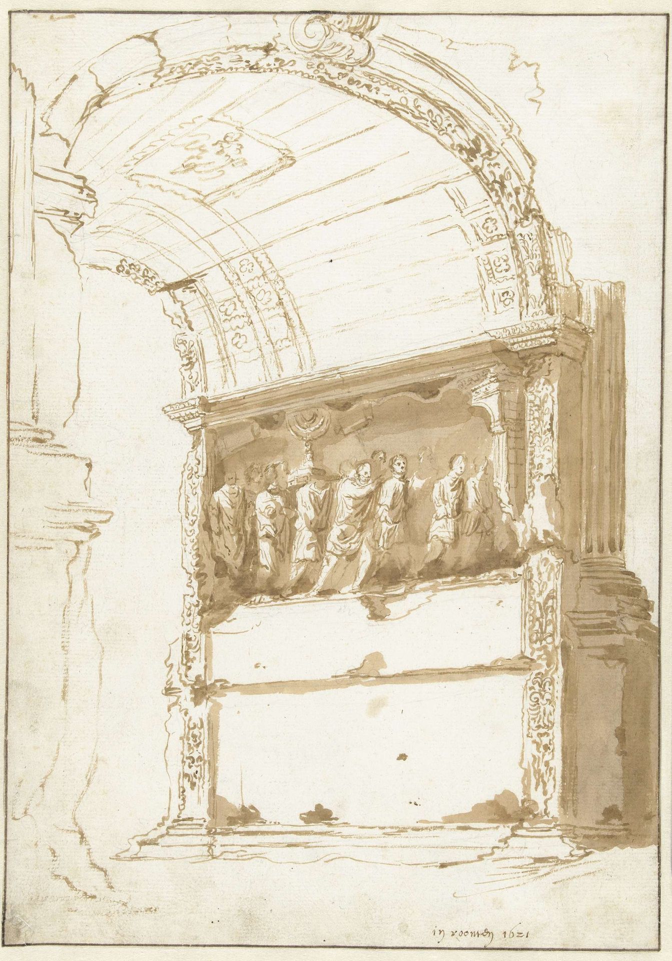
Editor: This pen and ink drawing, "De boog van Titus," was created in 1621 by Cornelis van Poelenburch and is currently held at the Rijksmuseum. It feels so delicate, yet imposing because of its subject. What catches your eye when you look at this artwork? Curator: For me, it’s the materiality of the piece itself. We're seeing an architectural monument rendered in the readily available and portable media of pen, ink, and paper. Consider the contrast between the monument, which signifies Roman imperial power, and the accessibility of these materials. This tension opens up the conversation to broader consumption: how did this drawing function within the market? Was it intended for scholarly study, artistic inspiration, or perhaps even a souvenir for travelers unable to visit the original? Editor: That’s a very interesting angle. I hadn’t considered the practical implications of using such common materials to depict such an important monument. It makes you think about who this artwork was actually *for*. Curator: Exactly! And consider the labour involved. Poelenburch would have spent considerable time on site, observing, sketching, and then translating that into this drawing. The lines, the shading…it speaks to a skilled hand at work, but also to the socio-economic status of the artist within the art market of his time. Were there workshop assistants involved in replicating copies, therefore creating a 'product' to be purchased, bartered or gifted? Editor: So, instead of just seeing the arch as a symbol of Roman triumph, we’re looking at it as a commodity, transformed and disseminated through the very act of its representation? Curator: Precisely. It shifts the focus from the idealized past to the tangible realities of artistic production and consumption in the 17th century. How the physical qualities of the materials, such as the ink, would've affected his final image, and subsequently the way this image was purchased, also becomes interesting when thinking in this light. Editor: I never considered that materials and economic contexts can influence and add to the symbolism of the artwork, besides the historical context. I'll keep that in mind. Curator: Indeed! Approaching it from a materialist perspective allows us a far richer understanding.
Artwork details
- Medium
- drawing, paper, ink, pen, architecture
- Dimensions
- height 326 mm, width 229 mm
- Location
- Rijksmuseum
- Copyright
- Rijks Museum: Open Domain
Tags
Comments
Share your thoughts
About this artwork
Editor: This pen and ink drawing, "De boog van Titus," was created in 1621 by Cornelis van Poelenburch and is currently held at the Rijksmuseum. It feels so delicate, yet imposing because of its subject. What catches your eye when you look at this artwork? Curator: For me, it’s the materiality of the piece itself. We're seeing an architectural monument rendered in the readily available and portable media of pen, ink, and paper. Consider the contrast between the monument, which signifies Roman imperial power, and the accessibility of these materials. This tension opens up the conversation to broader consumption: how did this drawing function within the market? Was it intended for scholarly study, artistic inspiration, or perhaps even a souvenir for travelers unable to visit the original? Editor: That’s a very interesting angle. I hadn’t considered the practical implications of using such common materials to depict such an important monument. It makes you think about who this artwork was actually *for*. Curator: Exactly! And consider the labour involved. Poelenburch would have spent considerable time on site, observing, sketching, and then translating that into this drawing. The lines, the shading…it speaks to a skilled hand at work, but also to the socio-economic status of the artist within the art market of his time. Were there workshop assistants involved in replicating copies, therefore creating a 'product' to be purchased, bartered or gifted? Editor: So, instead of just seeing the arch as a symbol of Roman triumph, we’re looking at it as a commodity, transformed and disseminated through the very act of its representation? Curator: Precisely. It shifts the focus from the idealized past to the tangible realities of artistic production and consumption in the 17th century. How the physical qualities of the materials, such as the ink, would've affected his final image, and subsequently the way this image was purchased, also becomes interesting when thinking in this light. Editor: I never considered that materials and economic contexts can influence and add to the symbolism of the artwork, besides the historical context. I'll keep that in mind. Curator: Indeed! Approaching it from a materialist perspective allows us a far richer understanding.
Comments
Share your thoughts