drawing, paper, ink, pen
#
portrait
#
drawing
#
comic strip sketch
#
hand-lettering
#
hand drawn type
#
hand lettering
#
paper
#
personal sketchbook
#
ink
#
hand-drawn typeface
#
pen-ink sketch
#
pen work
#
sketchbook drawing
#
pen
#
sketchbook art
Copyright: Rijks Museum: Open Domain
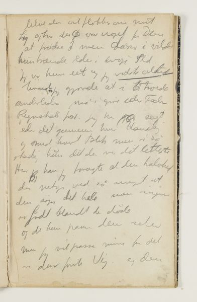
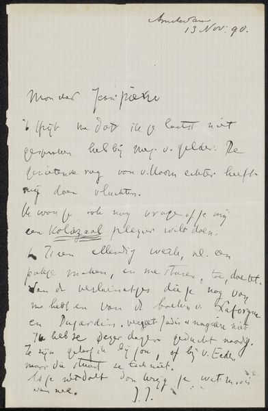
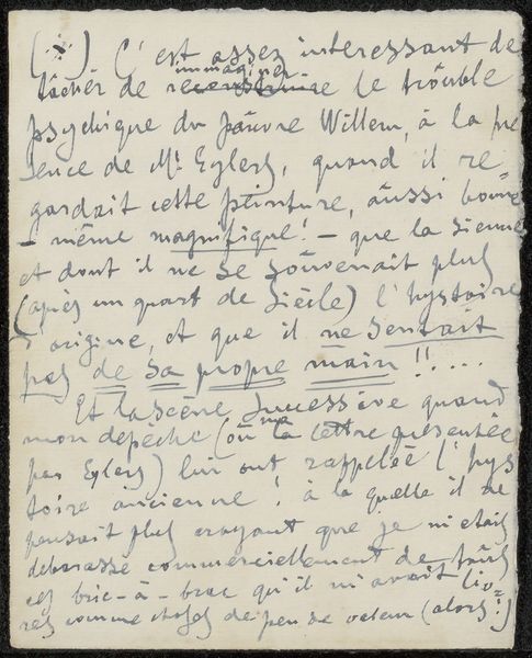
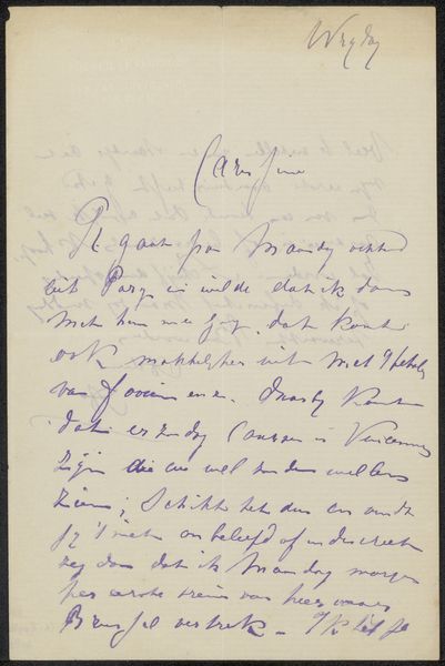
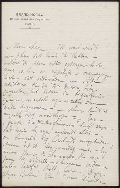
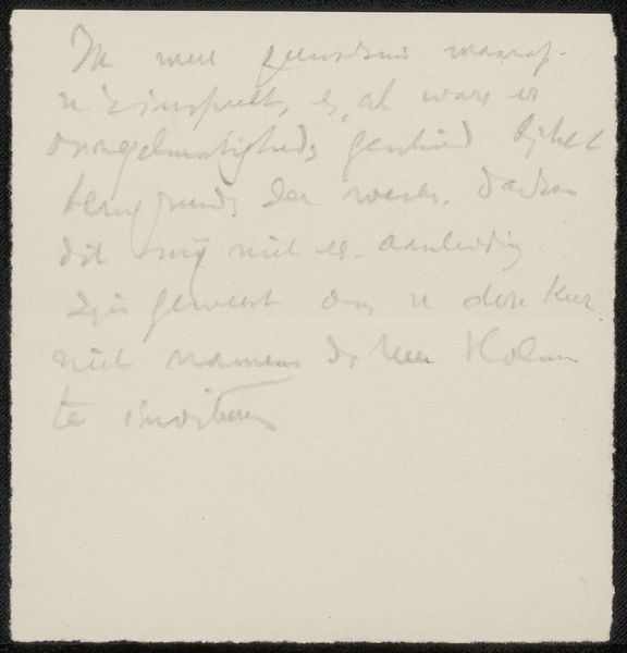
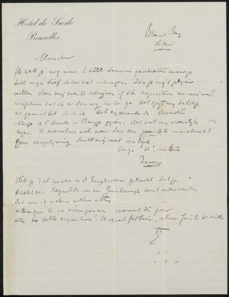
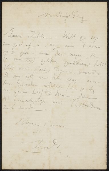
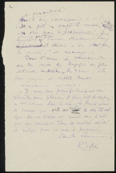
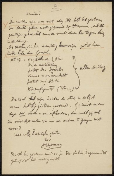
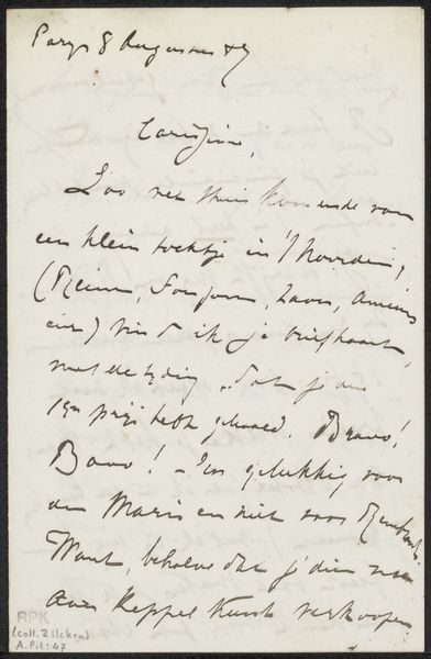
Curator: Welcome. We are now looking at "Brief aan Philip Zilcken" by Vittore Grubicy, likely created between 1920 and 1929. It’s an ink and pen drawing on paper. Editor: Immediately, there's this wonderful sense of intimacy. The cursive is like a little dance across the page. You almost don’t need to understand French to get the feeling of a personal note. Curator: The artist's choice to work directly with ink on paper signals a degree of spontaneity. There’s very little opportunity for correction, and the hand-lettering style gives us insights into the artist’s deliberate aesthetic decisions. The texture of the paper itself, though subtly visible, serves as an important ground for the contrasting ink. Editor: You're right, the line quality has that unrepeatable energy of a direct thought made visible. I can almost see him pausing, pen in hand, considering his next phrase to Philip. There’s a certain weight in the way some of the strokes thicken—a real character. It even looks like there may have been some moisture on the page at some point. Curator: I see it too. Note how the formal elements coalesce to form a unified visual statement. The lines vary, providing dynamic contrast that holds our eye, guiding us through the composition despite it being almost purely text. Editor: Exactly! The formal composition has an impact on its semiotic elements; like handwriting analysis, but applied to art. What story does it tell beyond the literal meaning of the words, do you think? I find myself wondering what Zilcken must have felt upon receiving such a candid message. Was this typical correspondence or something more? Curator: It would necessitate further investigation into the biographical context to fully decode the nature of their relationship. However, given Grubicy’s diverse oeuvre and the medium, it may signal the kind of free association employed as a stylistic form to externalize intimate ideas during that period. Editor: Absolutely, like peering into someone's private thoughts. You know, just looking at this, I feel encouraged to sit down and write a letter, or perhaps create something new. Thanks for your insight! Curator: My pleasure. The interplay between Grubicy’s choice of style and material truly encapsulate his artistic talent.
Comments
No comments
Be the first to comment and join the conversation on the ultimate creative platform.
More like this