Copyright: CC0 1.0
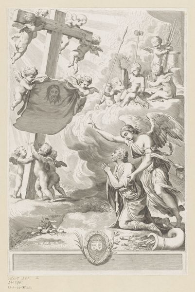
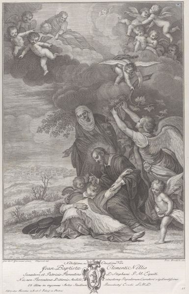
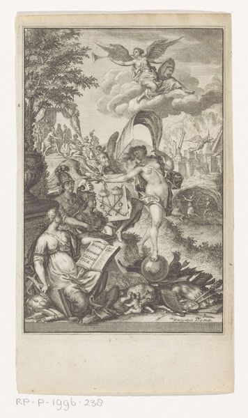
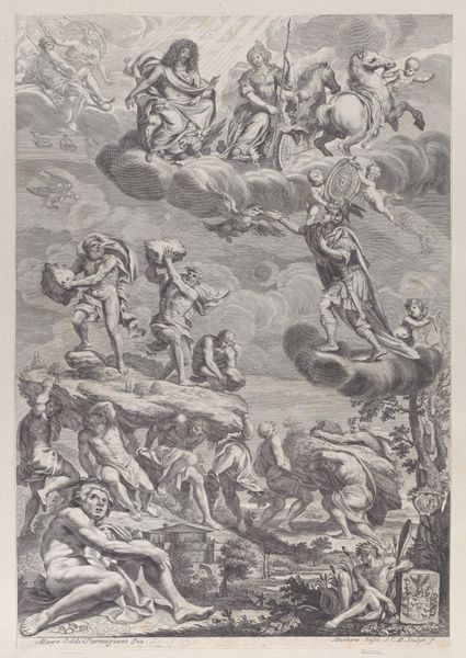
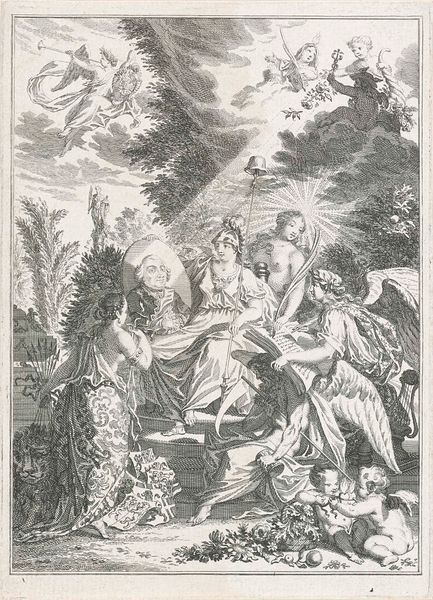
Editor: So this is Claude Mellan's title page for "The Imitation of Jesus Christ." It feels ethereal, almost like a dream. With all the cherubs, what's your take on how Mellan constructed this image? Curator: It's interesting to consider the physical labor involved in creating this print. Mellan's technique—using only parallel lines to create shading and form—speaks to a very specific mode of production and his mastery of the tools. The image also promotes the product being sold, namely the book. How does the typography used enhance this aspect of consumption? Editor: The typography at the bottom definitely gives it a formal, official feel, almost like an endorsement. It makes me think about the intended audience and their social status. Curator: Precisely! And what does it say about the relationship between religious devotion and material culture at that time? Editor: It suggests a complex interplay, where spirituality is not separate from commerce and production. Thanks, that's really helpful! Curator: Indeed, understanding the materiality helps us appreciate the full meaning.
Comments
No comments
Be the first to comment and join the conversation on the ultimate creative platform.