print, textile, photography
#
aged paper
#
script typography
#
paperlike
# print
#
landscape
#
textile
#
photography
#
hand-drawn typeface
#
thick font
#
white font
#
history-painting
#
handwritten font
#
classical type
#
thin font
#
historical font
Dimensions: height 64 mm, width 126 mm
Copyright: Rijks Museum: Open Domain
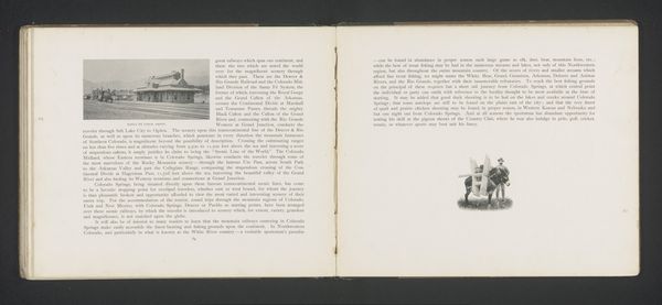
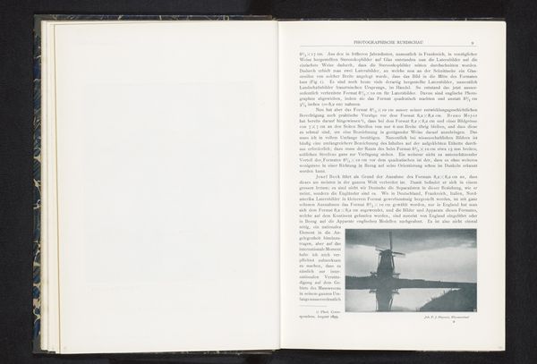
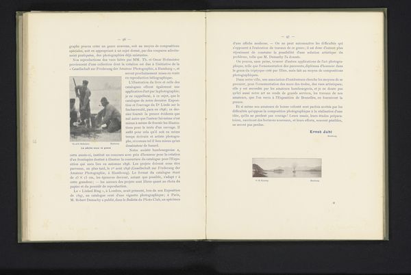
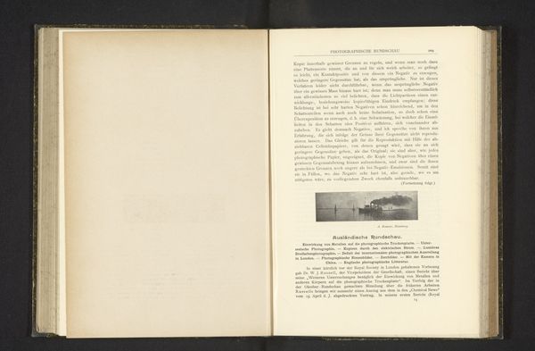
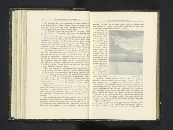
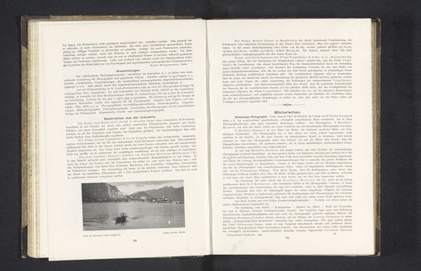
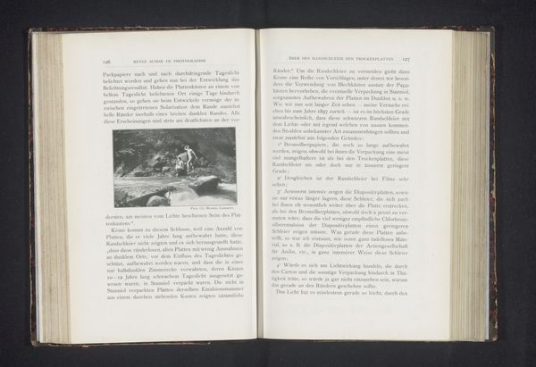
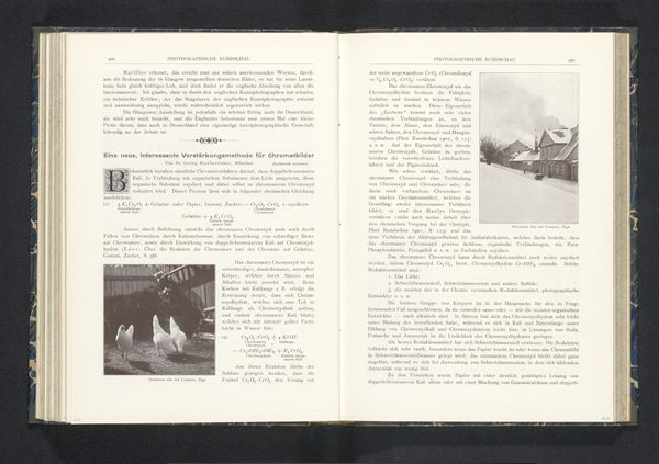
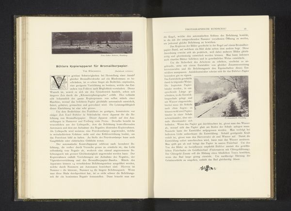
Curator: Here we have what appears to be a page from an old promotional booklet. It's entitled, "How to Reach Colorado Springs," and features a photographic print of the Rio Grande train station from before 1893. Editor: My immediate impression is of a quiet, well-ordered scene. The monochrome palette and aged paper lend it a nostalgic, almost romantic air. The composition, with the station centered, feels very deliberate, very balanced. Curator: Indeed, the balanced composition reinforces the sense of order you mention. It's a classic example of how railroads were marketed during that era. The photograph is clean, crisp, seemingly designed to convey reliability and progress. It certainly evokes a sense of the burgeoning American West. Editor: What strikes me is the typography; that rather florid, hand-drawn typeface used for the title. It clashes a bit with the practical intent, almost trying too hard to make rail travel seem… adventurous? There is tension between text and image here. Curator: That tension, as you call it, is very telling. On the one hand, there's the efficient, modern marvel of the train, but on the other, there's the need to dress it up with an appeal to the sensibilities of the time. Railroad companies of the period acted much like PR agencies hoping to both embody and curate impressions of progress. Editor: I find myself wondering about the station’s physical structure, the design elements of the building itself. It is certainly simple in shape, but appears a more solid and comforting arrival location amidst potentially uncertain circumstances. It almost says that although it seems modern with railway and text on the page, these details reflect deep stability, and perhaps some measure of grandeur. Curator: Precisely! Consider the intended audience: potential travelers who needed reassurance about safety and accessibility. A promotional piece like this needed to overcome anxieties and paint an image of travel as a reliable and desirable experience for settling families. Editor: The entire document becomes an interesting window into the era’s anxieties and aspirations. We can now interpret the aesthetic as communicating very directly on the possibilities for anyone moving West. I hadn’t initially considered the level of directed consideration behind even what font was chosen to welcome me in Colorado. Curator: Yes, a closer look can reveal the intersection between art, commerce, and cultural messaging—an exercise that makes experiencing such an historical document still vital today.
Comments
No comments
Be the first to comment and join the conversation on the ultimate creative platform.
