Dimensions: height 244 mm, width 356 mm
Copyright: Rijks Museum: Open Domain
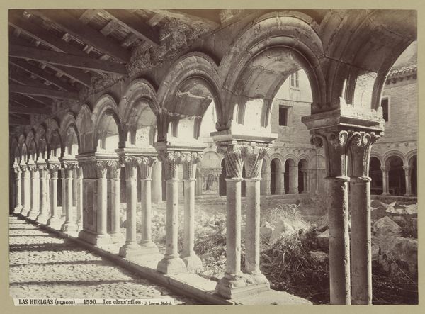
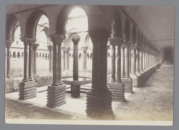
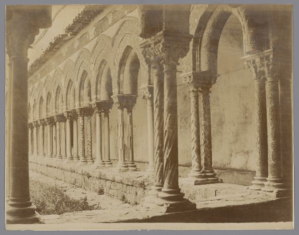
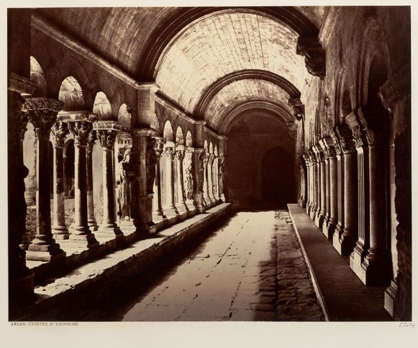
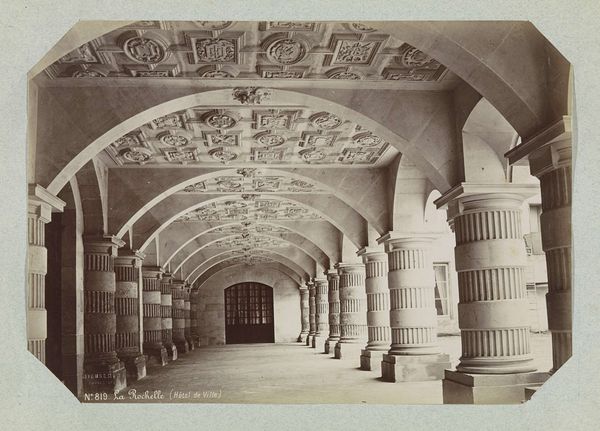
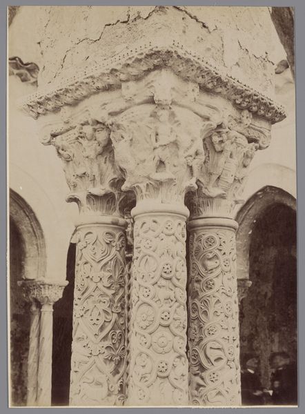
Editor: This is a photograph called "Zuilengalerij in het stadhuis van La Rochelle," taken sometime between 1880 and 1900 by Médéric Mieusement. It's currently at the Rijksmuseum. I'm immediately struck by the rigid geometry and repetition, almost a study in forms. What elements stand out to you? Curator: Note how the composition is governed by a relentless series of vertical and horizontal lines. The fluted columns, each segmented, establish a rhythm. Observe how the archways mirror this, softening the harshness with their curves. Ask yourself, how does this interplay of straight and curved lines affect the overall feeling? Editor: It does feel like a very controlled space, but I'm curious about why the photograph focuses so intensely on these architectural features. What can we learn from the relationships between them? Curator: Precisely. Consider the negative space. How does the photographer utilize it to define the columns and arches? Note also the quality of light, the chiaroscuro effect created by the sun filtering through the gallery. Light isn't just illumination here; it's a structural component, sculpting the forms. The symmetry of the archways contrast to the depth they produce from light. Editor: That's a good point – the way the light interacts with the columns gives them depth and volume. Now I’m wondering about the ornamentation… Curator: And rightly so! Observe the carved details above the arches. These are not merely decorative flourishes. They are integral to the overall design. Consider the texture, how it engages with the light differently from the smooth surfaces of the columns. It all works together in building relationships with one another. Editor: This has definitely given me a new appreciation for how all the elements work together. Curator: Indeed, through line, form, light, and texture, we decode the essence of the structure itself.
Comments
No comments
Be the first to comment and join the conversation on the ultimate creative platform.
More like this