About this artwork
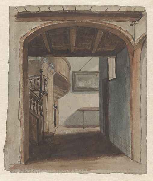
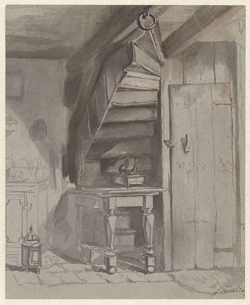
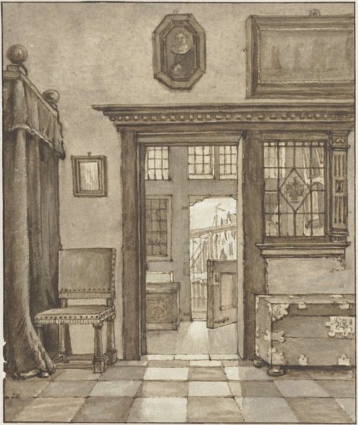
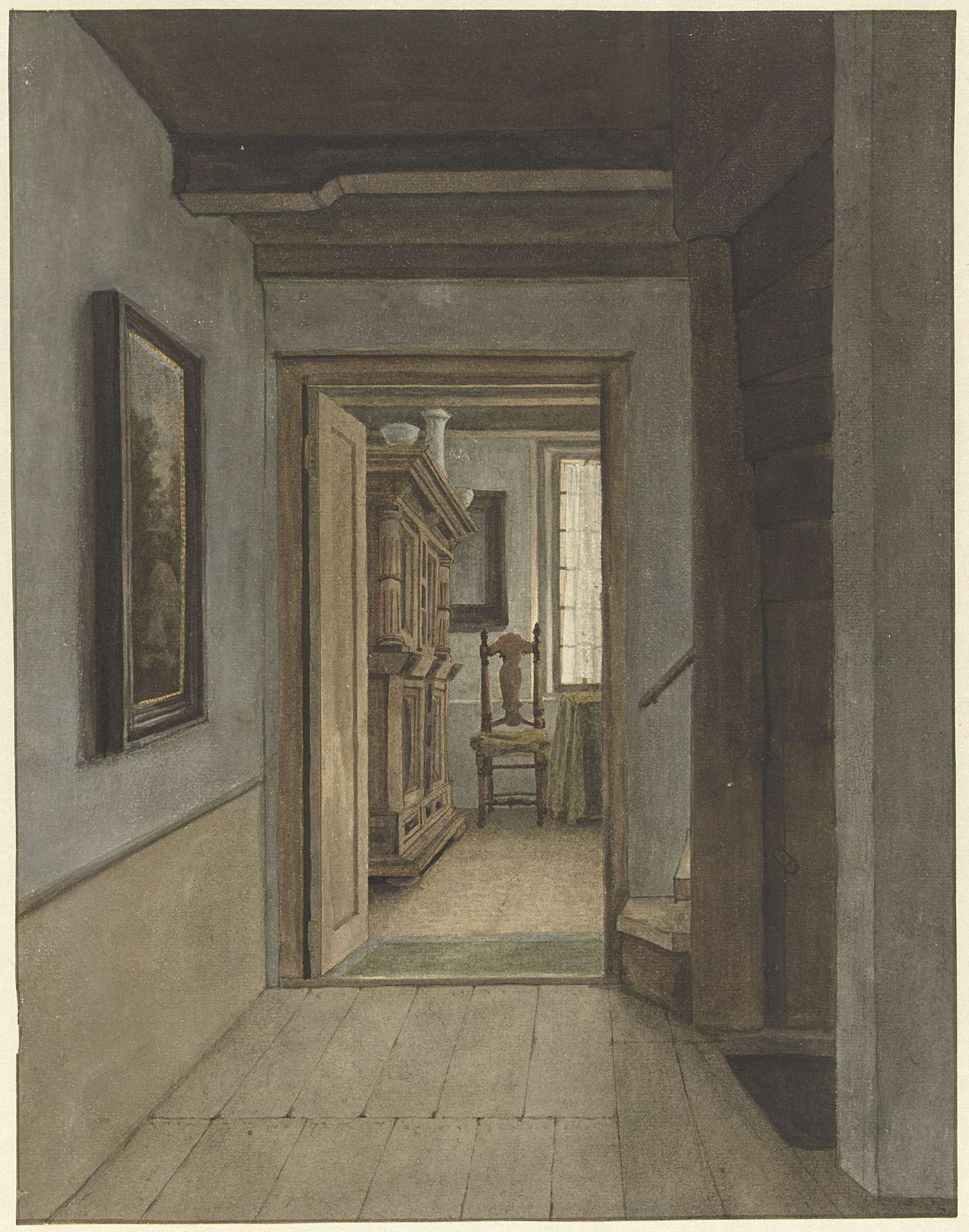
Editor: Here we have "Binnenhuis" by Gerrit Lamberts, a drawing in ink and watercolor on paper, dating from 1786 to 1850, housed in the Rijksmuseum. It's an interior scene and feels incredibly muted and still. What do you see when you look at it? Curator: I'm immediately struck by the artist's sophisticated use of perspective. Notice how the orthogonals of the floorboards, walls, and doorways converge towards a vanishing point somewhere beyond the interior room, creating a sense of depth. Also note the artist's palette-- largely subdued earth tones creating a tranquil atmosphere. What's your read on the use of light and shadow? Editor: It does feel carefully constructed, almost architectural. The light is soft, illuminating the interior, but also creating strong shadows that accentuate the architectural forms. How would you unpack its formal components? Curator: Indeed. Consider the composition itself. The artist segments the pictorial space into a foreground of the shadowed hallway, a middle ground of the brightly lit room beyond, and then, receding further, an aperture allowing us view to another space.. It’s an orchestration of visual planes designed to engage the eye and suggest infinite recession. Editor: The more you break it down, the more complex it becomes. It's not just a simple interior; there's a definite rhythm at play. Are there any details that you think are particularly crucial to interpreting the drawing? Curator: The slight asymmetry in the rendering of the doorway. Rather than a perfect rectangle, there are irregularities, suggesting a subjective rendering, and resisting the cold perfection of objective perspective. Now, look at the textures—how do you perceive them? Editor: I see what you mean, and I'm understanding how carefully planned the drawing is, despite its realistic approach. Thanks for pointing out all the relationships between light, shadow, texture, and pictorial space. Curator: Absolutely. By analyzing its formal elements—perspective, composition, light, shadow and texture we can have an appreciation of this artist’s meticulous strategy to transform mundane space into the art work.
Artwork details
- Medium
- drawing, paper, watercolor, ink
- Dimensions
- height 365 mm, width 286 mm
- Location
- Rijksmuseum
- Copyright
- Rijks Museum: Open Domain
Tags
Comments
Share your thoughts
About this artwork
Editor: Here we have "Binnenhuis" by Gerrit Lamberts, a drawing in ink and watercolor on paper, dating from 1786 to 1850, housed in the Rijksmuseum. It's an interior scene and feels incredibly muted and still. What do you see when you look at it? Curator: I'm immediately struck by the artist's sophisticated use of perspective. Notice how the orthogonals of the floorboards, walls, and doorways converge towards a vanishing point somewhere beyond the interior room, creating a sense of depth. Also note the artist's palette-- largely subdued earth tones creating a tranquil atmosphere. What's your read on the use of light and shadow? Editor: It does feel carefully constructed, almost architectural. The light is soft, illuminating the interior, but also creating strong shadows that accentuate the architectural forms. How would you unpack its formal components? Curator: Indeed. Consider the composition itself. The artist segments the pictorial space into a foreground of the shadowed hallway, a middle ground of the brightly lit room beyond, and then, receding further, an aperture allowing us view to another space.. It’s an orchestration of visual planes designed to engage the eye and suggest infinite recession. Editor: The more you break it down, the more complex it becomes. It's not just a simple interior; there's a definite rhythm at play. Are there any details that you think are particularly crucial to interpreting the drawing? Curator: The slight asymmetry in the rendering of the doorway. Rather than a perfect rectangle, there are irregularities, suggesting a subjective rendering, and resisting the cold perfection of objective perspective. Now, look at the textures—how do you perceive them? Editor: I see what you mean, and I'm understanding how carefully planned the drawing is, despite its realistic approach. Thanks for pointing out all the relationships between light, shadow, texture, and pictorial space. Curator: Absolutely. By analyzing its formal elements—perspective, composition, light, shadow and texture we can have an appreciation of this artist’s meticulous strategy to transform mundane space into the art work.
Comments
Share your thoughts