Copyright: Public Domain: Artvee
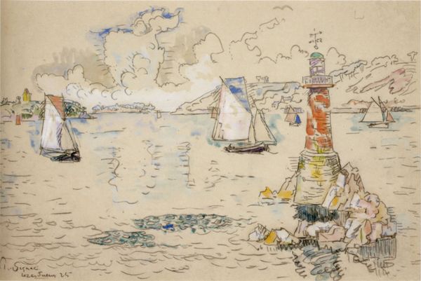
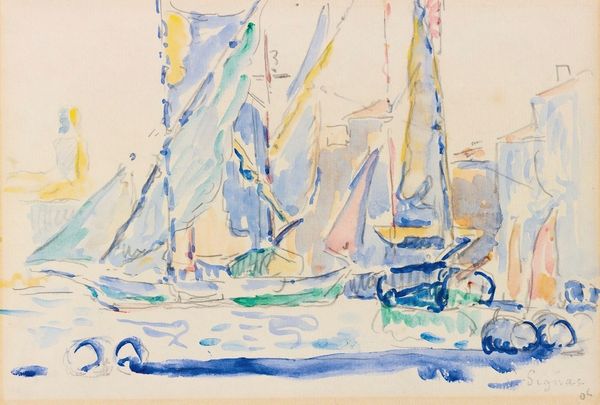
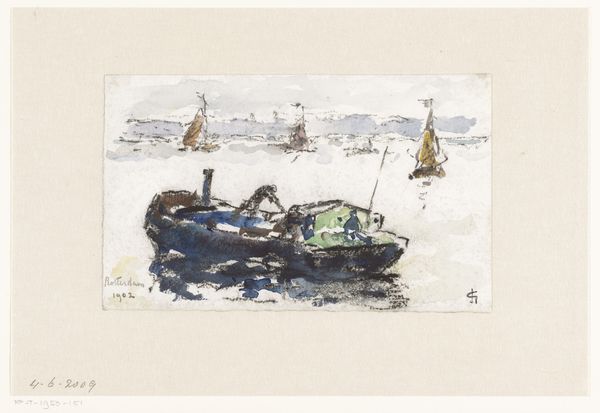
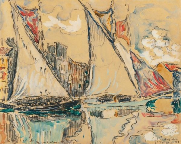
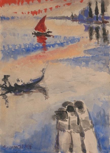
Curator: Welcome. Before us is Paul Signac’s 1906 watercolor, "Rotterdam". Editor: Oh, instantly dreamy! The wash of light is captivating, like squinting at a hazy memory. It feels ephemeral. Curator: Precisely. The watercolor medium lends itself beautifully to that effect. Observe Signac’s distinctive pointillist technique, though softer here than in his oils. He uses small, deliberate strokes of color to construct the cityscape. Notice how the tones vibrate against each other. Editor: Those touches of blue against the peachy hues of the buildings—divine! It’s not photorealistic, thank goodness, but captures something deeper, like the soul of Rotterdam. Curator: An intriguing interpretation. From a formal standpoint, consider the composition: the placement of the boats guides the eye, creating depth within a relatively flat plane. Signac masterfully uses the negative space. Editor: I’m just imagining myself on one of those boats, floating along with the colors… Do you think he was happy when he painted this? It’s got a joyful feel to it. Curator: The neo-impressionists aimed to evoke emotions through calculated color relationships, and it seems Signac succeeds here. Post-impressionism moved beyond simply capturing reality toward the subjective. The very structure mirrors it. Editor: Subjective is right! To me, it whispers stories of faraway ports and salty air, childhood vacations even! It's a feeling, not a lecture. Curator: Indeed, its formal qualities unlock precisely those nuanced interpretations, inviting personal reflection and enriching one's appreciation. Editor: You know, analyzing the bones sometimes does let the spirit shine through clearer. This one will stick with me.
Comments
No comments
Be the first to comment and join the conversation on the ultimate creative platform.