drawing, pencil
#
drawing
#
aged paper
#
art-nouveau
#
script typography
#
sketched
#
old engraving style
#
hand drawn type
#
personal sketchbook
#
hand-drawn typeface
#
fading type
#
geometric
#
pencil
#
stylized text
#
sketchbook drawing
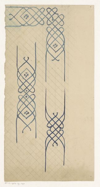
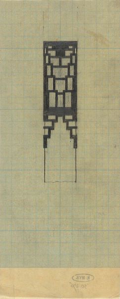
Dimensions: height 147 mm, width 88 mm
Copyright: Rijks Museum: Open Domain
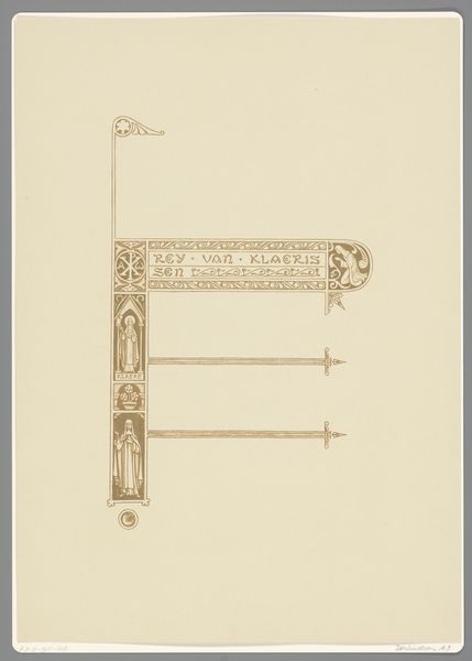
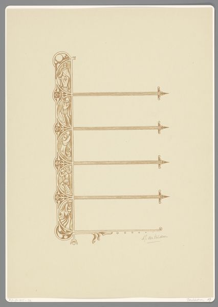
Editor: This is “Ontwerp voor een gesp,” or “Design for a buckle” by Mathieu Lauweriks, created sometime between 1874 and 1932. It’s a pencil drawing that gives off the aesthetic of Art Nouveau. The succession of shapes has a certain rhythm, almost musical. What stands out to you from a formalist perspective? Curator: The meticulousness of Lauweriks’ linework, laid out against the grid, offers us a privileged view into the artist's mind. Consider the geometry: squares, circles, rectangles, all unified by this central, vertical axis. What does that repetition communicate to you? Editor: I guess that, while the shapes vary in form, their consistent vertical arrangement creates a sense of balance and stability. Is the grid in the background important, in your opinion? Curator: Absolutely. The grid acts as a structural foundation. Lauweriks consciously chose this structured ground. He is both adhering to and playing with constraints, isn’t he? Editor: I see your point. He’s using these shapes and lines as building blocks of a more elaborate composition. Looking at the drawing now, it's almost like a study in abstracting natural forms into geometric elements. Curator: Precisely! By dissecting the visual language into basic components, we can reveal and emphasize Lauweriks’ understanding of order and aesthetic unity, creating something new in the process. Editor: I hadn't considered how the geometry interacts to achieve unity. Thanks for shedding light on Lauweriks’ unique, formal approach. Curator: My pleasure. There is much more that is yet to be uncovered.
Comments
No comments
Be the first to comment and join the conversation on the ultimate creative platform.
More like this