Dimensions: 7 5/16 × 4 7/8 × 3/8 in. (18.57 × 12.38 × 0.95 cm)
Copyright: Public Domain
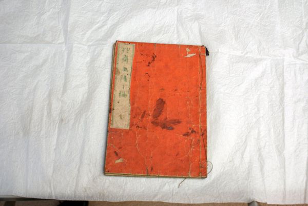
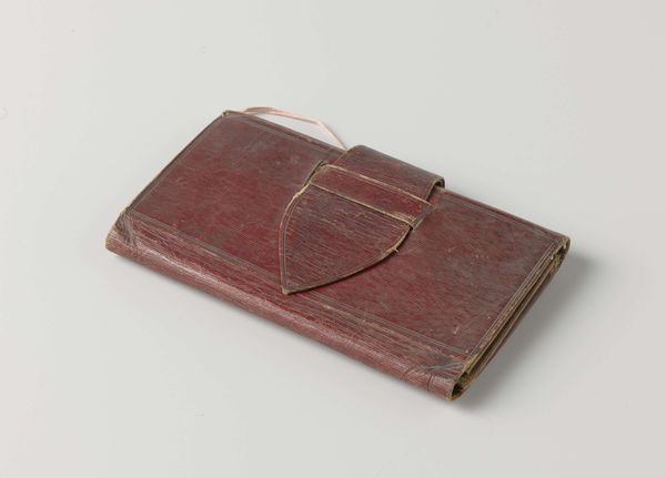
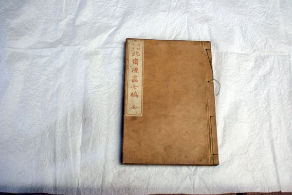
Editor: Here we have Kawanabe Kyōsai's *Kyōsai Drunken Pictures (Vol. 1)*, created in 1882, utilizing ink on paper. It strikes me as a simple, unassuming book, and I'm interested to understand how someone steeped in formalism would view it. What draws your eye in this piece? Curator: The book's materiality and composition are indeed fascinating. Notice the stark contrast between the worn, red cover and the off-white label with text. This contrast is immediately arresting and forces one to confront the physical history embedded within the object itself. Editor: That's a great point; I see what you mean about the contrast drawing the eye. The cover itself almost seems to be cracking. Is there anything about the texture or color choices that is especially notable? Curator: Precisely. The craquelure effect on the cover provides an essential tactile dimension, albeit visual. The chromatic decision to employ a saturated red alerts our senses and prepares us for dynamic imagery inside the volume. Editor: How fascinating! Looking at this now, I wonder what role condition and conservation play in how we engage with the artist's intent. Thanks for shedding light on what may seem unassuming. Curator: It's through such close, analytical viewing that we unearth profound artistic intention. Consider how these inherent characteristics inform meaning. This methodology encourages a very nuanced mode of perception and interrogation.
Comments
No comments
Be the first to comment and join the conversation on the ultimate creative platform.
More like this