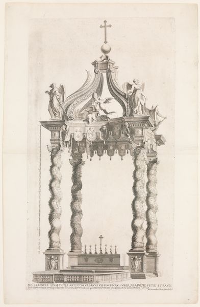
drawing, print, etching, engraving, architecture
#
drawing
#
baroque
#
dutch-golden-age
# print
#
etching
#
perspective
#
geometric
#
line
#
cityscape
#
engraving
#
architecture
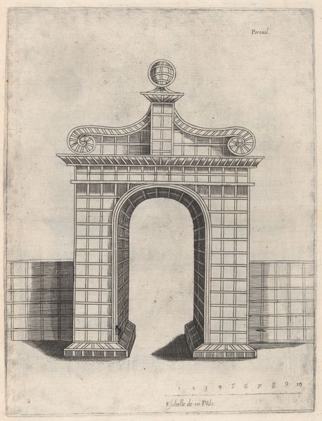
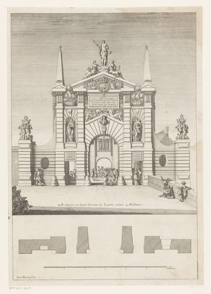
Dimensions: height 328 mm, width 231 mm
Copyright: Rijks Museum: Open Domain
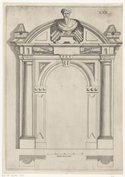
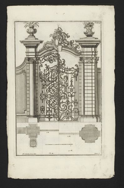
Curator: At first glance, this etching projects an interesting starkness. Its precision is striking, wouldn't you agree? Editor: Indeed. The use of line is remarkable. The precision is appealing in the rendering of this Haarlemmerpoort design. Curator: This piece, attributed to an anonymous Dutch Golden Age artist from 1631, exemplifies the Dutch Republic’s civic pride through its detailed architectural studies. Note the prominence given to what likely was a very public structure. Editor: The composition is primarily linear; its meticulous detail doesn't seem to let texture emerge naturally through tonality or shading techniques. Is there something more to say? Curator: I’d say so! As the physical gateway into Haarlem, it’s worth thinking about the historical role of city gates as sites of trade, governance, and defense. This print gives prominence to all of those symbolic aspects through that impressive ornamentation. Editor: Function certainly blends into ornamental forms, the lion heads above giving me a clue of that symbolism. Its geometrical forms create strong order and hierarchy but do those stone faces give off a stern feel to you as they do to me? Curator: They're standard fare for Baroque architecture, though! If you study these gates you will notice a conscious attempt to awe any passerby, reminding them of the power structures they're entering into. It speaks to the aspirations of urban planning at that moment, to impose authority through architectural presence. Editor: So its effect relies both on inherent properties like balance and scale but also relies on societal context? If its primary goal was to impress those traveling to or from Haarlem, do you think it fulfilled its original role successfully? Curator: The number of these prints being actively made shows an appreciation, or desire at the very least, to associate oneself with the architecture, or perhaps show one's loyalty to the city of Haarlem, a vital urban center then as now. Editor: Seeing such an analytical rendering definitely invites careful study. Thank you for drawing attention to these many different points! Curator: Thank you as well. It’s these small, carefully-wrought prints that really bring the past alive!
Comments
No comments
Be the first to comment and join the conversation on the ultimate creative platform.
More like this