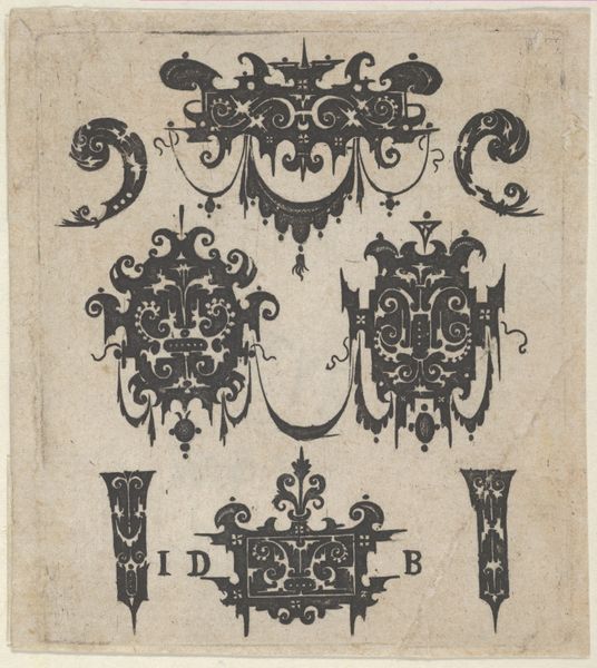
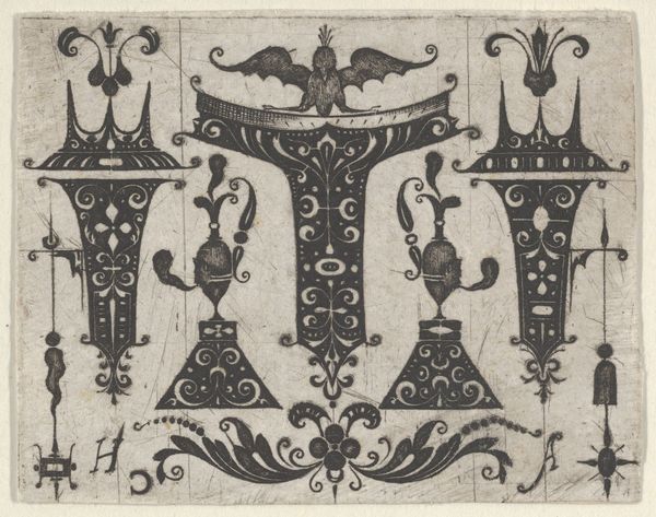
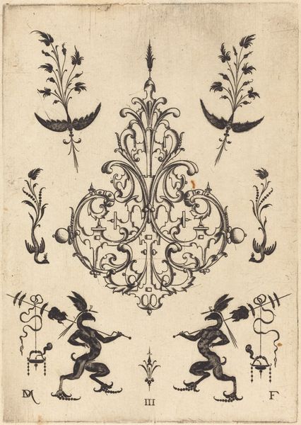
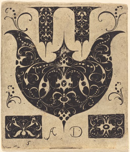
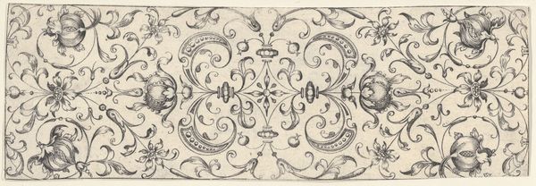
drawing, ornament, print, paper, ink
#
drawing
#
ornament
#
pen drawing
# print
#
paper
#
11_renaissance
#
ink
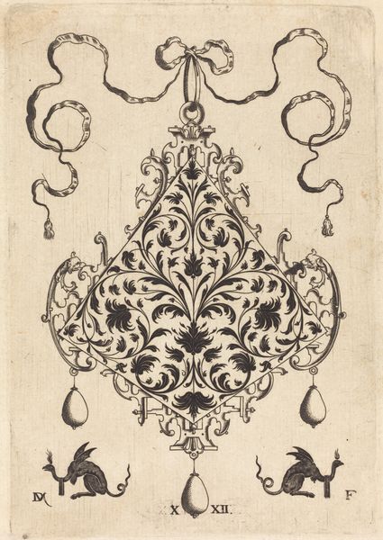
Dimensions: height 44 mm, width 51 mm
Copyright: Rijks Museum: Open Domain
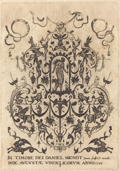
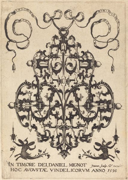
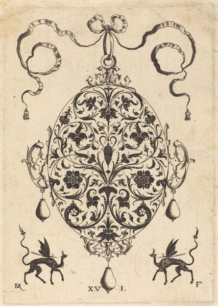
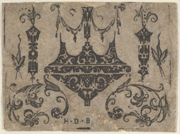
Editor: Here we have a “Driekantig ornament,” made around 1500-1600 by an anonymous artist using pen, ink, and paper. It has an intricate, symmetrical design reminiscent of something you'd see decorating a Renaissance manuscript. The lines seem deliberately and delicately placed. What structural elements stand out to you? Curator: The symmetry is immediately striking. Observe how the artist manipulates positive and negative space to create a harmonious balance. The curvilinear forms juxtaposed with the sharp, pointed elements contribute to a dynamic tension within the composition. Notice the flow and repetition of the intricate patterns? Editor: Yes, I see that the repeated use of those spiraling tendrils definitely unifies the different sections. How would you analyze its aesthetic impact? Curator: I would encourage an approach rooted in formal properties: Examine the textural contrast between the densely filled areas and the sparse backgrounds. The use of hatching and cross-hatching creates depth and volume, even in this monochromatic work. And consider the linear quality; how does the line weight influence the visual hierarchy and guide the eye through the design? Editor: That's a great point, I hadn't considered how the line work contributes to depth. Analyzing art from a purely visual perspective like this offers such specific insights. Thank you for sharing that perspective. Curator: And thank you for pointing out how even an aesthetic analysis like this provides new understanding for any observer.
Comments
No comments
Be the first to comment and join the conversation on the ultimate creative platform.
More like this