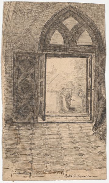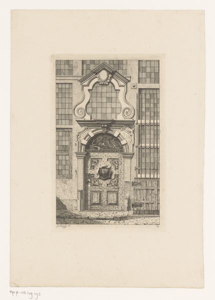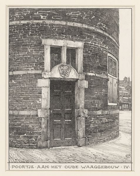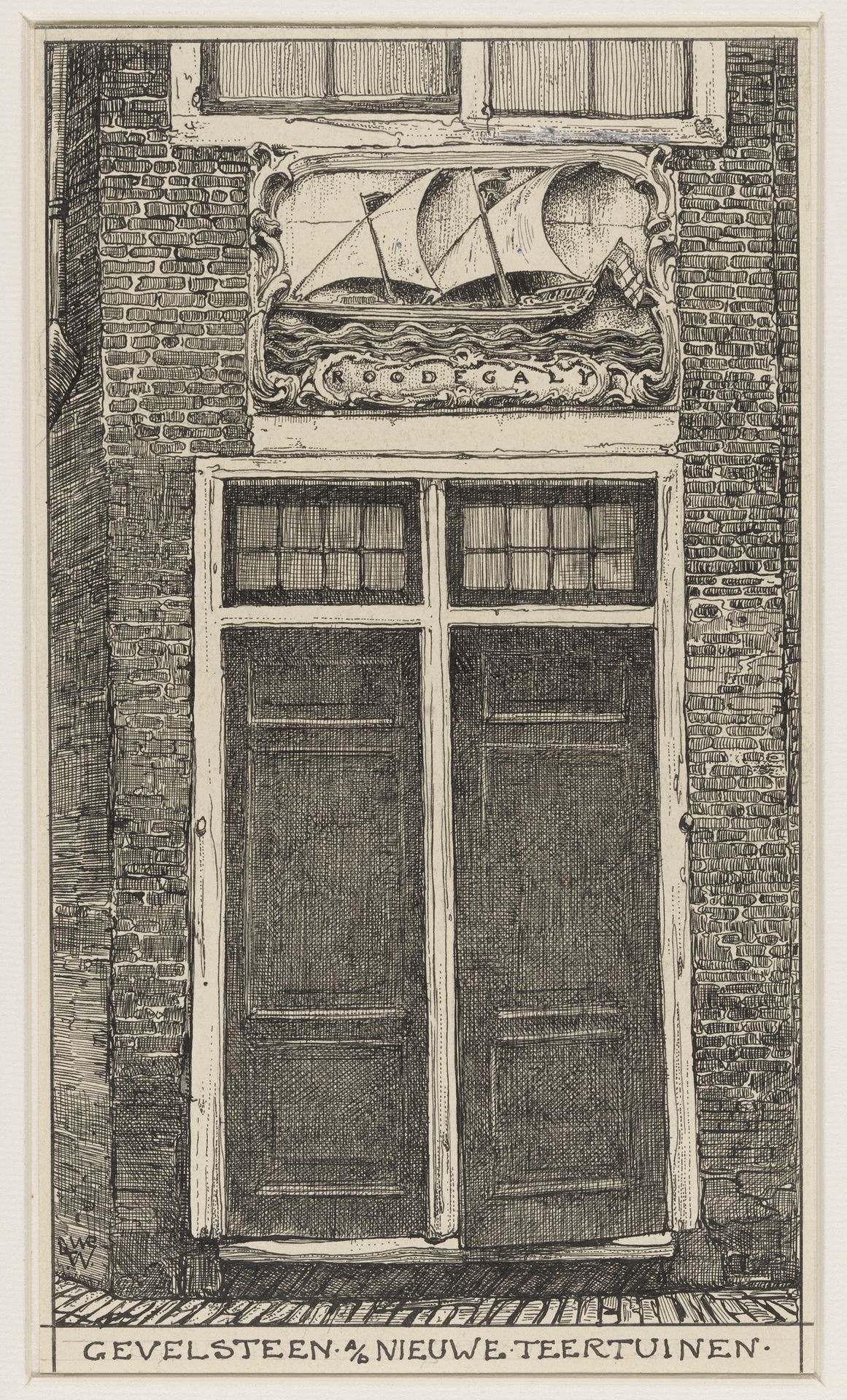
1870 - 1926
Gevelsteen aan de Nieuwe Teertuinen te Amsterdam
Willem Wenckebach
1860 - 1937Location
RijksmuseumListen to curator's interpretation
Curatorial notes
Editor: This is Willem Wenckebach's "Gevelsteen aan de Nieuwe Teertuinen te Amsterdam," created sometime between 1870 and 1926. It appears to be a pen drawing on toned paper. The level of detail is amazing, especially the brickwork and the carving above the door. I'm immediately drawn to the composition – the rigid lines of the architecture versus the more organic shapes of the ship relief. What do you see in this piece? Curator: The artwork presents an intriguing interplay of textures and forms, immediately drawing the eye to its intricate composition. The linear precision used to depict the brick facade creates a stark contrast against the curvilinear flourishes of the carved relief. Observe how the artist's meticulous rendering of the architectural elements highlights the structural integrity of the building. Do you notice the repetition of rectangular shapes? Editor: Yes, the windows, the doors, even the bricks themselves—they all contribute to this overall geometric feel. It’s almost like the building is asserting its solid presence. Curator: Precisely. The artist utilizes these shapes, contrasting them to amplify the organic nature of the ship carving. The use of the pen strokes creates tonality to build form throughout, offering a tactile, textural dimension that emphasizes the age of the materials. This conscious arrangement fosters an atmosphere charged with the echoes of maritime history. Editor: So, the tension between the rigid structure and the flowing ship tells a visual story through its composition and materials. Curator: Indeed. It allows us to look beyond the representational subject, and to contemplate the formal decisions and what they communicate to the viewer. Editor: I see now. Focusing on the interplay of lines and shapes reveals a more complex visual dialogue than I initially grasped. Thanks for sharing that insight! Curator: You're most welcome. It is through that dedicated analysis we deepen our engagement with art.