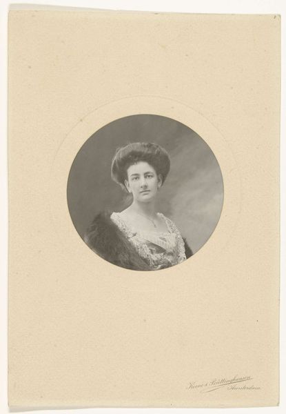
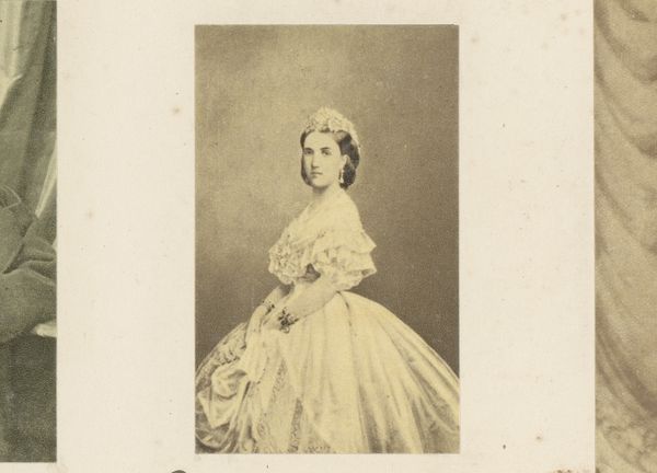
photography, gelatin-silver-print
#
portrait
#
photography
#
historical photography
#
gelatin-silver-print
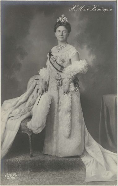
Dimensions: height 34.3 cm, width 27.8 cm
Copyright: Rijks Museum: Open Domain
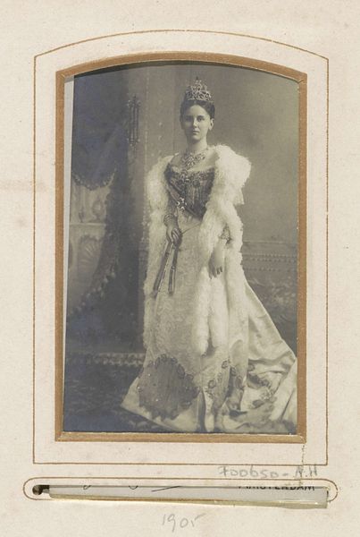
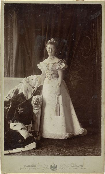
Editor: This is a gelatin silver print by Herman Deutmann, entitled "Wilhelmina," made in 1923. It's quite striking. The texture gives it a somewhat ethereal feel, but it's also very formal and regal. What are your first impressions, looking at it? Curator: Immediately, I'm drawn to the contrasting tones within the composition. The play of light and shadow across Wilhelmina's garments, specifically, creates a visual rhythm. Notice how the textures--the smooth sheen of the jewels against the soft, almost blurred effect of the fur--generate a captivating dynamic tension. Do you perceive how these variations influence the overall impact of the image? Editor: I do. The contrast emphasizes her status, the juxtaposition of luxurious textures really creates that image. Curator: Precisely. Furthermore, observe the composition's inherent structure. The central figure, Wilhelmina, dominates the frame, commanding the gaze through a formal symmetry. But there are interesting asymmetrics, for example her fan. How do you view its inclusion? Does the fan give a balance to the visual dynamic, or detract from the overall harmony of the image? Editor: I'm wondering now if it emphasizes asymmetry to counter the imposing rigidity of the pose and formal attire. Curator: A compelling argument. Note, finally, the limited tonal range Deutmann employs. He restrains the image with shades of gray, using it to augment our sense of weight, structure, and presence in what could easily become an overly effulgent presentation. Editor: So, by focusing on texture, tone and form, the picture maintains an imposing feel? I see the balance more clearly now!
Comments
No comments
Be the first to comment and join the conversation on the ultimate creative platform.
More like this