Copyright: CC0 1.0
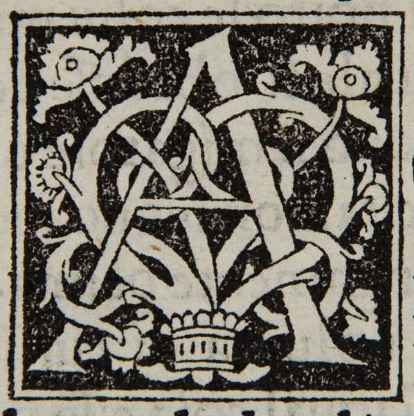
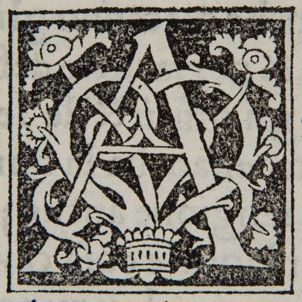
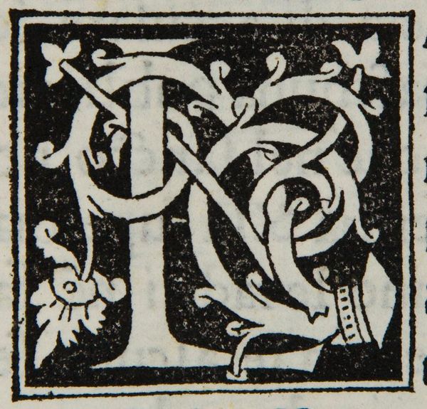
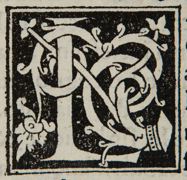
Editor: So, this is "Letter A" by an anonymous artist. It looks like a woodcut, maybe? It’s a bit hard to read, with all the swirling lines. What do you see in its composition? Curator: The figure-ground relationship is compelling. Note how the white 'A' and the decorative elements vie for dominance against the black background, creating a dynamic tension. The positive and negative spaces are equally important in articulating the form. Editor: That makes sense. The contrast really does jump out. I see the tension now. Curator: Indeed. The tightly interwoven lines create a sense of depth within a limited plane. It’s a study in how simplicity of form can yield complexity of visual experience. Editor: Thanks, I’ll be sure to look for that in other works too.
Comments
No comments
Be the first to comment and join the conversation on the ultimate creative platform.
More like this