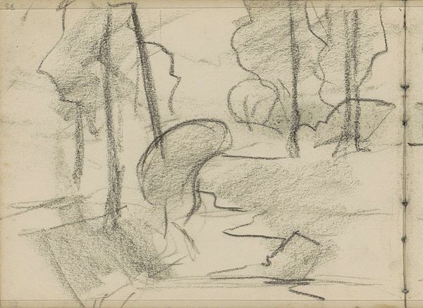
drawing, graphite
#
drawing
#
impressionism
#
landscape
#
graphite
Copyright: Rijks Museum: Open Domain
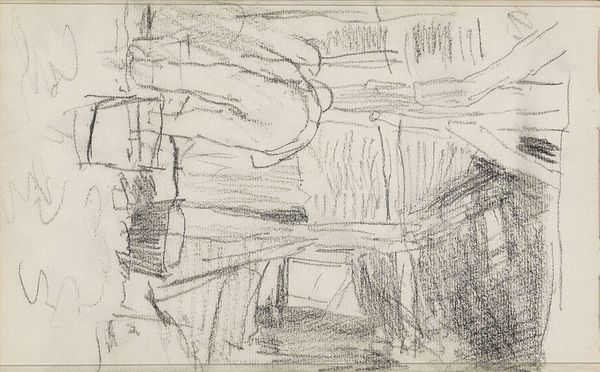
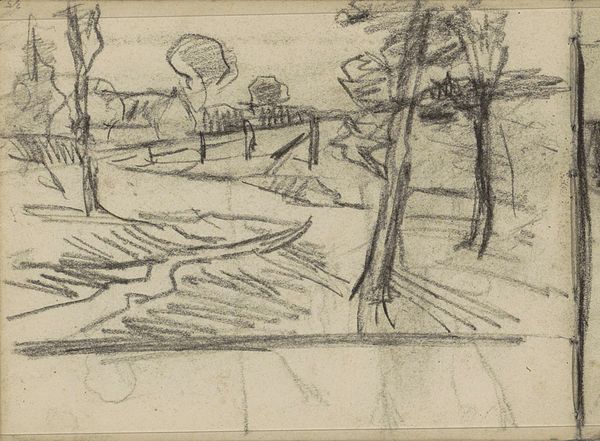
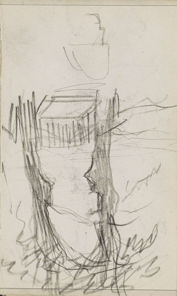
Editor: So, this is Willem Witsen’s "Stadsgezicht," a graphite drawing from around 1888-1891. It feels very preliminary, almost like a fleeting impression captured on paper. The lines are so sparse and suggestive. What stands out to you? Curator: Immediately, the relationship between line and void is compelling. Consider the composition—the arrangement of dark graphite marks against the starkness of the untouched paper. Each stroke, seemingly minimal, defines the form. It's an interplay of positive and negative space, would you agree? Editor: I do. It feels very intentional, like he's carefully choosing what to include and exclude. Is the simplicity also characteristic of Impressionism? Curator: Indeed. The simplification is less about direct representation, and more about conveying an impression of light, form, and atmosphere through minimal means. Note how the variation in line weight affects depth, especially towards the center. Editor: You're right, the thicker lines bring a sense of weight to the building forms. What does that say about his choice of using a medium like graphite, rather than something that lends itself to texture? Curator: Graphite, in its very smoothness, directs our gaze to the structure, rather than texture, emphasizing the foundational architecture of the urban landscape. Witsen has distilled it to its very essence; line and structure. Editor: That’s fascinating! I hadn't considered that medium specificity to this degree. This close looking has completely changed my perception of it. Curator: Precisely. By attending to its formal components, the inherent qualities of art, we deepen our understanding and experience.
Comments
No comments
Be the first to comment and join the conversation on the ultimate creative platform.
More like this