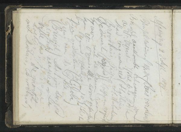
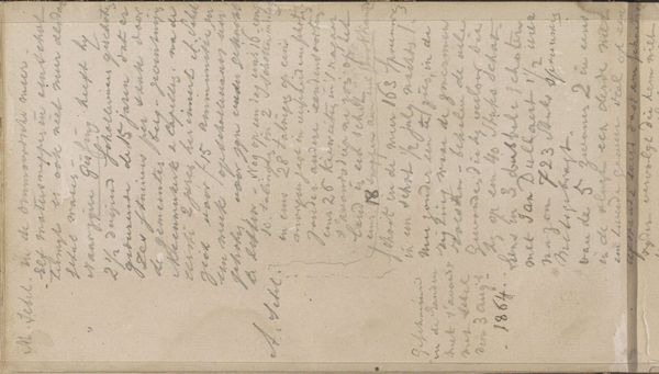
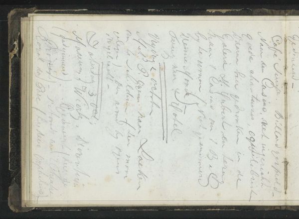
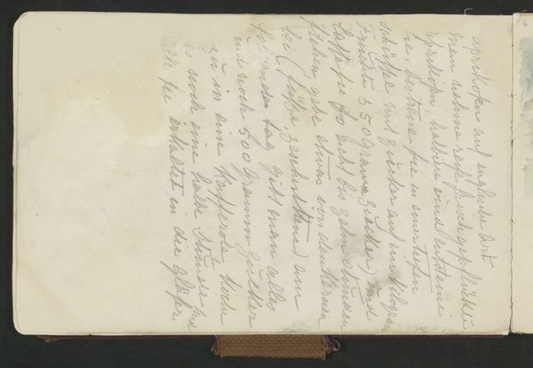
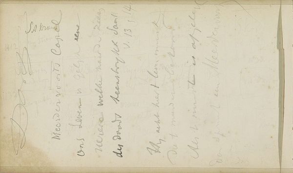
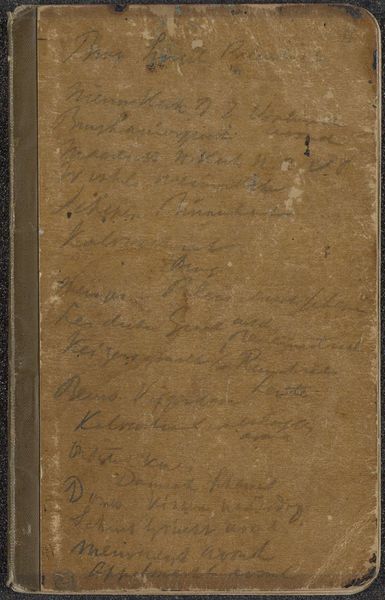
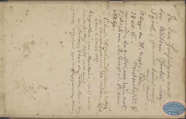
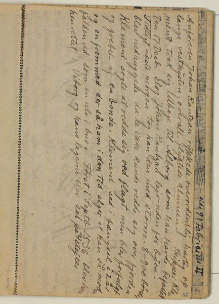
#
aged paper
#
toned paper
#
hand-lettering
#
hand drawn type
#
hand lettering
#
personal sketchbook
#
hand-drawn typeface
#
sketchbook drawing
#
sketchbook art
#
watercolor
Dimensions: height 115 mm, width 160 mm
Copyright: Rijks Museum: Open Domain
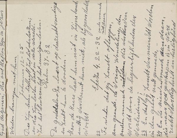
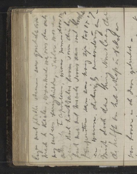
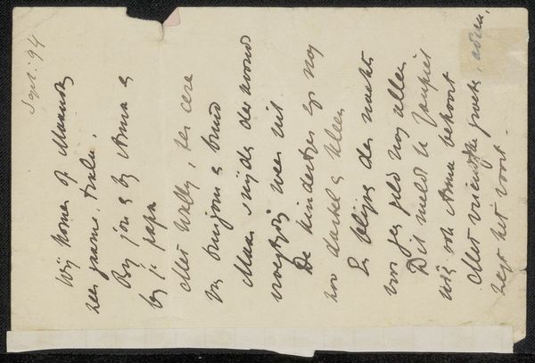
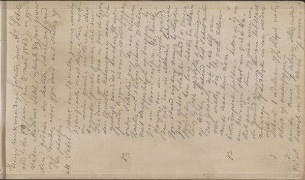
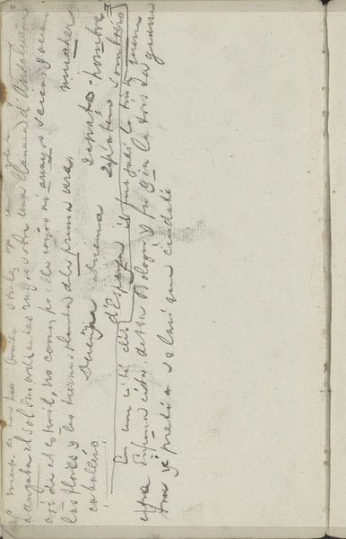
Editor: We're looking at "Notitie over eerzucht" by Willem Cornelis Rip, created sometime between 1914 and 1916. It appears to be a page from a personal sketchbook, perhaps using watercolor on aged paper. I’m struck by the artist’s hand-lettering; it’s so expressive, yet hard to decipher. What jumps out at you in this piece? Curator: The formal elements are quite compelling. Note the aged paper, its coloration providing a field upon which the hand-lettering performs. Consider how the composition draws your eye around the page. Rip isn't just conveying language, but also exploring the visual weight and texture of the words themselves. Is the text organized in a rhythmic or symmetrical manner? How do the formal qualities, such as the handwritten forms of the words and how they coalesce, play into your understanding of the piece? Editor: I see that. The unevenness of the writing does give it a sort of rhythm. Do you think the difficulty in reading it contributes to its meaning? Curator: It absolutely affects the perception. The materiality is a central element; the opacity is relevant to how meaning can be created, or obscured, as a method of artmaking. What emotions do the work's formal elements inspire, as it withholds narrative? Editor: I think I was too focused on trying to understand the words themselves. I can see how it’s more about the feeling of the handwritten text, and how the layout contributes. Curator: Precisely. It encourages one to move past denotation into the realm of sensory appreciation of the piece’s formal qualities. A piece about textual art requires engagement from the audience in deciphering its purpose beyond textual reading.
Comments
No comments
Be the first to comment and join the conversation on the ultimate creative platform.
More like this