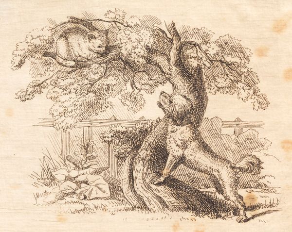
Illustration til "Halvhundrede Fabler for Børn" af Hey 1834
0:00
0:00
drawing, print, ink, engraving
#
drawing
# print
#
landscape
#
ink
#
romanticism
#
genre-painting
#
engraving
Dimensions: 94 mm (height) x 130 mm (width) (bladmaal)
Curator: Let's turn our attention to Martinus Rørbye's 1834 engraving, "Illustration til 'Halvhundrede Fabler for Børn' af Hey," currently housed here at the SMK. What's your initial reaction? Editor: My first impression is… domestic tranquility, almost cloying in its simplicity. It’s a carefully rendered scene of a hen and her chicks. The sepia ink gives it an antiquated, sentimental feeling. Curator: The magic is absolutely in the meticulous execution of the printmaking itself. The precision of the engraved lines gives such detail to even commonplace aspects of rural life, raising a children's story illustration to the level of fine art. You can practically feel the texture of the paper! Editor: Precisely! It’s romanticizing labor, isn't it? The hen, representing perhaps the working mother, leading her brood through a landscape defined by picket fences and blooming foliage. Consider how such imagery might have resonated with burgeoning nationalist movements and gendered divisions of labor. Curator: It speaks to the power of the printing press to disseminate cultural values, definitely. We see those values not only in the subject matter but in the quality of materials used – the very availability of finely crafted paper and quality inks signifies a level of industrial output accessible at the time, that reflects particular shifts in labor itself and the production of luxury commodities. Editor: The narrative reinforces established power dynamics, I think. The fence signifies boundaries, ownership, protection, and constraint. The artist presents a vision of society carefully organized. The wildness of nature is literally fenced in, the very illustration mirroring that condition through defined lines of the ink print. Curator: A perfect example of Romanticism imbuing the everyday with moral weight through visual rhetoric. That fine hatching to give texture to the mother hen is *work*. Laborious production. These aren’t quick sketches; these are calculated, carefully rendered pieces destined to convey explicit meaning to its target audience, young readers in particular. Editor: An illustration deeply enmeshed in the cultural and political landscape of 19th-century Denmark, reflecting both the simple charm and subtle ideological constraints of the time. Curator: An illustration where the technique, the materials themselves, speak volumes about its value both then and now. It highlights how a 'simple' drawing, born from material processes and widespread access, really speaks to both luxury and burgeoning industry.
Comments
No comments
Be the first to comment and join the conversation on the ultimate creative platform.
More like this