painting, acrylic-paint
#
pop art-esque
#
abstract-expressionism
#
popart
#
painting
#
op art
#
pop art
#
acrylic-paint
#
form
#
word art
#
geometric
#
abstraction
#
pop-art
#
line
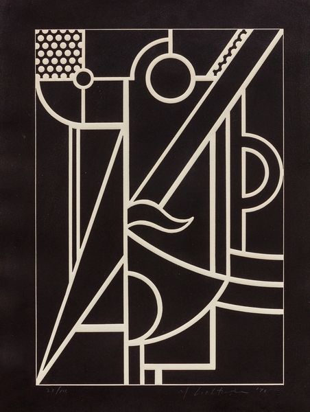
Copyright: Vilen Barsky,Fair Use
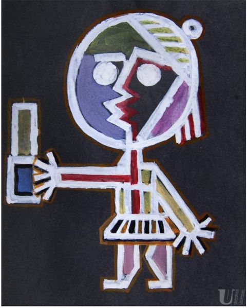
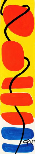
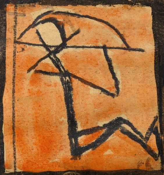
Curator: Well, here we have Vilen Barsky’s “Untitled” piece from 1960. It seems to be an acrylic painting. What are your initial impressions? Editor: It strikes me as immediately bold. The geometric figure, starkly rendered in yellow against that somber black backdrop, seems almost like a primal symbol, a character in some ancient, unknown alphabet. Curator: The geometry is interesting. Consider its creation during the rise of abstract expressionism, but already hinting at pop art aesthetics. The rigid, almost hieroglyphic representation contrasts sharply with the gestural abstraction that dominated at the time, signalling a move towards accessible symbolism. Editor: Right, it does recall early writing. Look at the figure's 'head' – is that a circle intersected by a jagged line? And the object it holds aloft. Is it a tool? A weapon? Curator: Those could be charged signifiers. Consider, though, the cultural context of 1960. This period was a crucible for various counter-cultural movements, all wrestling with identity, Cold War anxieties, and a hunger for a new visual language. Editor: So you are thinking the symbolism stems from broader societal upheavals? It makes sense. Curator: Exactly. That yellow figure isn't just an abstract form; it’s potentially an embodiment of marginalized voices staking their claim on visual culture, simplifying and reforming inherited conventions. The deliberate rawness of the lines reinforces this disruption. Editor: Yes. And that simplified form...it reminds me, strangely, of early computer icons – a pre-digital attempt at representing the human form through technology, or perhaps the spirit becoming digital. It speaks to the core human drive for recognition, reduced to basic signals. Curator: A fascinating point about the digitization of form. In some ways, this work prefigures our modern obsession with symbols. Barsky gives us a concentrated meditation on how much we invest in, and infer from, such simple visual cues. Editor: Seeing how he compresses meaning through these basic elements has broadened my appreciation for the piece. What seemed initially simplistic reveals unexpected depth, almost becoming a prototype of graphic messaging. Curator: Indeed. I think considering how seemingly rudimentary gestures or shapes can ignite powerful dialogues speaks volumes about how we engage with art and the world around us.
Comments
No comments
Be the first to comment and join the conversation on the ultimate creative platform.
More like this