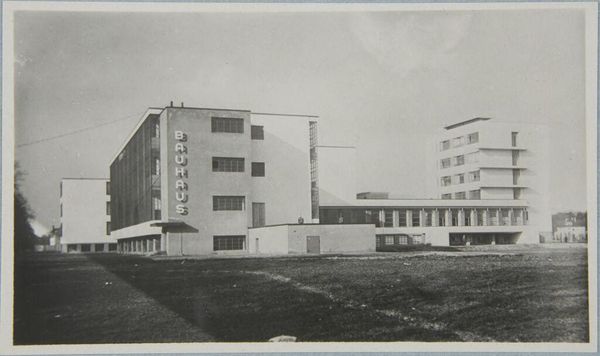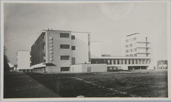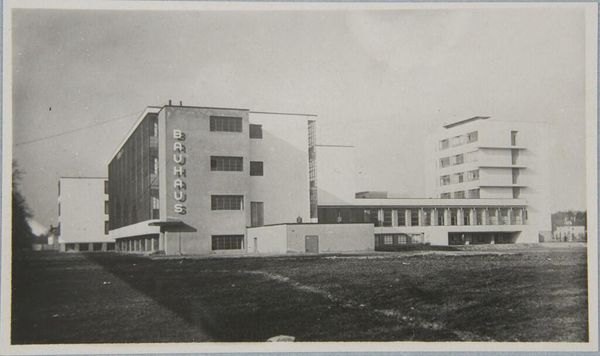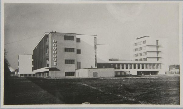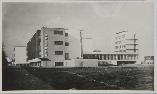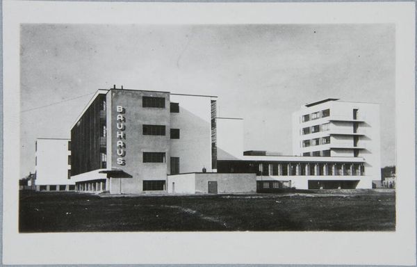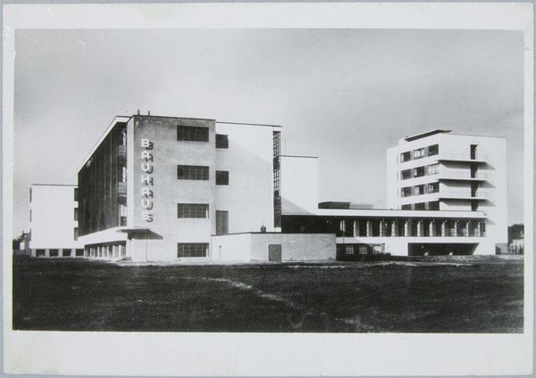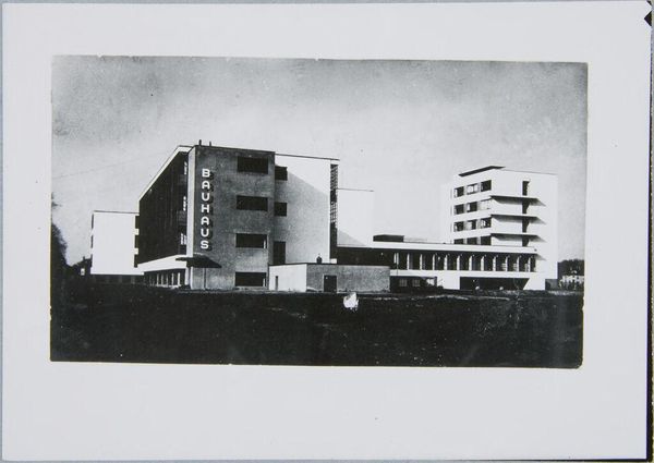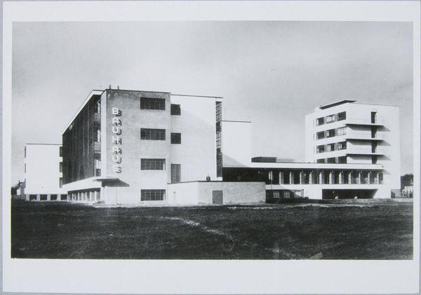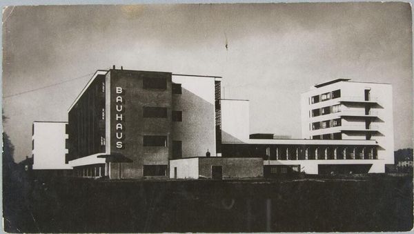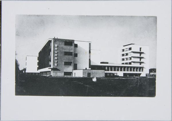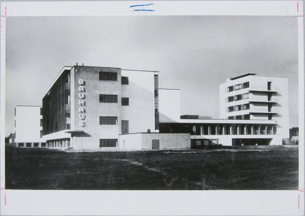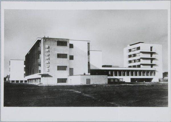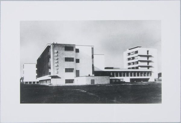
Bauhaus Building, Dessau, 1925-1926: View from southwest 1926 - 1927
Copyright: CC0 1.0
Editor: Here we see Klaus Hertig’s photograph of the Bauhaus Building in Dessau, dating to 1925-1926. I’m struck by the stark geometry and the interplay of light and shadow. What compositional elements stand out to you? Curator: The building's facade offers a compelling study in the relationship between form and function. Note the emphasis on horizontal and vertical lines, creating a grid-like structure. The typography of "Bauhaus" integrated into the architecture exemplifies the movement's desire to unify art and design. How do you interpret the absence of ornamentation? Editor: I think it emphasizes the building’s purpose and rejects unnecessary embellishment. It seems very… intentional. I hadn’t considered the typography as part of the structure itself. Curator: Indeed. The interplay between planar surfaces and cubic volumes is essential. This approach reflects a broader artistic trend towards abstraction and a rejection of historical styles. Are you perceiving any sense of depth? Editor: Yes, the different buildings seem to recede into the distance. It gives the photograph a great sense of scale and three-dimensionality. It’s been enlightening to consider this building in terms of its pure visual elements. Curator: Precisely. Through rigorous analysis, we gain insight into the aesthetic principles that shaped this architectural masterpiece.
Comments
No comments
Be the first to comment and join the conversation on the ultimate creative platform.
