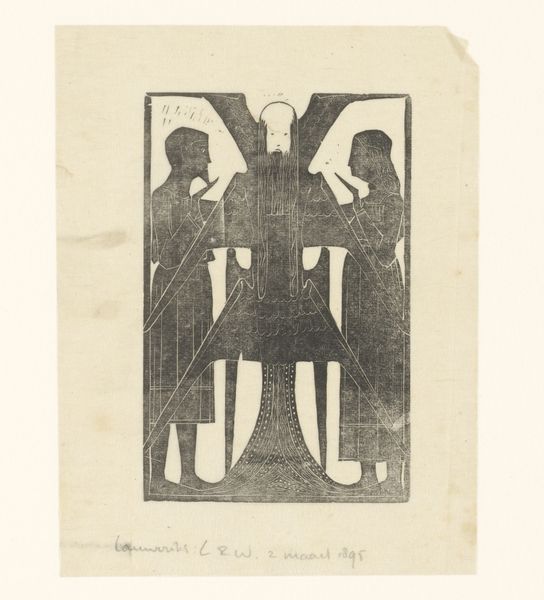
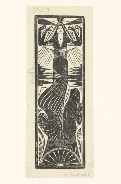
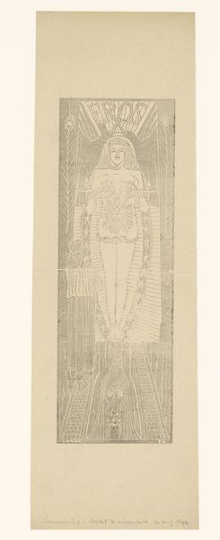
print, woodcut
#
art-nouveau
# print
#
old engraving style
#
woodcut effect
#
figuration
#
woodcut
#
line
#
symbolism
Dimensions: height 146 mm, width 116 mm
Copyright: Rijks Museum: Open Domain
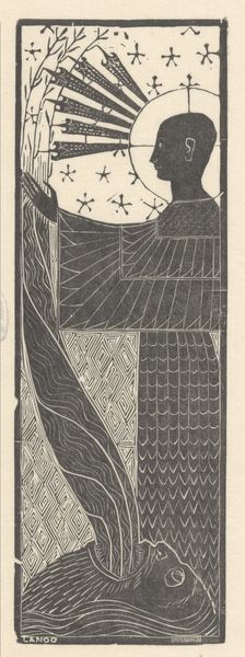
Editor: This is Mathieu Lauweriks’ “In een veraf gelegen wereld,” or “In a Distant World,” created around 1895. It's a woodcut print with this striking, graphic style. The limited color palette definitely evokes a sense of mystery, but what I find most compelling is its symmetry, almost like a playing card. What draws your attention to this print? Curator: The woodcut’s formal arrangement—the rigid symmetry, the interplay of positive and negative space—these are the elements that immediately capture my interest. The composition, though seemingly simple, is a complex arrangement of geometric forms. The central figure acts as an anchor, its verticality in stark contrast to the converging lines of what appear to be wings or perhaps architectural elements. Notice how the figures on either side mirror each other, yet they also contribute to a sense of enclosed space, almost a stage. What do you make of these opposing, symmetrical forms and their overall contribution to the artwork? Editor: That's fascinating. I hadn’t considered how those angles contribute to a sense of constriction, despite the openness of the central figure. It feels very deliberate. So the artist is really focusing on manipulating the viewer's perception through pure form? Curator: Precisely. The power here lies not in narrative, but in the formal relationships. Consider the use of line, for example. Sharp, decisive cuts create stark delineations between light and shadow. These choices intensify the composition’s impact and reinforce the emotional tenor of, as the title states, a world set apart. Notice the contrast between smooth expanses and densely textured areas; how do they direct the eye and what sensations do they trigger? Editor: This completely shifts how I see the print. The negative space feels much more intentional now, rather than just the background. Thank you for illuminating the construction of this piece for me. Curator: My pleasure. By considering line, shape, and composition, we unveil the intentional choices that inform the work’s emotional depth.
Comments
No comments
Be the first to comment and join the conversation on the ultimate creative platform.
More like this