drawing, paper, ink
#
drawing
#
paper
#
ink
Copyright: Rijks Museum: Open Domain
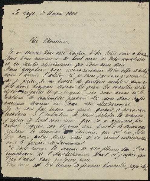
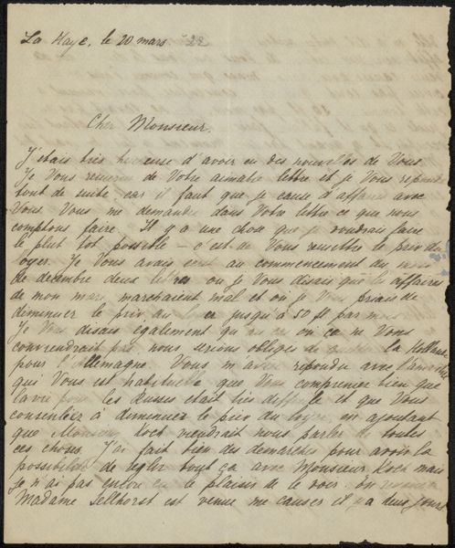
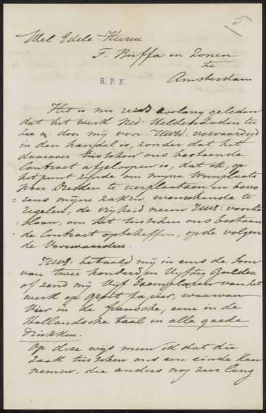
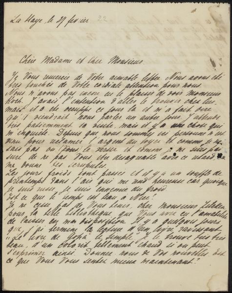
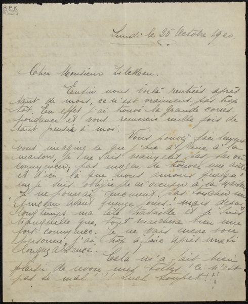
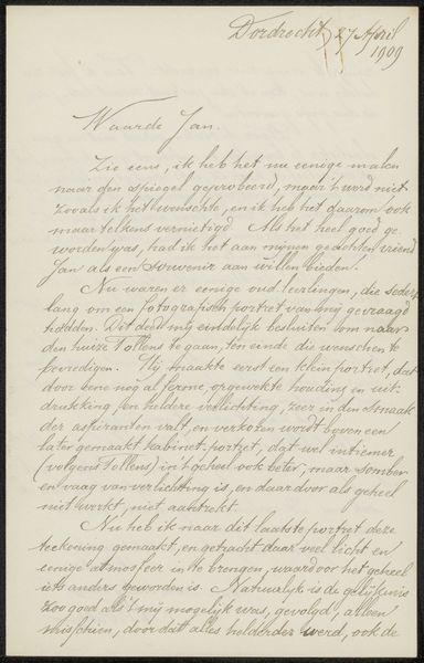
Curator: Anna Sologoub’s “Brief aan Philip Zilcken,” possibly created between 1922 and 1924, is an ink drawing on paper. This piece immediately draws my attention—the hurried, sloping script, the aged paper... It feels so personal, so vulnerable. Editor: I'm immediately struck by the texture. The faded paper contrasts sharply with the strong, dark lines of the handwriting. There's an interesting dichotomy here—the delicacy of the medium against the urgency of the message. Curator: It appears to be a letter, judging from the handwriting. Letters offer incredible insight. Through this correspondence with Philip Zilcken, we might begin to explore Sologoub’s concerns and personal circumstances. Note how it’s composed in French, so we could inquire into Zilcken's connections within artistic and intellectual circles in France or the Netherlands, considering Sologoub's background. Editor: Focusing on the pure aesthetics, I see an almost calligraphic quality in the handwriting, even with its slant and apparent haste. The composition, with the text filling nearly the entire page, creates a sense of enclosure. I feel compelled to scrutinize and carefully decode each mark on the page to interpret a potential meaning from the image alone. Curator: Given the post-war period in which she was creating her art, we must also consider themes of displacement, communication, and even the very act of preserving a connection through physical correspondence during an era of immense social and political upheaval. There may even be an implicit discussion of the privilege associated with maintaining correspondence, considering the upheaval following World War I. Editor: Perhaps the imperfections—the fading ink and aged paper—only enhance the artwork. These intrinsic traits only add more beauty in a pure sense. Curator: Absolutely, but the letter hints at more than visual delight; there could be a subtext regarding the health of a person in the letter. Understanding these layers could inform and change our reading of its inherent aesthetic features. Editor: Ultimately, it reminds me of how an apparently simple combination of form and surface in an artwork can suggest even grander contexts, emotions, or intentions. Curator: I agree, and the letter's significance, like any document from such a turbulent period, likely reaches beyond its simple and ordinary function, resonating on a historical, intimate, and expressive scale.
Comments
No comments
Be the first to comment and join the conversation on the ultimate creative platform.
More like this