Copyright: Public domain
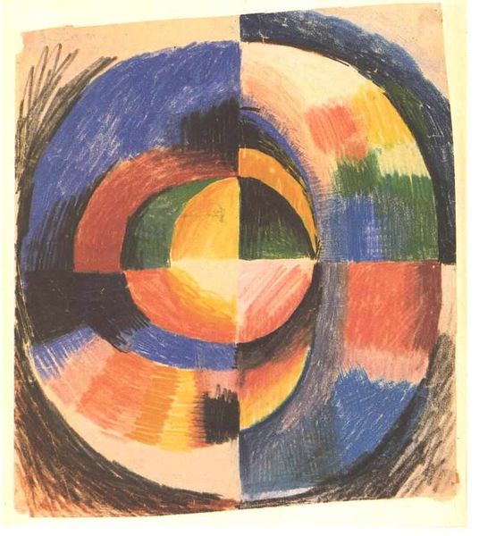
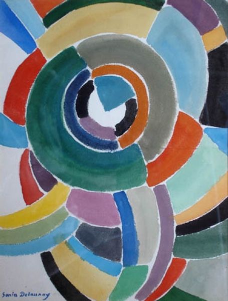
Robert Delaunay made this colour wheel, known as Premier Disque, sometime in the early twentieth century, and you can just tell that this was a real breakthrough in terms of colour. The pigment here is pretty thin and washy; you can see the marks of the brush in the concentric rings of colour which make up the painting’s design. What’s also interesting is how Delaunay divides the circle into four quadrants, which sets up a contrast between similarity and difference in the painting’s basic design. Look at how the top left-hand quadrant has a very different feel to the bottom right; the colours in the top left are softer, more modulated, with a white stripe setting off the darker hues of purple and brown. By contrast, the bottom right quadrant features denser areas of colour, with stark contrasts between black and pink. This kind of contrast shows a debt to artists like Kupka, who really understood how to use non-objective form to express ideas. But what I love about this work is how it leaves room for all sorts of open readings, without ever landing on one solid meaning.
Comments
No comments
Be the first to comment and join the conversation on the ultimate creative platform.
More like this