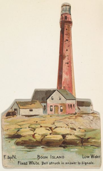
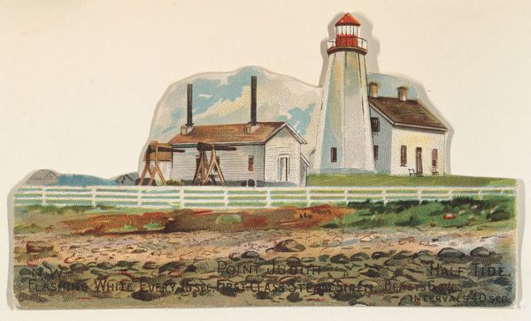
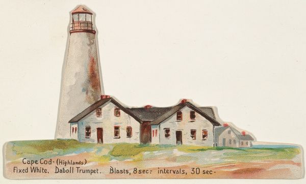
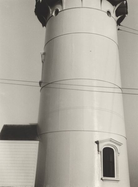
Sanibel Island, Florida, from the Lighthouses series (N119) issued by Duke Sons & Co. to promote Honest Long Cut Tobacco 1889
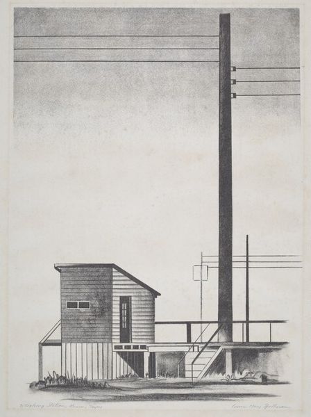
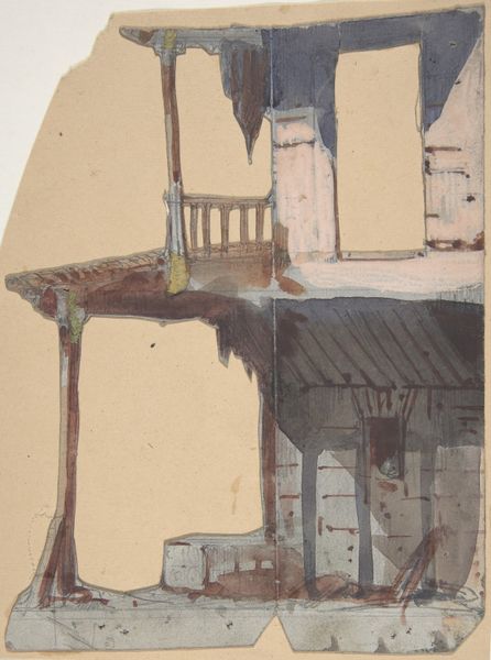
drawing, print, watercolor, architecture
drawing
water colours
street view
landscape
oil painting
watercolor
watercolour illustration
watercolor
architecture
Dimensions: Sheet (Irregular): 3 15/16 × 2 7/16 in. (10 × 6.2 cm)
Copyright: Public Domain
Curator: It’s amazing to look at this little gem—"Sanibel Island, Florida," dating back to 1889. Apparently, it was issued by W. Duke, Sons & Co. to promote their Honest Long Cut Tobacco. A curious intersection of art and commerce! Editor: My initial impression is how skeletal the lighthouse appears. Stripped down, almost vulnerable, unlike the romanticized lighthouses we often see. The colors are gentle but a tad muted. I’m getting a very fragile feel from this one. Curator: Fragile, that's interesting. I see it more as candid, artless—it speaks volumes about the rampant commodification during the industrial revolution. Tobacco companies used these idyllic images to associate their harmful products with leisure and pristine environments. The very land they were often exploiting, I might add. Editor: Exactly! This lighthouse stands for trade and progress—illuminating routes for ships carrying goods, extracted resources. It reflects on the brutal impact of colonialism on these supposed “pristine” lands. Plus, the island itself became another tradable object with this depiction. Curator: It is so striking when considering the watercolor and printmaking mediums. Gentle strokes depicting the reality of big tobacco profiting off land that wasn't even theirs in the first place. Makes the beauty a little bitter, doesn't it? Editor: The image isn't overtly critical; it serves its commercial function. However, its existence opens a door for us to analyze the relationship between marketing and art and explore the cultural undercurrents it exposes. Curator: Indeed! Seeing how the watercolor is very delicate but also exact mirrors how precise capitalism seeks to be with its exploitations. These little details add such depth! Editor: And considering its original context—as a promotional insert—it makes you think about all the hands that handled this image. Each touch, each gaze adding to its story. I agree; it's profoundly complex, deceptively simple. Curator: Looking back on this small, seemingly unassuming image, I can’t help but think about how the light in that lighthouse—that ideal—never truly shines on everyone equally. Editor: Ultimately, I will always remember how commercial art can be an echo chamber for all people and also the system's faults.
Comments
No comments
Be the first to comment and join the conversation on the ultimate creative platform.