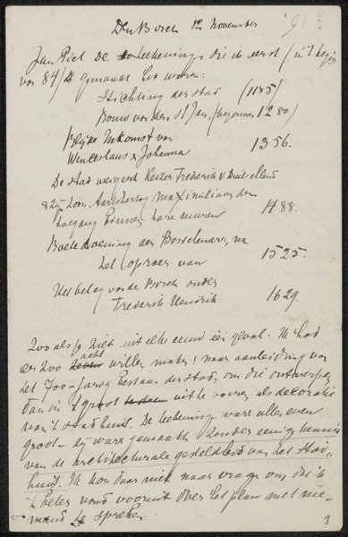
drawing, paper, ink, pen
#
drawing
#
hand-lettering
#
hand drawn type
#
hand lettering
#
paper
#
personal sketchbook
#
ink
#
hand-drawn typeface
#
ink drawing experimentation
#
intimism
#
pen-ink sketch
#
pen work
#
sketchbook drawing
#
pen
#
sketchbook art
Copyright: Rijks Museum: Open Domain
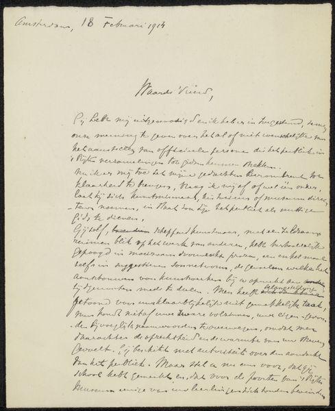
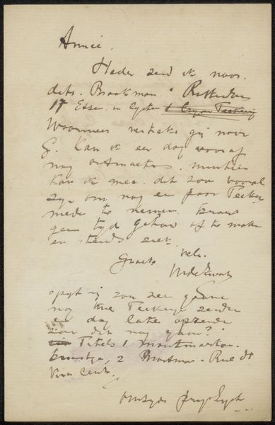
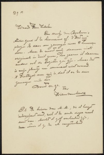
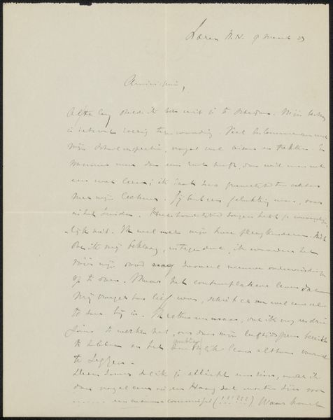
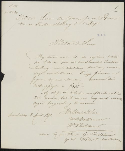
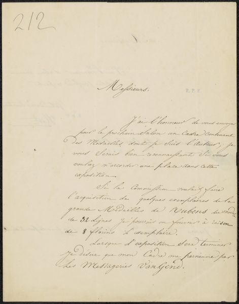
Editor: Here we have "Brief aan Jan Veth," or "Letter to Jan Veth," possibly from 1895, by Pieter Lodewijk Tak. It’s a drawing done with pen and ink on paper. The immediate impression is one of intimacy, of a glimpse into someone's private correspondence. What do you see in this piece? Curator: The drawing compels analysis of its graphic elements. Consider the line itself: its variable weight, the deliberate rhythm it establishes across the page. Note how the varying pressure creates a dynamic texture. Semiotically, each stroke functions as a signifier, contributing to the overall message and aesthetic experience. Observe the composition; the way the text is arranged isn't simply utilitarian, but also formal, creating visual balance and drawing the eye through the script. What impact does the handwriting have on your experience? Editor: The handwriting feels so personal and almost secretive, making me focus on the shapes more than the words themselves. Curator: Precisely. The imperfections and idiosyncrasies of the hand become integral to the work's character. Further study using formal methods might examine the use of negative space – the interplay between filled and unfilled areas. Also, note the contrast between the more legible header, the main body, and how it subtly shapes our understanding of the text's layers. Editor: I hadn’t thought about the different "voices" created by the script, and how that contributes to the feeling of it being intimate. Curator: The synthesis of these visual elements is critical; through this methodological lens, we might discern a deeper understanding of its construction as more than simple script but a deliberate and artistic arrangement. We appreciate how the components—line, shape, space— coalesce to forge its very expression. Editor: This close reading has given me so much to think about. Thanks!
Comments
No comments
Be the first to comment and join the conversation on the ultimate creative platform.
More like this