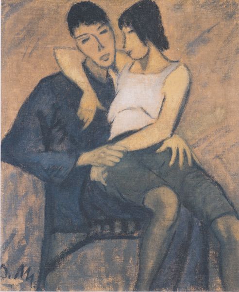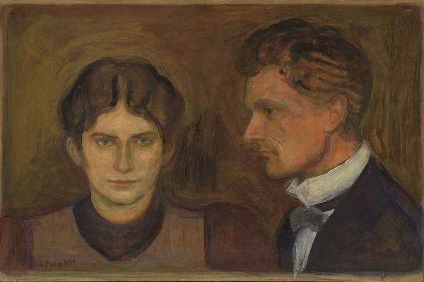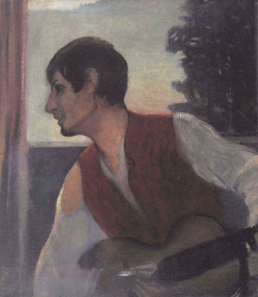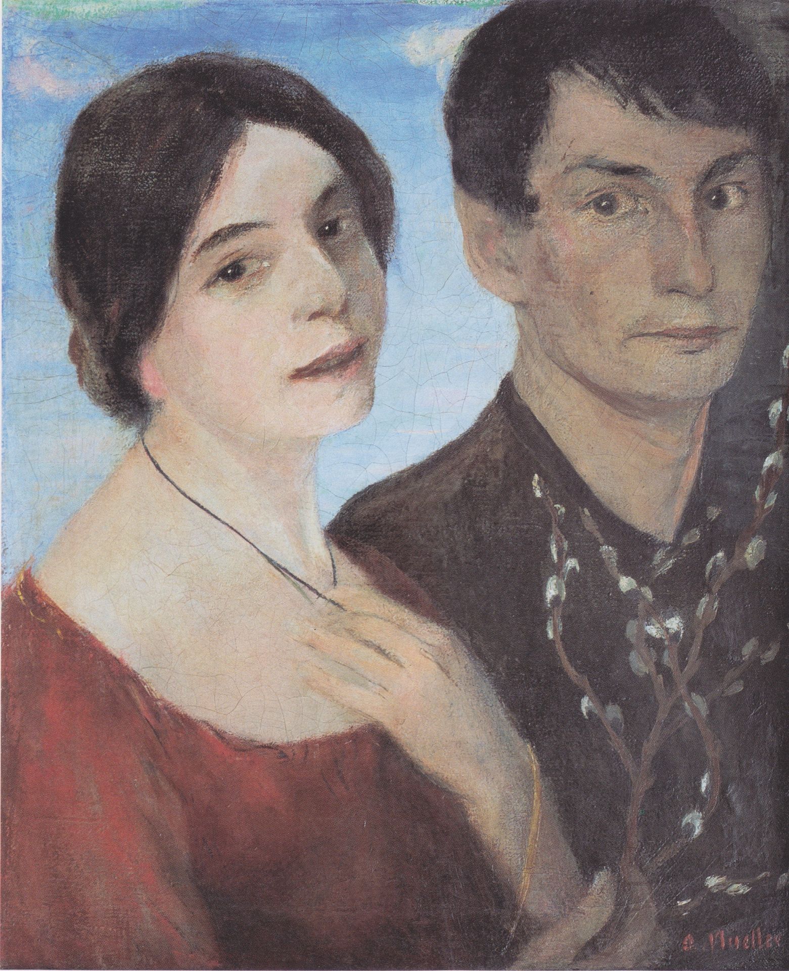
1903
Liebesfrühling Ii (doppelbildnis Maschka Und Otto Mueller)
Otto Mueller
1874 - 1930Location
Schlesisches Museum zu Görlitz, Görlitz, GermanyListen to curator's interpretation
Curatorial notes
Editor: We are looking at Otto Mueller's "Liebesfrühling II (Doppelbildnis Maschka und Otto Mueller)," an oil painting from 1903. It strikes me as a rather formal portrait, almost austere, despite the suggestion of "Spring" in the title. What draws your attention when you consider the work's intrinsic qualities? Curator: The composition is what first commands attention. Observe the flatness of the picture plane, a common feature within German Expressionism despite the formal style of the work, especially when thinking of Mueller's later lithographs of nudes. Note the subjects positioned almost parallel to the picture plane; we are granted little sense of depth, a quality heightened by the flattening effect of the lighting. The application of color enhances this further; do you see how it models the forms? Editor: Yes, I notice that now. There are tonal variations to suggest form, but there's little blending of shades, as though it flattens each form rather than rounds it, right? What is your feeling when viewing the faces themselves? Curator: Precisely! Then note the contours, defining each of the sitters in dark pigment, further enclosing them in a space of artifice, that denies any sort of recessive illusionism. It’s clear from their penetrating, yet ambiguous expressions, and even more clearly with his almost gothic darkness compared to her gentle pastel coloring, they were intended to evoke introspection and emotional weightiness rather than pure representation, and yet both are turned out, meeting the viewer’s eye directly! What do you think accounts for this paradox? Editor: Perhaps it is a visual device of contrast, designed to enhance visual tension. By considering only the formal choices it appears almost oppositional, or contradictory, yet creates an aesthetic I didn't notice to start. Thank you for your insights, and new perspective! Curator: And thank you for noticing those tensions and inviting this reading! Together we observe there are indeed no intrinsic or stable forms, and are always open to question.