drawing, ink
#
drawing
#
medieval
#
narrative-art
#
text
#
ink
Copyright: Public domain
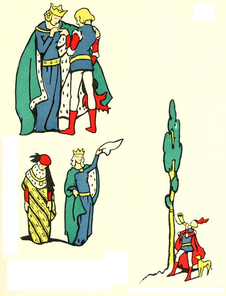
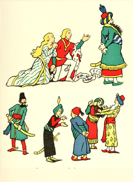
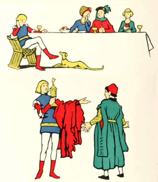
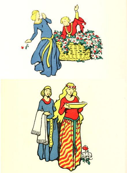
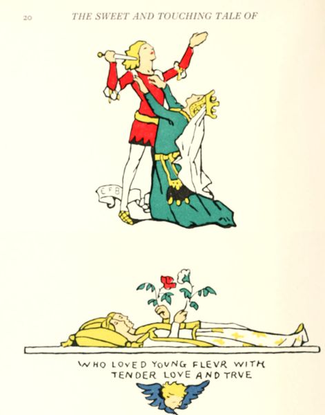
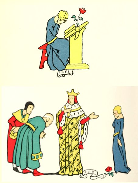
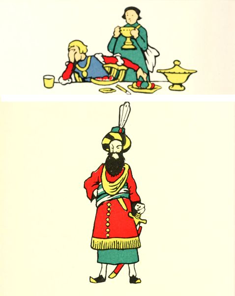
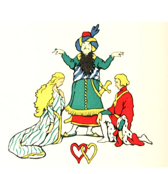
Eleanor Fortescue-Brickdale’s illustration presents a sweet and touching tale through an interesting mark making approach, primarily using what looks like ink to define lines and blocks of color, that shows us that artmaking is a process of layering and outlining. You can really feel the texture of the paper in this artwork, the ink and the pigment almost sit on the surface, creating a sense of depth. The colors are bold and bright, evoking a sense of childlike wonder, with the reds, yellows, and blues bringing the scene to life. Look at the way the figures are outlined in black, creating a graphic quality that is both playful and precise. Take in the way the artist has used the line to emphasize the folds in the characters' clothes, or the expressions on their faces. The lines seem so clear, and make the narrative even easier to understand. Fortescue-Brickdale's unique style reminds me of the work of Paula Rego. I think both artists bring a similar kind of folk storytelling to their art, letting us interpret their art through our own lens.
Comments
No comments
Be the first to comment and join the conversation on the ultimate creative platform.
More like this