#
pencil drawn
#
toned paper
#
light pencil work
#
pencil sketch
#
charcoal drawing
#
personal sketchbook
#
pencil drawing
#
pencil work
#
watercolour illustration
#
watercolor
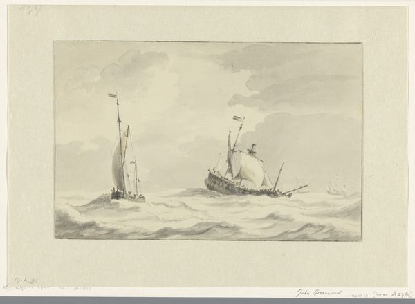
Dimensions: height 195 mm, width 282 mm
Copyright: Rijks Museum: Open Domain
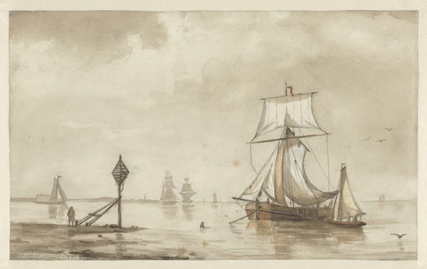
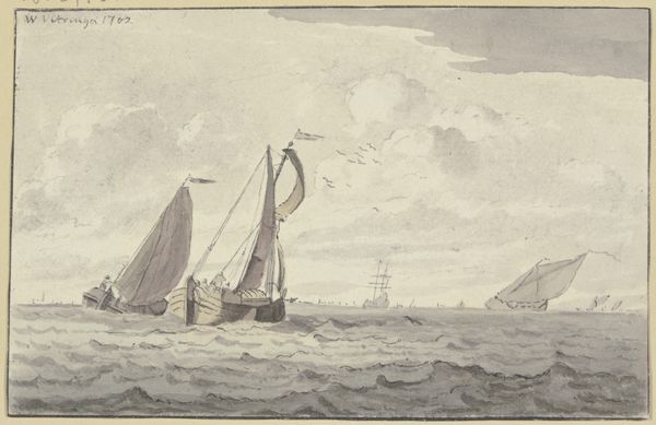
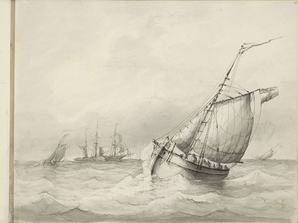
Curator: Immediately, a kind of restless energy pervades this sketch, wouldn't you say? The monochrome tonality gives it an almost spectral feel. Editor: Yes, it's evocative. We are viewing "Ships at Sea" by Willem Witsen, likely rendered sometime between 1870 and 1923. Currently, it resides in the Rijksmuseum collection. What strikes me is Witsen’s economy of line – how he captures so much movement with seemingly so little effort. Curator: Precisely! Notice the distribution of the vessels across the picture plane. The closest ship dominates the foreground. This contrasts with other smaller vessels further toward the horizon. A very deliberate placement indeed, drawing the eye into spatial recession. Editor: It also hints at a kind of melancholy, a sense of transience. These ships, these lives are all moving…toward what? The muted tones only amplify this feeling, it seems almost like memory made visible, don't you think? Or maybe an attempt to reconcile the ephemeral with solid structure. Curator: An astute reading! I’d also add that Witsen’s decision to employ watercolor on paper, with its inherent transparency, underscores this ephemeral quality. There's a distinct difference, if you consider this piece compared to an oil painting from the same time. We get this great tonal subtlety and blending. Editor: There is also such a profound sense of vulnerability; that small rowboat pitched against what could be an impending storm. Maybe the drawing holds some key to Witsten’s personal journey – his doubts or hidden passions rendered as allegory? It leaves one pondering the untold narrative. Curator: It offers a compelling snapshot into maritime life while demonstrating Witsen's formal skills and mastery. The subdued palette coupled with its dynamism makes the overall image intriguing. Editor: In its own modest way, this simple composition stirs grand ideas and reflections far beyond the boundaries of its own making. Thanks for helping make it tangible.
Comments
No comments
Be the first to comment and join the conversation on the ultimate creative platform.
More like this