drawing, paper, ink, pen
#
drawing
#
ink drawing
#
pen sketch
#
paper
#
ink
#
pen
#
calligraphy
Copyright: Rijks Museum: Open Domain
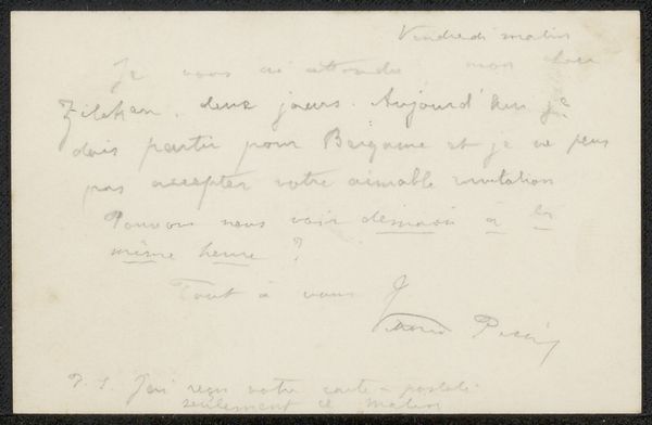
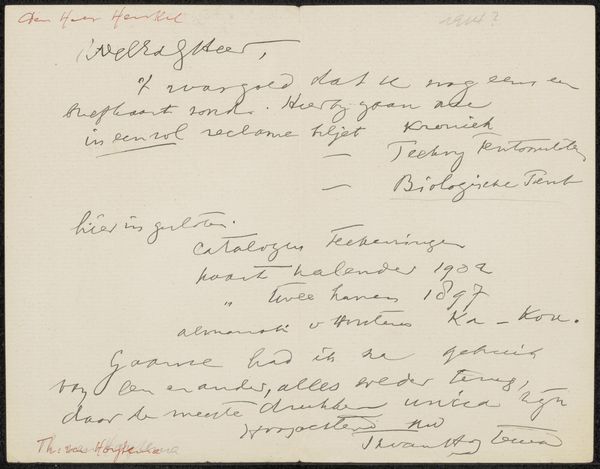
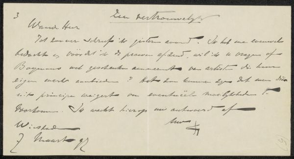
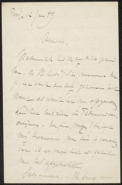
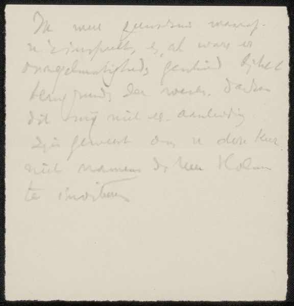
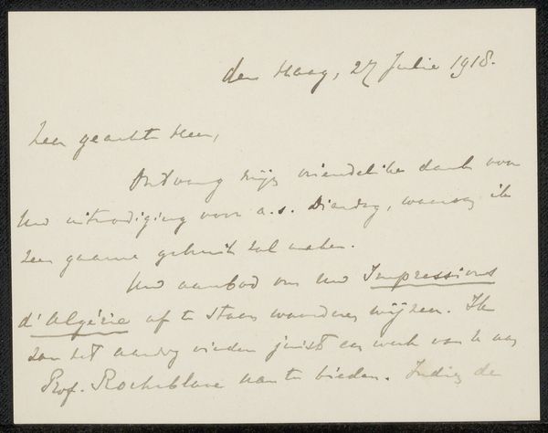
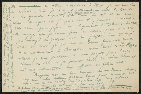
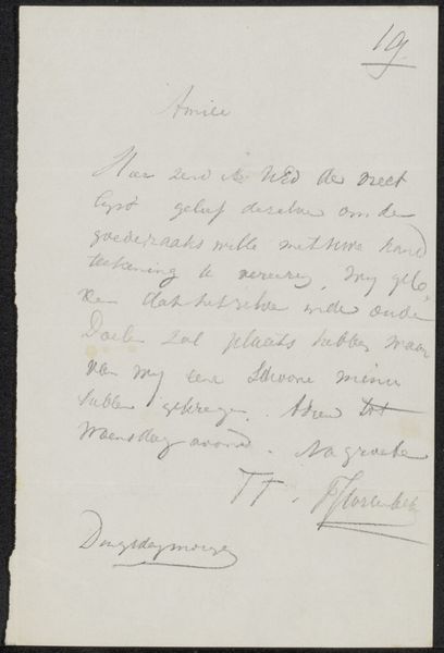
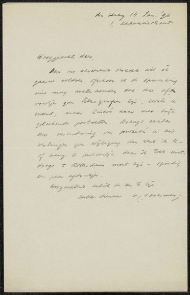
Curator: This artwork is titled "Brief aan Philip Zilcken," tentatively dated to 1885. It's a pen and ink drawing on paper by Philip Gilbert Hamerton. Editor: You know, the first thing that hits me is the elegance of it. Even a simple letter seems elevated to an art form with that script. There's something almost mournful in its formality though, do you get that? Curator: Indeed. The calligraphic style carries so much historical weight. Letters, especially personal correspondence like this, were vital conduits of connection and thought before instantaneous digital communication took over. The act of writing, the very stroke of the pen, becomes imbued with meaning. Consider the careful curves, the deliberate slant – these reveal character and intention. Editor: Right. I can almost feel the writer’s hand as it moved across the paper. The slightly faded ink even gives it a kind of… whisper from the past quality. What's the message though? Is it revealing some huge secret? Curator: The letter declines an offer for "le Portfolio" to reproduce a watercolor by J.M. Swan as an etching. It isn’t revolutionary in content, no great secret spilled, but that’s precisely the point! We get an insight into the social and professional circles of the time, an almost casual glimpse into artistic exchange, but the refusal itself, couched in such polite terms, is telling. There's a dance of power at play, even in rejection. Editor: I suppose that every artifact carries some aura of time and circumstance. Knowing it's not just an exercise or a draft changes everything. So a “no” carries more resonance now because it hints at untold discussions and plans that once seemed urgent but became obscure with time. Curator: Precisely. What strikes me is the persistence of ritual in these interactions. He's refusing a proposal but maintaining connections through the graceful, almost stylized, mode of delivery, something modern email strips away entirely. The date at the top becomes symbolic in itself! Editor: It makes you think, doesn’t it? It feels heavier than just words on a page. Well, I won't pretend I'm not itching to find out why that watercolor was so objectionable. Curator: Indeed. It leaves a delightful enigma. Thanks to the beauty and the detail of this particular exchange, a message crafted over a century ago continues to speak to us today, carrying subtle social signals and historical memory.
Comments
No comments
Be the first to comment and join the conversation on the ultimate creative platform.
More like this